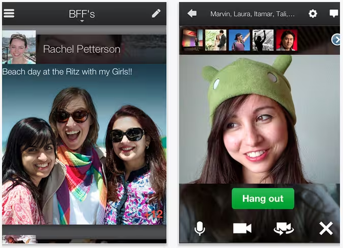
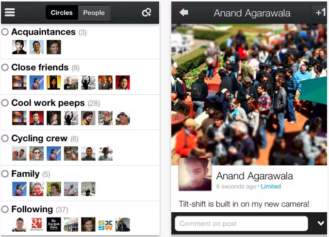
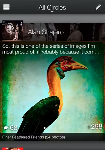
Google has just released a new version of its Google+ iPhone app, and boy is it impressive. This release features crisper fonts, larger profile pics and a friendlier home-screen. In addition, Google worked to make the stream easier to scan and easier on the eyes, with overlays, gradients and other visual elements.
Google+’s original app for iPhone never received much praise, but this latest iteration is, for lack of better words, surprisingly good. Given how unexpectedly sexy this app is, my intuition leads me to believe that the acquihire of Kevin Rose and the Milk team has played a part in this.
This is actually quite likely, due to Google’s confirmation that the new hires will focus on “social efforts.” That said, designing an entire app would require an absolute ton of work to have happened in just 2 months.
From Google’s Senior Vice President Vic Gundotra:
Sharing is deeply sensory. From cooking a favorite meal to getting together with friends, it’s the smells and the stories and the smiles that make human connections so essential. With Google+ we want to extend these moments online, so it’s only right to focus on the most personal of personal computers: your mobile phone.
To be clear, we’re not interested in a mobile or social experience that’s just smaller. We’re embracing the sensor-rich smartphone (with its touchable screen and high-density display), and transforming Google+ into something more intimate, and more expressive. Today’s new iPhone app is an important step in this direction—toward a simpler, more beautiful Google.
 Google knows how good this app looks, and has called it “a feast for the eyes” and “a stream you can swim in.” Its blog post is also even more playful than usual, with links to a Men In Black trailer, ball pits, etc. The team is clearly celebrating. More, from Google:
A feast for the eyes: Full-bleed photos and videos are cool. But you know what’s really cool? Content so immersive it remakes your mobile device into a rich carousel of beloved memories and breaking news. That’s the Google+ experience we aspire to, and today’s release helps us get closer:
Whether you post photos or articles or text, we’re making ‘em look gooood. We’re adding crisper fonts, larger profile pics and a friendlier homescreen.We’re making the stream easier to scan, and easier on the eyes with overlays, gradients and other visual elements
A stream you can swim in: Looks alone aren’t enough—you also need an app that’s fast and fluid. Even a simple swipe gesture can inspire the same “wheeee!” as the bubble wands and ball pits we enjoy(ed) as kids. So today’s update pays special attention to fun and performance:
Conversations fall into view as you move forward and backward in time. Optical cues (like parallax) help the mind linger on individual posts. Important actions like +1 now float atop the stream, making it easy to endorse all your favorites
 At the end of Google’s announcement, it notes that it’s goal is to bring “you closer to the people you care about, and the stuff you’re into.” A more attractive app, paired with the recent site redesign and deep integration with other Google products means G+ has quite the chance of making continuous waves to achieve its goal.
Right now, this iPhone update is rolling out immediately (version 2.0.0.5888), while the Android update is “coming in a few weeks (with a few extra surprises).” It’s interesting to see Google give iOS first access, but it’s likely that those “extra surprises” are there to make up for it.
Get the TNW newsletter
Get the most important tech news in your inbox each week.


