If there’s one thing that Android has taken a beating for consistently over the years, it is its lack of design-centric applications. Many of the apps that are available on both Android and iOS, for instance, look and perform better on Apple’s devices.
Google has been making strides toward changing that with the latest version of Android, Ice Cream Sandwich. Not only does Android 4.0 look quite a bit better and have a more cohesive (though still not completely consistent) aesthetic, but Google is also beginning to offer more tools and help to developers to improve the look of their apps.
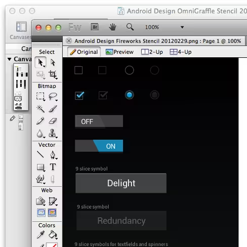
First, it was the introduction of an Android Style Guide that helps developers determine a good starting point of user experience. Now, Google is launching design stencils on its new Android Design center. Android designer Alex Faaborg explains the new stencils:
With these stencils you can now drag and drop your way to beautifully designed Ice Cream Sandwich (Android 4.0) applications, with grace and ease. The stencils feature the rich typography, colors, interactive controls, and icons found throughout Ice Cream Sandwich, along with some phone and tablet outlines to frame your meticulously crafted creations.
The stencils are available for a host of design suites like Adobe Fireworks, Photoshop and Illustrator, as well as OmniGraffle and says that it will expand this out to other products in the future.
If you’re an Android developer, do you think that these stencils will help in your mockup building, or do you prefer to create from scratch?
Get the TNW newsletter
Get the most important tech news in your inbox each week.
