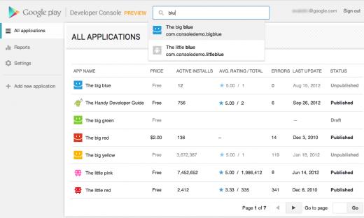
Following a tease at Google I/O and a subsequent test with “tens of thousands of developers,” Google has just made its redesigned Google Play Developer Console available for everyone.
This update is just one example of how Google has been working hard to improve the Android developer experience over the past year, despite stories of fragmentation hell. Now, the entire process of submitting, managing and updating apps in the Google Play store has been completely refreshed.
While Apple still has the upper hand in terms of active and well-paid developers, Google knows it has the advantage of significantly more users. That’s exactly why this redesign took place: to provide devs with better tools for “delivering great Android apps that delight” the “hundreds of millions of Android users.”

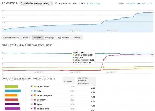
As far as what’s changed besides the fresh new look, Google is specifically touting a new “streamlined publishing flow, new language options, and new user ratings statistics.” The stats graphs in particular should make iOS developers a bit jealous, as they blow away what’s offered directly in iTunes Connect (aka, why services like Distimo and Flurry are so popular).

Although the Google Play team says the redesign isn’t quite finished yet and doesn’t support some advanced features, you can try the new version of the Developer Console by visiting the link below.
Get the TNW newsletter
Get the most important tech news in your inbox each week.


