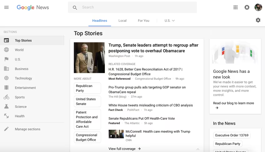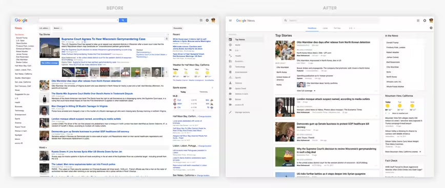
Google today rolled out a brand new look for News. The redesign is modern, clutter-free, and puts the emphasis on what’s important when browsing dozens of news stories.
According to Google:
“To make news more accessible and easier to navigate, we redesigned the desktop website with a renewed focus on facts, diverse perspectives, and more control for users.”
Scrolling through the news feed, you’ll find easily scannable content. Google’s Story card format allows users to quickly pinpoint key bits of information like news source, headline, and publish time. The Story cards also allow users to look at the different perspectives surrounding the story ー encouraging readers to gain a more informative understanding of the issue.
And if you glance at the top of the page, you’ll see a new navigation bar for “Headlines,” “Local” and “For You.” “Local” is exactly what it sounds like ー keeping tabs on stories from any part of the world. And then there’s “For You,” a feature that personalizes the news feed based on your interests.

The icing on the cake is the Fact Check block, which makes it a lot easier to vet a story’s credibility.
The feature is only available to US readers at the moment, but Google plans to slowly roll out the update globally.
Get the TNW newsletter
Get the most important tech news in your inbox each week.


