It’s 2020, the year when you can’t go outside without being at least a little worried about getting infected with COVID-19 or infecting someone else. Google wants to make your life a little easier during these trying times by adding a COVID-19 layer to Maps, helping you keep track of the number of confirmed cases in different areas.
[Read: 5 things to know when you’re buying your first electric vehicle]
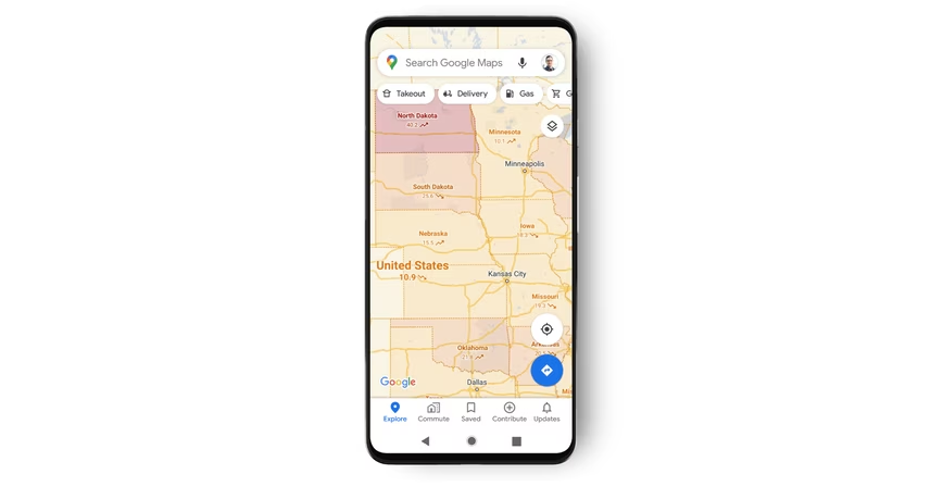
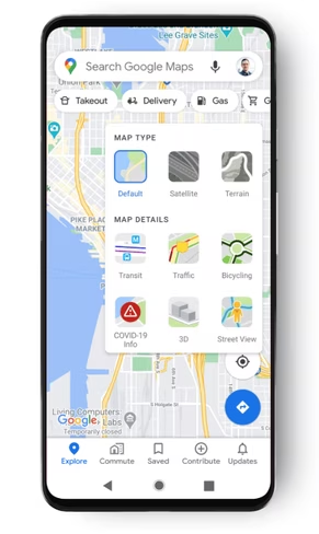
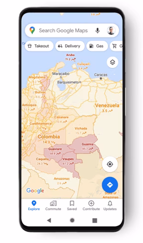
Now you can open Google Maps, tap on the layers button on the upper-right corner, and select ‘COVID-19 info.’ The app will then display the seven-day average of cases per 100,000 people in different areas, color-coded to make case density more obvious. The colors are as follows:
- Grey: Less than 1 case
- Yellow: 1-10 cases
- Orange: 10-20 cases
- Dark orange: 20-30 cases
- Red: 30-40 cases
- Dark red: 40+ cases

The 💜 of EU tech
The latest rumblings from the EU tech scene, a story from our wise ol' founder Boris, and some questionable AI art. It's free, every week, in your inbox. Sign up now!
Maps will also display whether the cases are trending up or down, helping you potentially find a new place to shelter in until all of this is over.
Google says its using information “multiple authoritative sources, including Johns Hopkins, the New York Times, and Wikipedia.” These, in turn, get their information from the government agencies, hospitals, and the World Health Organization. Some of these sources already provide information for the coronavirus blurbs in Google Search.
The new layer rolls out to Android and iOS this week.
Get the TNW newsletter
Get the most important tech news in your inbox each week.