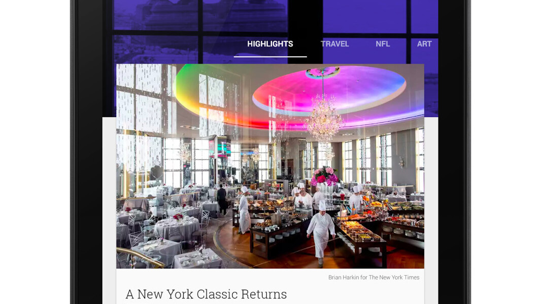
Google today updated version its Play Newsstand app for Android with a Material Design makeover. It follows the Play Newsstand app for iOS, which Google released less than 10 days ago as a successor to Google Currents.
 If you’ve tried Play Newsstand for iOS, or at least looked at the screenshots, you’ll have a good idea of what to expect. The design is flatter than before, with larger images and playful animations. Scrolling up and down reveals a smooth stream of article cards with interesting photos, in addition to smaller rows of square icons for specific publications. Tapping any one of these will send you to a stream centered on that specific outlet, where you can also add them to your ‘My Library’ section.
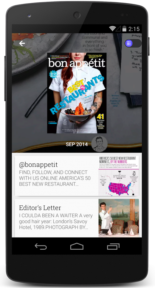
Today’s update also introduces a new magazine reading experience for smartphones. Now, you’ll see a clear list of articles that you can read individually. No more pawing around the screen to look at a digital double-page spread.
(Note: Google says the updated app will roll out to all users over the next week, so sit tight if you’re not seeing it just yet.)
➤ Google Play Newsstand [Android]
Get the TNW newsletter
Get the most important tech news in your inbox each week.


