It was only a matter of time. Google launched Play Newsstand for Android in November 2013, before closing its predecessor, called Currents, in February 2014. Today, it’s performing the same ritual with the release of Play Newsstand for iOS.
The new app has a completely different look to Currents. Google is clearly incorporating its flatter, cleaner Material Design language here; the animations are tighter and more playful, with elegant typefaces and color-coded tabs.
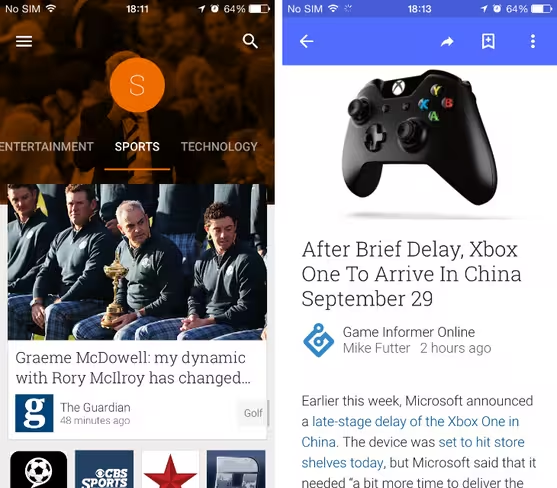
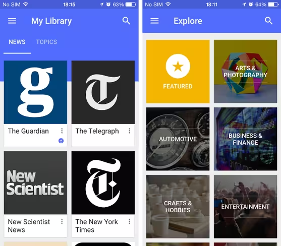
By default, the home screen splits the news into a number of different sections including Highlights, News, Business, Sports, Entertainment, Technology and World. Each contains a stream of visual cards for individual stories, as well as rows of square icons for specific publications. Tapping any one of these will send you to a new stream centered on that specific outlet, with the option to add or remove them to a separate section in the app called My Library.
Here you can easily access and download stories from your favorite publications, in addition to “Topics.” These are found in the Explore section and initially split into broad categories such as Travel, Women’s Lifestyle and Automotive. You can mine down, however, to more specific subjects and add them to Topics.
The reading experience is top-notch and the app will alert you to restrictions on paywalled sites such as The New York Times. Articles are also greyed out once you’ve finished reading them, creating an easy checklist system for catching up with the latest headlines before and after work.
Should the likes of Flipboard and LinkedIn Pulse be worried? Perhaps.
➤ Google Play Newsstand (iOS)
Top image credit: JOHANNES EISELE/AFP/Getty Images
Get the TNW newsletter
Get the most important tech news in your inbox each week.


