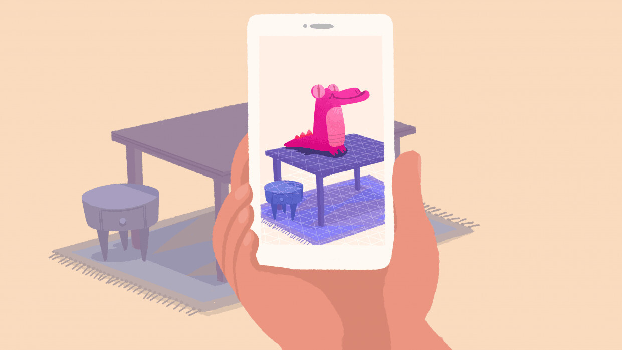
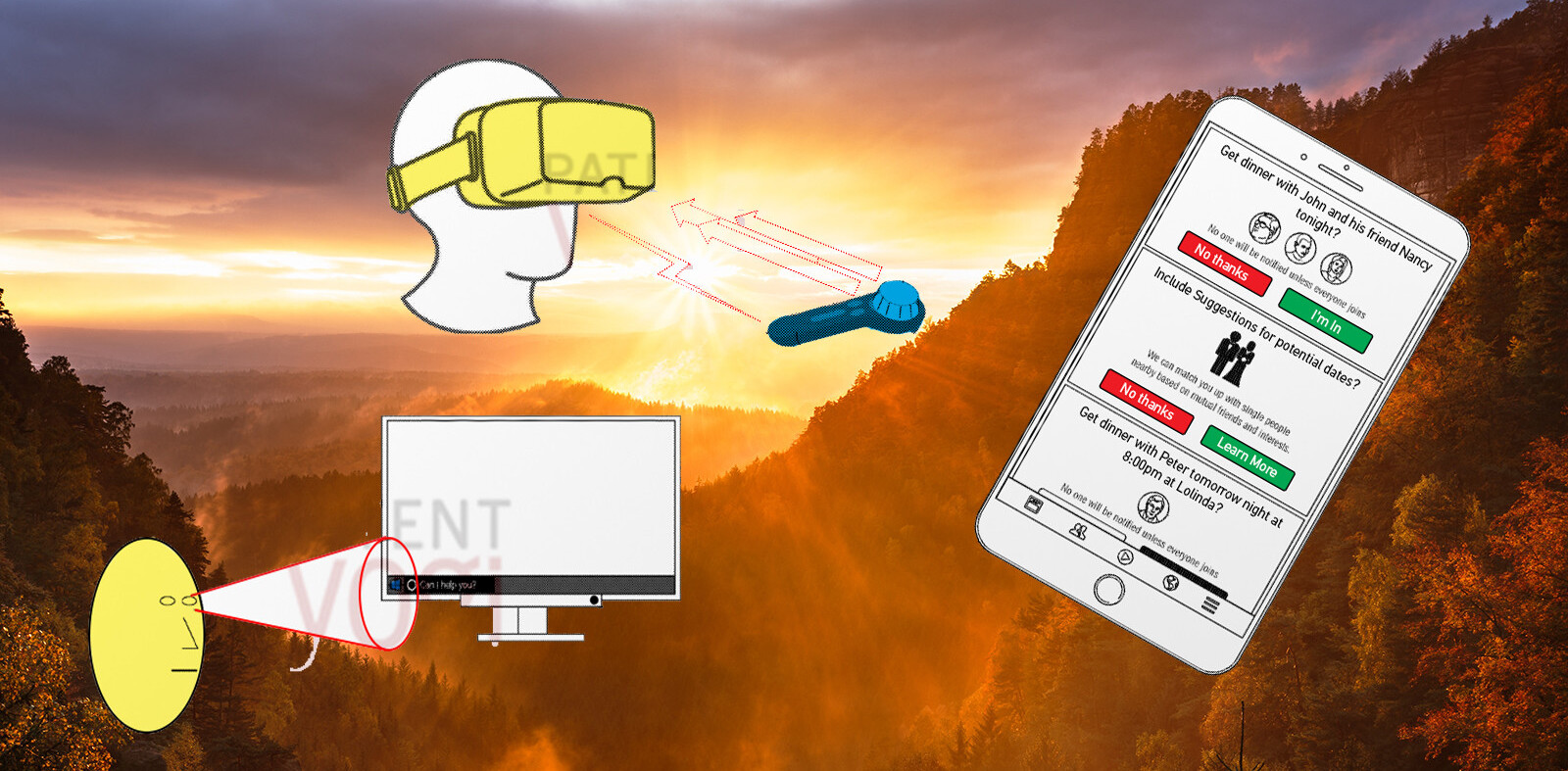
When Google and Apple announced their mobile augmented reality (AR) platforms last summer, they rocked the 3D world. Almost overnight, Google’s ARCore and Apple’s ARKit shifted the center of gravity for 3D UX design away from headsets like the Oculus Rift, HTC Vive, and PlayStation VR toward already ubiquitous mobile devices.
ARCore and ARKit sparked interest in 3D from a new — and huge — group of designers and developers with experience building 2D mobile applications. They also added confusion to an already chaotic field. At the time, 3D workflows were a hodgepodge of tools and design patterns borrowed from gaming, film, 3D printing, and architecture. They were fragmented and time consuming, especially compared to 2D prototyping workflows. They required mastery of new tools with steep learning curves.
To complicate matters, there were no how-to’s, reference applications, or design guidelines to help get these designers started in mobile AR. However, that thankfully changed with the recent release of a set of AR design guidelines from Google.
The Google Augmented Reality Design Guidelines should be a lifeline for 2D mobile app developers. But how helpful are they really? Do they reflect the priorities or address the needs of designers engaged in building complex 3D applications? Are they something I would recommend to designers looking to get started in AR?
What follows are my (hopefully helpful) observations as I try to answer these questions.
The pluses
In general, the guidelines excel when they encourage designers to build applications that focus on motion and environmental engagement. Movement, specifically user movement, plays a critical role in AR.
Mobile app developers must account for new device orientations and camera positions. The guidelines recognize that users of AR apps no longer simply cradle a device; they constantly re-position it.
Designers must account for user fatigue and whether screen-locked UI elements obscure the camera view. Different device types and weights also impact a user’s experience. A tablet offers a larger screen, but weighs more than a phone, making lengthy user sessions more problematic.
“Be mindful of the length of play experiences,” the guidelines state. “Consider when users might need to take a break.”
The guidelines remind designers of one of the most overlooked aspects of AR: end-user mobility and how this shapes interactions with immersive designs. What if the user is on the bus, uses a wheelchair or is unable to move or hold a device?
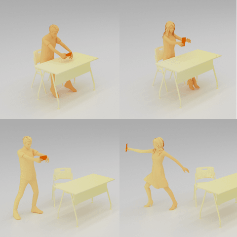
In order to ensure access for everyone, the guidelines urge designers to consider four user modes — seated, hands fixed; seated, hands moving; standing, hands fixed; and standing, hands moving (full range of motion).

The guidelines also suggest providing “an alternative experience” if the user isn’t able to move around: “For example, instead of encouraging users to move closer, emphasize other activities, such as object interaction or transformation.”
The guidelines stress awareness of the outside environment and seek to encourage designs that prioritize user safety. Making users back-up, or encouraging them to move in any direction while the device is pointed elsewhere is strongly discouraged.
Lagging behind users
The guidelines offer help under six main buckets: environment, user nuances, initialization and adding virtual assets, interacting with virtual assets, designing the experience, and realism.
However, they struggle to keep pace with the quickly evolving demands of designers and developers. This leads me to wonder if Google might actually be trailing behind users in understanding the potential of mobile AR to accomplish complex tasks or communicate nuanced experiences.
For example, the guidelines make no allowance for multi-scene use cases or complex mechanics — or really anything beyond simple object placement and sticker-like functionality. However, designers today are attempting to build apps that include interactivity like object selection, conditional behaviors, and branching scene flows driven off of user behavior.
Another key omission is a discussion of collaborative environments. One of the most sought-after features in mobile AR is the ability of users to collaborate in the same scene from the same location on different devices or, in some cases, to share the same camera view.
I often see the latter when designers wish to allow remote collaborators to see their AR prototypes in the environment for which they were intended, and to provide feedback, all in real time.
The verdict
With all of this being said, I give the guidelines a tentative thumbs-up. They’re a good and much-needed starting point, and they cover a few critical concepts well.
Above all, they put the user and her needs front and center — in particular vis-à-vis interacting with the physical environment while using AR. The guidelines never stray far from the central idea of being mindful of humans out in the world using your (simple) application — and that’s not a bad thing.
However, this first iteration of best practices is distinctly conservative. For designers feeling the urgency to get started in mobile AR, this approach leaves them wanting more. The silver lining here is that the patterns and best practices of mobile AR UX design are wide open for anyone to help define.
One effect of the introduction of ARCore and ARKit has been to newly empower the roughly 4.5 million-strong community of 2D designers to make a dent in the universe. They’re already developing clever workarounds, and companies are starting to develop tools of their own.
The mobile AR space may seem chaotic and disorganized now. But what works well will win. Innovations by the pioneering designers of today will inform the design guidelines of tomorrow. In a matter of years, I believe we will look back fondly on these days as a time of incredible experimentation, freedom, and learning.
Update: This article’s title was changed after publishing.
Get the TNW newsletter
Get the most important tech news in your inbox each week.


