Google+ rolled out a pretty massive redesign last month, which I actually liked a lot. The only problem was, and it was a big one, the changes that it made to the “Explore” section, which I happen to use a lot.
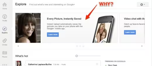
For whatever reason, the team decided that placing a huge bar at the top of the page, which I called “the slidey thing”, was a good idea. Not only was it obnoxious and full of outdated and repetitive information, you couldn’t close it at all. It just sat there and got in the way.
In case you haven’t been to the site in a while, here’s what it looked like:
This particular section of the site pulls together all of the hottest posts on the network, which I find extremely interesting. I’ve found numerous hilarious videos and photos by perusing Explore. After the update though, I found myself visiting the page less and less.
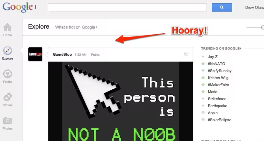
As I was making my way around the interwebs today, I noticed that I wasn’t the only one complaining about this monstrosity and the team decided to yank it:
I let out an audible “Yay!”. Yes, I’m a geek, but thank you for listening to us, Google+ team.
Get the TNW newsletter
Get the most important tech news in your inbox each week.


