So it’s been a little over a week since Google+ unleashed its brand new redesign on us and so far I’m a fan. That is, until I clicked the Explore button. I’ll get to that in a minute.
Much has been talked about regarding the extra white space on the site, leaving some of us wondering what will be placed there. A prominent member of the team for the product, Vic Gundotra, promised that there are plans for the white space. That’s cool, I like plans.
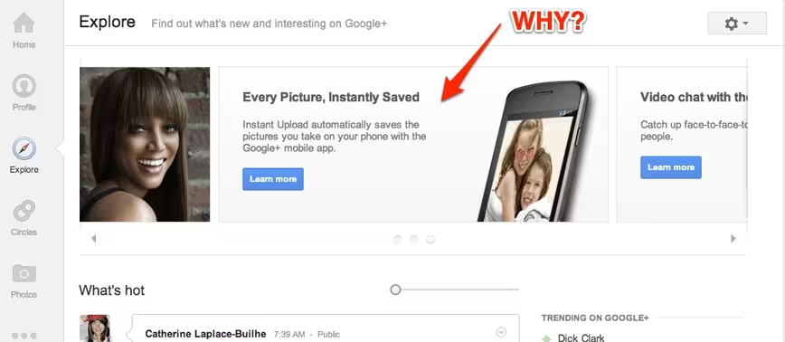
However, I’m wondering what in the hell the team was thinking when it released this monstrosity at the top of its Explore page, a page that I tend to visit often:
Don’t get me wrong, I’m by no means a designer nor an expert in user experience, but I would have literally laid on top of the engineers keyboards to stop this from being pushed into production. I’m calling this “the slidey thing”, since there is no other term I can come up with that doesn’t include foul language.
Not only is it humungous, it spins through the same three features without being updated, constantly. Even if Google+ used this space to promote some actual fresh content, I’d still be offended by it.
The worst part is that you can’t even close it. Every single time I visit the Explore page I hope that some designer with their wits about them sneaks an “X” button in there that sends it packing.
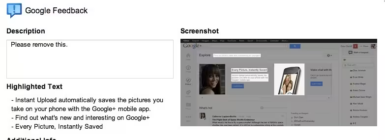
Luckily, Google+ has a pretty great feedback system that lets you highlight the sections you’re having issues with. Only problem is that the tool sees the entire bar as separate elements so I wasn’t able to submit it all with my feedback request to “remove it”:
I’m not sure who thought it was a good idea to take up that much space with information that is useful once to users, but I hope that they reconsider. And soon. It doesn’t make me want to “Explore” anything other than another website.
Get the TNW newsletter
Get the most important tech news in your inbox each week.


