Steve Matteson is the Creative Type Director for Monotype.
It has been famously said that the Web design is 95 percent typography. Typography has always been central to any written message – books, manuals, packaging, advertisements – and now the Web.
The Web gives brands a new opportunity to interact with customers. Therefore being ‘on brand’ or ‘on message’ is more critical than ever.
In order to tie the immaterial Web experience with the physical product experience a common thread of consistent typography is key. The adoption of Web fonts technology (the ability to embed corporate brand typefaces within the corporate website) means it is now the norm to build this common thread throughout a brand.
Choosing existing typefaces or designing new typefaces which uniquely reinforce or emphasize the written content is the ‘Holy Grail’ of typographic execution. American type design pioneer Frederic Goudy once said, “If one type is more suitable than another for a given purpose, then there must be some type most suitable, and print to be (considered artistic) will not be satisfied with any but that right type.”
It’s normal for designers to feel overwhelmed when choosing typefaces – there are so many available with varying degrees of quality and utility. New designs, such as the OpenSans design used in Google’s Chrome advertising, or Southwest Airline’s new typography system, enable the corporation to fine-tune the letterforms so that they fit the brands overall promise.
The elements of future-proof typefaces
Typefaces are created to reinforce a significant element of a corporate brand. For example, precision and geometry in a design suggests mechanical expertise or engineering whilst irregular or softer details suggest organic or human qualities. However if taken too far, either of these effects can alienate other aspects of the brand guidelines.
An antique-looking typeface may be warm and friendly but would appear contrary to a forward-thinking engineering firm. Conversely, a harshly regimented and geometric design may suggest an impersonal corporation.
It is important to view written brand messages using selected typefaces and evaluating whether there is discontinuity. For example, if the word ‘friendly’ is part of a brand promise, yet appears neutral or impersonal, then there may need to be a change in type choice.
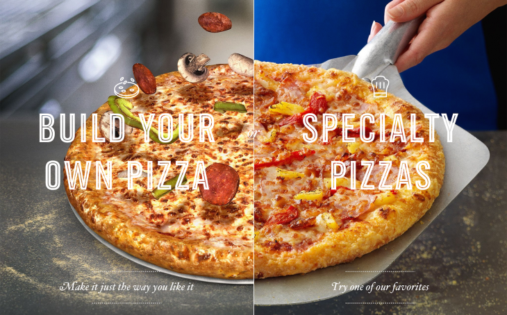
Pizza Press was designed for Domino’s Pizza brand in collaboration with Crispin Porter & Bogusky in Boulder, Colorado. The typefaces and their usage help the Domino’s brand appear more like a local pizzeria where craft is revered over quantity.
Color and shadow effects can be mixed and matched like ingredients on a pizza. The early 19th century style, a condensed sans-serif design lends itself to the graphic treatments and speaks of a simpler, unrushed time of hand craftsmanship.
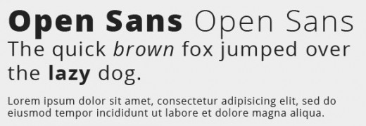
Another example is Open Sans, designed for Google’s Chrome brand. It was crucial for this family to be highly legible with open shapes and ample spacing between characters, because the Web is so text-intensive.
But rather than creating a mechanically engineered and predictable design, Open Sans offers a degree of personality making it uniquely Google.
Looking carefully at any typeface, one can get a sense of refinement, quirkiness and craftsmanship. Some typefaces like Goudy Old Style have few or no straight lines at all, which imparts an antique patina to words. While Univers Next, with its regimented straight corners and somewhat square curvature, exudes mechanical refinement.
Size matters
Once a general direction is decided upon, it is crucial to be sure the integrity of the typeface is not lost when the words are displayed in all brand touch points from headline to packaging to Web. Typefaces are usually designed with a specific set of sizes and conditions in mind.
A typeface designed for 12 point text may not look its best at 72 point without adjustments to details such as fitting, hairline thickness or serif length. The best typographers will see where typefaces need refinement for best effect at every size and situation – a detail often overlooked since the introduction of scalable fonts on desktop computers.
In a world with tens of thousands of typeface choices it can be a daunting task to establish the perfect typographic solution to a brand identity. But with thoughtful attention to detail and careful testing the ‘right type,’ as Goudy described, will artistically support the brand promise.
Read next: 23 of the most beautiful typefaces from September 2014
Get the TNW newsletter
Get the most important tech news in your inbox each week.


