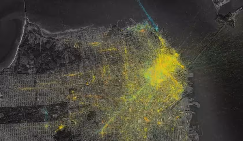
Foursquare designer Matt Healey has explained in an interview with Fast Company how he created the stunning Pulse visualizations of check-in data that the company has been showing off recently.
Healey said he used the Processing programming language to manipulate the data, which would sometimes be as large as a 5GB text file. The work wasn’t all for show, either, as it contributed to the creation of the “Places people go next” feature.
➤ How Foursquare Made Those Insane Data Visualizations [Fast Co.Labs]
Get the TNW newsletter
Get the most important tech news in your inbox each week.