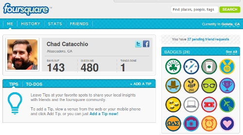
 Foursquare has rolled out sharper profile pages on its website (yes, there is a website). There doesn’t seem to be any new features associated with the new look, but for those of you that spend time on the website checking your stats or whatever, it certainly is a nice looking improvement.
Foursquare certainly needs to spend some of that $20 million that it raised on its website (here are our suggestions on how they should spend it), and while cosmetic changes are nice, we’re hoping that the site will turn into more of a hub of activity than it is now – Foursquare might just be hoping the same thing too. So hopefully, this is just the start of big changes ahead for the rapidly growing service.
Get the TNW newsletter
Get the most important tech news in your inbox each week.


