On average, I take over 2,000 photos every month between my phone and my camera. Until recently, I was using iPhoto and iCloud to store and share my pictures, but this month, I decided to give Flickr’s revamped service a go.
I was curious to see if it could hold its own against the ease and convenience of using iPhoto.
First impressions
My initial reaction was that the homepage loads noticeably faster than the old version. It’s sleek and elegant in its design. And the new Content Stream bears a strong resemblance to Instagram, which is pleasing to the eye. You could say that they encroached on Instagram’s layout, but I say, they used a model that has proven itself to be functional.
In use
Uploading my thousands of photos was really quick and straightforward with the Uploadr app on my Mac (it’s available on Windows too).
It removed all my duplicates in less than 30 seconds and uploaded the 5,200 images very quickly in the background.
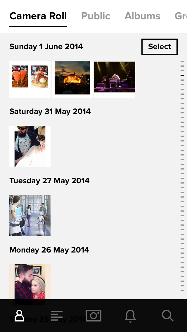
The mobile app lets you sync your camera roll to save images automatically using what Flickr calls the Auto-Uploadr. It’s essentially Photo Stream for Flickr, but it frees up space on your phone, rather than clogging it.
Switching to the Flickr app and deactivating automatic saving to my Photo Stream has made a big difference to the amount of free space on my almost full iPhone.
Everything uploaded is automatically set to private as well, so no need to worry about anyone sneaking a peek at your selfies.
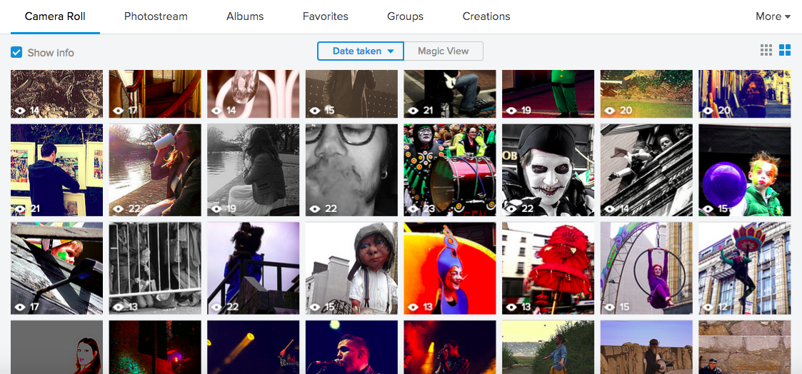
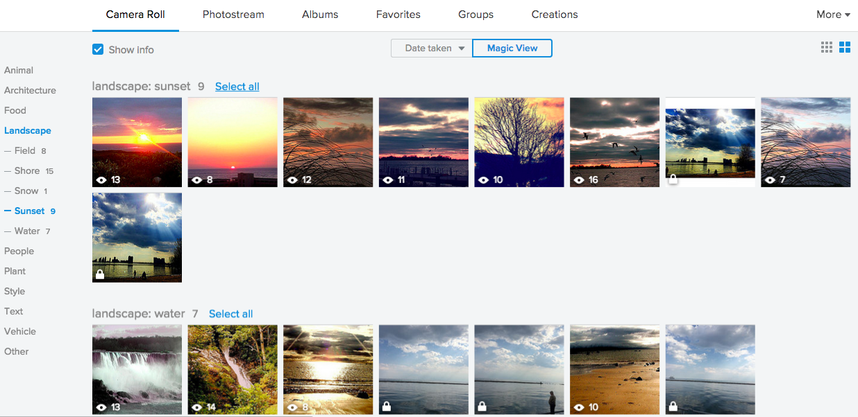
The Camera Roll and new Magic View feature are what really won me over.
Camera Roll is perfect for anyone who takes as many photos as I do, or even for someone who doesn’t. The important part is that it works better to organize the pictures than anything else I have used, and certainly better than the older version of Flickr.
Magic View works by using image recognition to divide pictures into surprisingly accurate categories. It made life a lot easier for those times I couldn’t remember when a photo was taken, but I knew what it was of.
For my photos, it put them into categories like ‘Landscape’ or ‘Food’ with sub-categories further defining what the picture is of, like ‘Sunset’ or ‘Beverage’.
The only disappointing thing about Magic View is that it’s currently only available on the desktop. Hopefully Flickr will add it to its mobile apps later in the year, though.
The mobile app has its own camera, but I have to admit, I still went to my native one most of the time out of habit.
The filters on offer are decent and the editing tools are diverse. There’s a particularly handy feature called Levels that lets you adjust the overall appearance of the pictures, as well as all the usual suspects – White Balance, Brightness, Contrast, Saturation, Exposure, Sharpness and Color Balance.
Using the app, you can shoot, edit and upload high-def videos of up to 30 seconds as well.
Wrap
After using the new Flickr for just under a month, I have become a convert of sorts. I still use my phone’s native camera instinctively to take photos but I have used the Flickr camera a couple of times.
And I still use Instagram or Camera+ to edit photos for the most-part, but Flickr has become the main place that I store my images.
1TB of free storage makes it particularly appealing – I’ve uploaded over 15,000 pictures so far.
All in all, the new Flickr is more user-friendly than its predecessor and the intuitive sorting features mean it’s invaluable when it comes to finding those long lost photos in a jiffy.
Read next: Do photo filters really heighten viewer engagement? Yahoo’s research says ‘yes’
Get the TNW newsletter
Get the most important tech news in your inbox each week.


