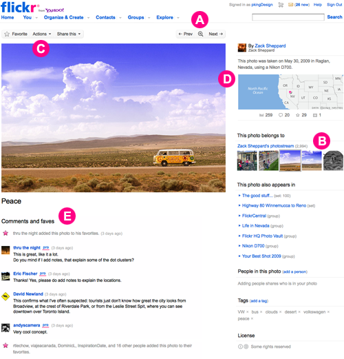
Flickr has rolled out a new design for the photo page, after testing and tweaking it since June 23 with 800,000 users as testers.
The most striking difference is that the default picture is 28% larger than before. Other features include:
- A new lightbox, that allows you to click on a photo or use the magnifying glass icon to browse through large photos on a dark background.
- Always there navigation buttons to navigate between photos.
- Navigate between the photostream, groups, and sets via the upgraded film strip on the photo sidebar.
- A new widget-like grouping of the “story” of the photo, with location, tags, author, etc all in one easy to find place.
- Licensing set by the author will be more visible in the new design.
- Favoriting is now more visible next to comments.
For more info on the new design, you can check out Flickr’s FAQ on the new design. So what do you think of the new design? Please let us know in the comments!
Get the TNW newsletter
Get the most important tech news in your inbox each week.
