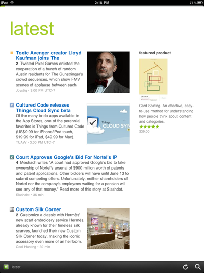
I read thousands of news articles a day and that’s on a slow news day. It’s important to prioritize the most important news items so that I don’t spend hours scrolling through useless information. Feedly thinks that it has the solution with an active content filter that presents your favorite feeds in a magazine-style format.
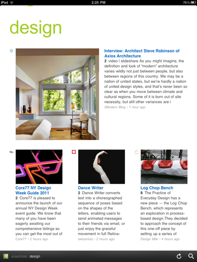
Feedly [Free, App Store] has a clean, simple design that emphasizes the content over a fancy interface. The text and images are presented in a simple list-style layout with each item popping up to fill the view at a tap. This view can be customized in a light or dark theme for night reading.

Today, Feedly introduces an app for the iPad that uses that same clean design to present you with the most important news on your tablet as well as iPhone and browser. The user experience is kept nearly identical between devices, with some concessions for the size of the iPhone screen.
All of the apps synchronize with either Feedly itself or Google Reader, ensuring that your feeds are always in sync across all of your devices.
The key feature of Feedly is the fact that it learns from both the community and your feed reading habits to generate a digest of the news items that it feels are important to you. These items are then presented in the Essentials section, giving you a customized magazine view of feed items that you can swipe through to get a snapshot of important news for the day.

As a standard feed reader I found Feedly to be refreshingly distraction free. Many readers these days are getting more concerned with emulating some sort of physical interface like a newspaper or notebook. I don’t care about that, give me my news in a simple, clean way that makes it easy to digest it quickly. Feedly does a great job of this.
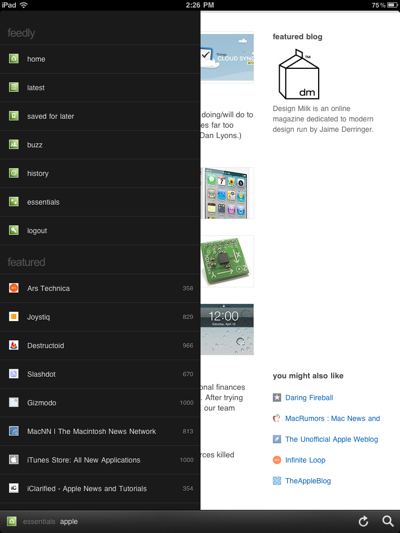
Feedly also has a nice array of gesture controls on the iPhone in addition to the swipe or scroll modes available for paging through news. Swiping down will mark a page as read, tapping anywhere on the menu bar will bring up a list of your sources and you can save an item for later reading.

Some of these gestures are duplicated in the iPad version but you also have a nice list of items at the bottom of the larger layout. These include a ‘like’ button, bookmark, email, Twitter and a reformatting button that strips the page down to nicely formatted text.
I’ve only been able to preview Feedly for a little less than 24 hours but so far I’m liking it’s interface. The no-distractions take on a feed reader is a refreshing change from the cluttered, unnecesarry mimicry of many reader apps on the iOS platforms.
I’m a huge newshound so I don’t know if I could bring myself to trust Feedly to give me everything I have to read automatically. If you’re a more casual reader though, you may find that the automatically generated digests that Feedly provides might just be enough for you to get all the news that you need.
For a look at how Feedly works, check out this video interview that Robert Scoble conducted with Feedly’s founder Edwin Khodabakchian.
Get the TNW newsletter
Get the most important tech news in your inbox each week.


