Today, the mobile team at Facebook announced some changes to all mobile versions of the site, which include better utilization of the real-estate on your mobile device’s screen:
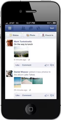
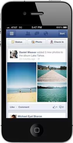
Starting today, we’re rolling out an improved design for posts in news feed on your mobile phone. Now photos are up to 3x larger, and all posts will fill your mobile screen from edge to edge. The new design will be available on iOS, Android and m.facebook.com. Check out some before/after screenshots below.
Here are some before and after shots:
I personally feel like the issue with Facebook mobile is that there are simply too many features to pack into a mobile experience. It really doesn’t matter how the company lays everything out, it’s still going to feel awkward. Clearly, the white space issue around Newsfeed items was easily correctable, so the company took care of it.
For those of you that primarily use Facebook on the go, you’ll notice the changes immediately. The company says that its currently rolling out the new design to iOS, Android, and its mobile version now, so stay on the lookout for it.
Update: As a TNW reader points out, it looks like Facebook took some cues from the latest Google+ iPhone app as far as edge-to-edge treatment of status updates and photos.
Get the TNW newsletter
Get the most important tech news in your inbox each week.


