Of all Facebook’s good design choices, the ‘like’ button remains an example of a bygone design era. That’s all changing though: Facebook has updated to Like button.
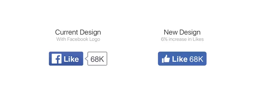
Instead of the familiar ‘f’ and a bubble telling you how many likes a post has, the new button integrates the familiar ‘thumbs up’ and like count into one icon, with the ‘f’ disappearing entirely.
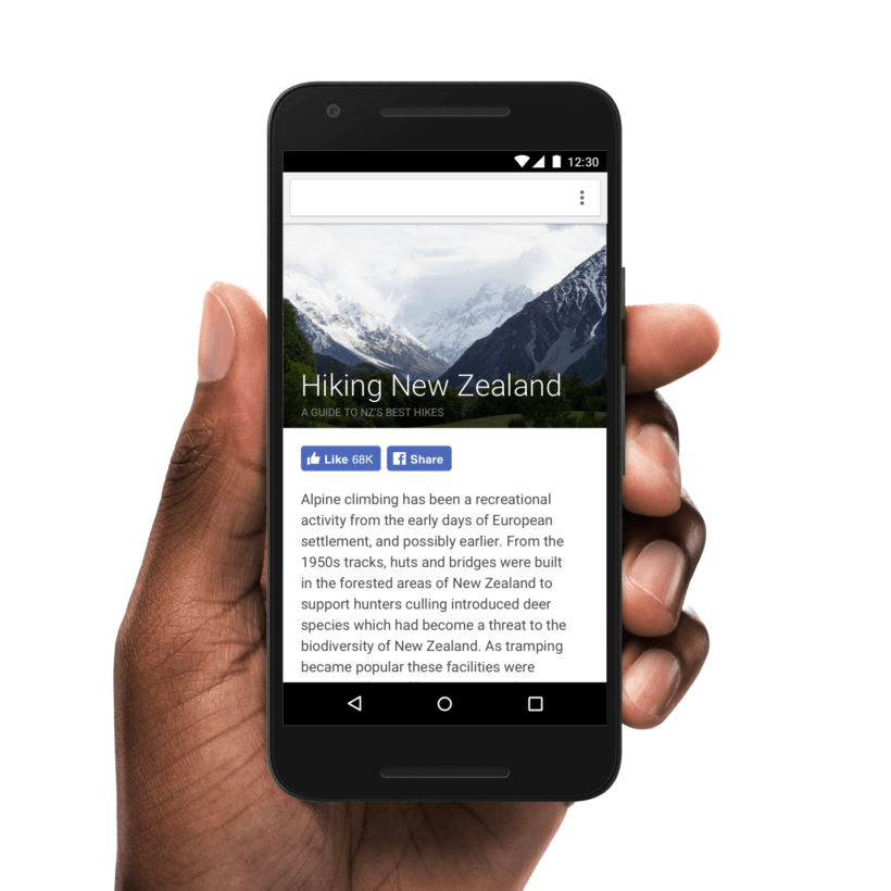
The core reason for the change was mobile; Facebook says its original design was great for desktop experiences (when mobile browsers and apps were in their infancy), but the new era of mobile-first caused it to rethink the Like button.
A byproduct of modernizing the Like button was more engagement. Facebook says it saw about six percent more likes in its side-by-side testing with the legacy button.

While the Like button is the more noteworthy change, the company is also redesigning its entire suite of buttons. The Share, Follow and Save buttons have also been revamped to adhere to the new design guideline. The Share and Follow buttons are keeping the ‘f,’ while the Save button has the familiar bookmark icon.
If you’re already using the buttons in your app or on your site, there’s nothing to worry about. Facebook says it “did exhaustive testing with different languages and in the context of people’s sites to ensure backwards compatibility and scalability.”

The new buttons are also coming to Instant Articles in the coming weeks, and will be found at the bottom of those pages. They’ll also count towards aggregate like, follow and share counts.
Expect to see the buttons update incrementally on websites and apps over the coming days and weeks.
Get the TNW newsletter
Get the most important tech news in your inbox each week.


