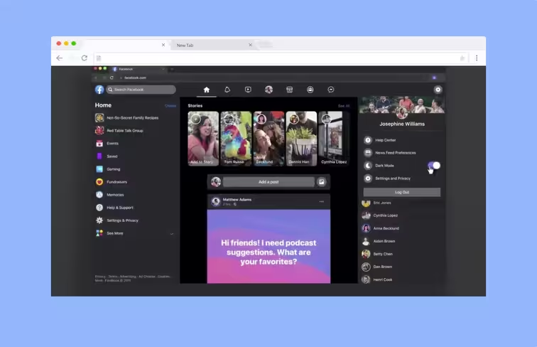
In May, Facebook said it was going to redesign the website and bring dark mode to its website and mobile apps. While it began testing dark mode for its Android app in August, it has now started rolling out a beta version of its website with that option to some users too.
Multiple people are being invited to test the new interface. The screenshots shared by testers are akin to design Facebook showed off at its developer conference F8 in May. The new version of the website kinda looks like Twitter:
Got the invite to try Facebook's new desktop design and yes it includes a dark mode 🙌@MattNavarra pic.twitter.com/buCJBdgQ5I
— Anas Tipu (@teepusahab) October 11, 2019
#Facebook #beta dark mode for desktop is almost awesome! pic.twitter.com/JGR5UYnHFd
— Mantas Rukuiža (@MantasRukuiza) October 14, 2019
This is just a test version, so the final release of dark mode and the new interface might not look the same. Thankfully, if you don’t like the new look, there’s a handy toggle that lets you switch to the good ol’ classic version of the website.
We’ll keep an eye on this, and update you as soon as the new interface and dark mode is available for a wider audience.
Get the TNW newsletter
Get the most important tech news in your inbox each week.


