Alexander Huls is a freelance writer who has been writing about pop culture for over five years. His work has appeared in the New York Times, the Atlantic, National Post, Film School Rejects, and more. This post was originally published on the Shutterstock blog and has been reprinted with permission.
You spent hours making your design perfect. The images have been meticulously Photoshopped. The calls-to-action have been revised and refined countless times. You know exactly where you want the user’s eye to land and precisely how you want it to move. And with the emergence of eye-tracking technology, it’s finally possible to know whether or not it actually works.
Using cutting-edge neurotechnology, eye-tracking studies record the movement of users’ eyes across Web pages. The resulting heat maps show “hot zones” of the design elements and page areas where attention lingered most.
“Technology has made it fairly easy to measure where people look,” says Kurtis Morrison, vice president of client services at EyeQuant. “EyeQuant has made it extremely easy to validate your design ideas in just a few seconds.” Morrison was kind enough to let us pick his brain about how eye tracking can lead to more effective web design.
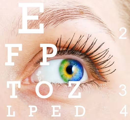
 Vladyslav Starozhylov | Eye with vision chart
Shutterstock: Which elements are most critical in effective Web design? Is it the F and E-Shaped patterns (layouts that take advantage of users’ natural tendency to read the left side of screens the most) that come up so often when eye tracking data is discussed?
Morrison: In general, you should emphasize the three Ws: the content that conveys what the page is about, why users should care, and where they should go next. I don’t think that necessarily means conforming to an F or E pattern. It is absolutely possible for content outside of the F or E pattern to be seen, as long as it has attention-grabbing properties. For example, if it’s high-contrast, centrally located, and uncluttered.
Are there any best practices in Web design that have been challenged or even disproven by eye-tracking data?
Absolutely. For example, the conventional wisdom that people always look at faces is a myth. We’ve run eye-tracking studies on thousands of different Websites, and we know there’s definitely a relationship between faces and attention, but the idea that people are always going to look at them is simply not true. Another one is people believe that if you want some text to stand out, you should just make it bigger. I’ve seen pages with huge text that was very relevant to the users, but was completely ignored.
What should designers know about selecting and using stock images?
If you want people to look at an image, the most important thing is that it’s high in contrast — both within the image itself, and compared to the rest of the content on the page. It’s not just color contrast that’s important, but also luminance contrast. You should place it above the fold, in a central location or toward the top left. Also make sure that it’s not too cluttered — it should have some room to breathe on the page.
How effective are image-heavy elements like rotating banners or slideshows?
Motion is proven to be a factor that initially attracts attention. That said, they’re also likely to be annoying, and they usually contain offers that are only relevant for a sub-segment of people coming to the page, so people won’t want to look at them for long. They generally have a negative effect on conversion rates for business Websites, so I don’t recommend using them.
Big hero areas (like Apple’s) are increasingly popular. Are these actually effective?
Hero shots can be extremely effective if the image is relevant. Otherwise it’s just a distraction. If you’re using stock photography, it’s important that you choose imagery that supports your message [and isn’t] taking too much attention away from other key content on the page.
Are long-form scrolling pages successful, or is keeping important elements above the fold still the best strategy?
Every day, users seem to be getting more comfortable with scrolling. I’ve certainly seen long-form Websites that are very successful. At the same time, I’ve also seen data that suggests the average user still spends most of their time viewing above-the-fold content. I think it’s better to be safe than sorry. You shouldn’t assume users will scroll. Rather, you should assume that you’ll have to earn it by making a good impression above the fold.
What can eye tracking teach us about designing buttons for links?
You have to remember that humans are creatures of contrast, so it’s important that there is a high amount of contrast between the button and the background color, and between the button text and the button itself.
Based on eye tracking data, is it ultimately better to design for where you wantthe user to look, or where you know the user will look?
As a designer, you have the power to influence where people will look. You’re not a slave to a particular layout or pattern. Positioning of elements on the page is only one factor that affects what people will see. That means you can make people look where you want them to look as long as you understand the building blocks of attention: contrast, positioning, size, and white space.
Get the TNW newsletter
Get the most important tech news in your inbox each week.


