This post originally appeared on the Mention blog.
A few months ago, I held a Yabbly AMA about how and why we use webinars at Mention. For the uninitiated, webinars are online seminars or master classes designed to educate around a clear and concise topic.
Generally around 30-40 minutes, these live events are a fantastic way to demo a product, show off a new feature, offer tips, hacks, or best practices, and perhaps most powerfully: to introduce yourself — your actual self — to customers.
I have to say, I was surprised by all the interest on Yabbly. The AMA had almost 9,000 views and generated a lot of great activity. Clearly this is a topic that a lot of people are interested in.
Part of that has to do with the unique barriers to entry that a webinar has. On the one hand, they seem conceptually easy. On the other, when you start thinking about what webinar platform to use (none two are alike), how to publicize the event, what content to share, etc., it quickly becomes clear that webinars are a lot like live theater: they take a crazy amount of planning and execution to pull off without a hitch.
We’ve actually shared a few webinar pointers before, but I thought it was time to organize all of our ideas in one place. Here’s everything you ever wanted to know (and then some) about running a successful webinar.
1. Use GoToWebinar
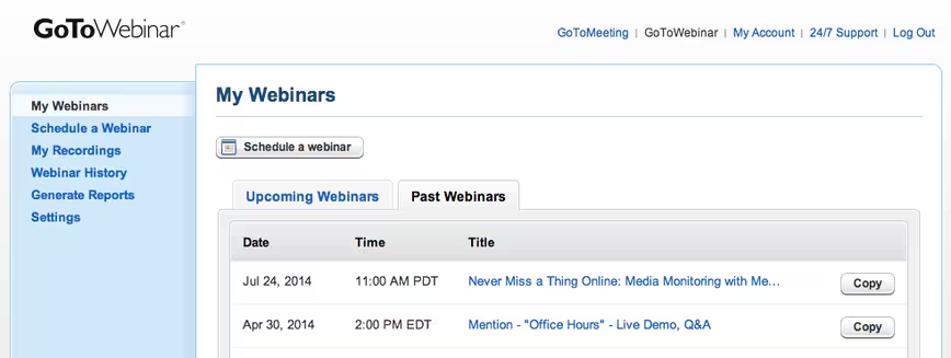
If you’ve been struggling to decide which platform to use, don’t hesitate any longer. Go with GoToWebinar. Not only do you get a 30-day free trial, but unlike Adobe Connect (which only allows for a maximum of 25 attendees during your trial), GoToWebinar has a way higher limit, letting you actually, ya know, run your first webinar while you’re trying the product out.
After all, the best way to get the full picture of a product is to see how it works under the actual conditions of how you’re trying to use it.
At first, while planning our initial webinar, we considered Adobe Connect mainly for one reason: it’s a Web-based program and lets you simply share a URL with your attendees for them to join. In essence, no software to download.
But in the end, over the course of 20+ webinars, we’ve yet to see a significant amount of friction added to the process to have attendees download the GoToWebinar platform.
Unfailingly, about 30 percent of those who sign up attend, and this number has stayed remarkably consistent.
2. Consider time zones
Now that you don’t have to worry about a platform, the one thing you should be thinking about at this point is timing. When to best schedule your webinar. This is going to depend on your audience and where they are in relation to you.
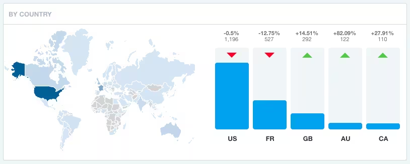
For us here at Mention, while our HQ is located in Paris, we’re keenly aware (thanks to the Geolocation feature in the Statistics & Exports section) that our audience is primarily in the US.
We therefore hold all of our webinars at 8pm Paris time. That’s 11am PDT and 2pm EST — perfect because it’s right before lunch in San Francisco and right after lunch in New York (we’re a tech company after all).
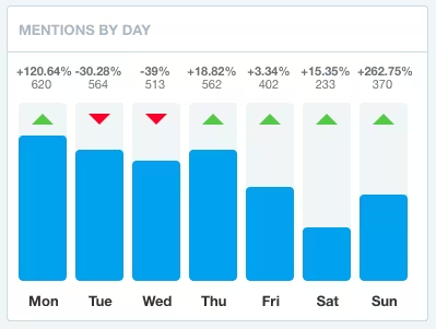
We also know that Thursdays and Mondays are usually the best days for us in terms of activity in our community. We’ve done webinars on both, but I prefer Thursdays as it gives you more time to promote the event during the week to boost attendance.
It’s important to create a landing page for the webinar that clearly states the time. If you’re working across multiple timezones like us, it’s pretty much unavoidable that you’ll get multiple emails throughout the day saying, “Hey, isn’t the webinar supposed to start now?”
These are people thinking it’s supposed to start at 11am their time. So do your best to clearly state the correct time in all communications.
You can always send the recording to people who can’t make the event live. Here’s the note I usually send to people who can’t make it:
A webinar is both a live event and a lasting record — a great tool for onboarding, demoing a feature, or clips for product support.
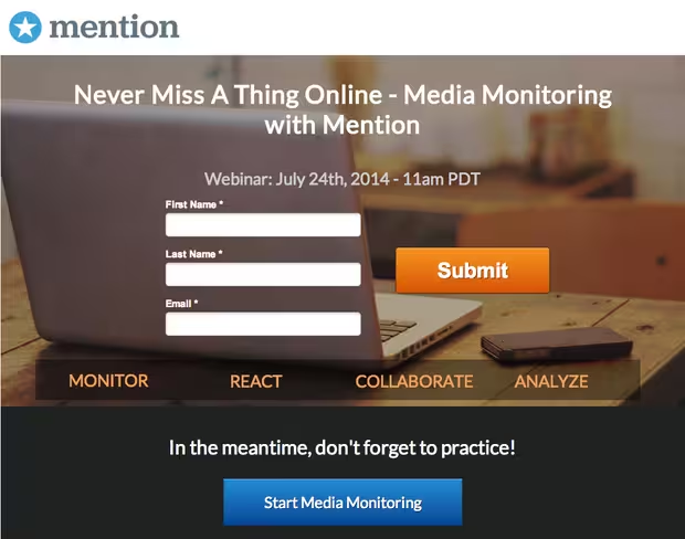
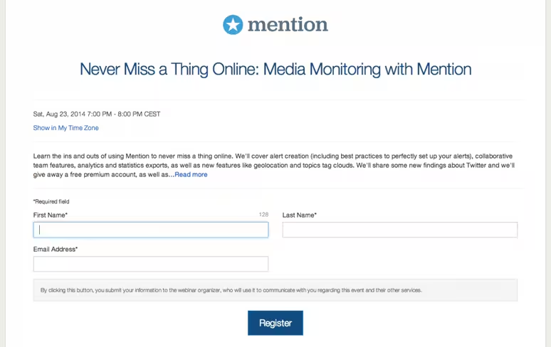
3. Create a landing page on Unbounce
So you have your time all set, everything’s ready to go on GoToWebinar. Now you need an effective landing page for people to sign up on.
We use Unbounce.
It might not win any design awards, but it gets the job done. It doesn’t distract the visitor and focuses on what’s important: making it quick and easy for anyone to sign up.
Compare it to the standard page that GoToWebinar provides, and although they’ve definitely improved their design in the year that we’ve been using it, it’s still clear to see how someone could get lost and not complete the form.
Landing pages shouldn’t be where you describe the webinar. (We’ll get to this later.) The signup page should be for only one thing: signing up.
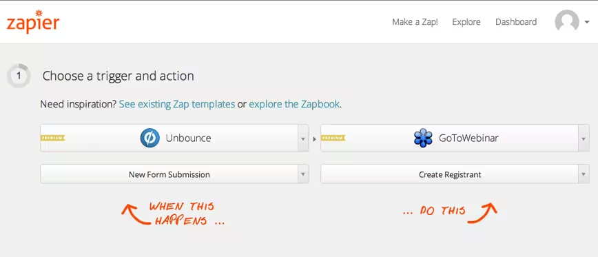
4. Link the landing page directly to GoToWebinar via Zapier
Unbounce pages can be automatically linked directly to GoToWebinar via Zapier, creating a “New Registrant” upon any “New Form Submission.” So the process for someone signing up looks like this:
Link → Landing page → Email confirmation from GoToWebinar
While all the nitty gritty goes on in the background:
Link → Optimized (or even A/B tested) Unbounce page → Zapier connection → GoToWebinar attendee registration → Email confirmation from GoToWebinar
Using this set up, we were able to achieve a 53 percent conversion rate (which later grew to 63 percent upon A/B testing), resulting in over 800 signups for our first webinar.
With 800 signups, you can expect a webinar with about 220 people joining. That’s a huge opportunity to show off your product. Not to mention that all 800 registrants will receive the webinar recording at the end.
But how do you get people to your fancy new Unbounce page?
5. Spread the word
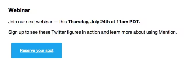
Email is still (in my opinion, but I’m not the only one) by far the most effective way to get the word out about something, and that’s especially true for webinars. For maximum effect, send out an email with a clear focus and a direct reason for joining.
In this example, we recently shared some surprising Twitter figures in our monthly newsletter — a perfect opportunity to propose the upcoming webinar as a means of seeing the figures in action, to actually offer the direct value of breaking down the numbers.
Pro tip: Always emphasize the timing of the webinar as specifically as possible: “Thursday, July 24th at 11am PDT.” Putting it this way will actually trigger most mail apps to underline it so that the person can directly add it to their calendar, at least on iOS.
We also use Intercom to reach out directly within the Mention app to specific groups of customers who may be interested in learning more about using Mention — people in the free trial, or who’ve just activated one of our pro features, or perhaps linked a social account — all things we make sure to cover really in depth during the webinar.
Make your webinar URL easy to remember and share by creating a specific short link on Bitly (we use bit.ly/mention_webinar). This is great for people joining at the last minute and for sharing on social networks for an extra boost.
This takes us to our next tip for producing a beautiful webinar: have slides ready to give your talk structure and to emphasize things like links to visit, social accounts to follow, and features to check out.
6. Create clear, directional slides
Signpost everything — remember that the better organized your presentation is, the better people will be able to follow along and replicate the steps you’re showing off.
That’s why we always put together really nice Keynote slides.This lends your webinar the professionalism it deserves, and helps you keep track of where you are (seriously, talking for 30 minutes straight can be hard! It’s good to have something to remind you where you are).
Even if it’s just marking off that you’re about to go into a demo, well-made slides give the viewer a quick and clear idea of what’s going on.
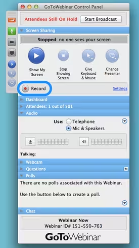
7. Don’t forget to hit record!
This one may seem really obvious, but you’d be surprised at how much gets caught up in the excitement of talking to hundreds of people live and in real-time. It definitely happens — one time, we ran an entire webinar without realizing we hadn’t hit record!
It’s pretty frustrating having to explain to a bunch of people who are waiting (and writing to you) for the recording that you simply forgot to hit the record button. So make sure you have a Post-It note or something handy, saying: PRESS RECORD.
8. Have an official hashtag
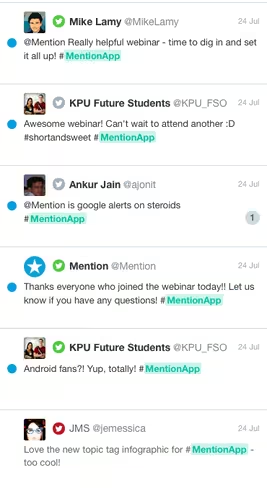
You may have noticed in the slides above that each one featured the hashtag #MentionApp on the bottom right. It’s important to recognize that webinars are also powerful opportunities to engage with your community on Twitter.
We always make sure to have a least three people running our webinars.One or two people (trading off) to present, someone to answer questions on the native GoToWebinar chat box, and someone to man the Twitter chat activity through Mention.
Having an official hashtag makes it easier to track and later organize the conversation. You could use Storify, for instance, to do a post-webinar roundup of all the best questions and answers shared during the event. Or you can hold a contest for whoever tweets the most. Which brings us to…
9. Offer a tangible benefit to encourage attendance and participation
Make sure to offer real value when it comes to encouraging participation.Someone who takes the time to attend and take part in a webinar is more than likely someone who will stick around and use your service for the long term (depending, that is, on if they like what they see).
We always like to give out a 30 percent discount for anyone who attends and sticks around for the entire webinar. And we also give out a free premium plan to the person who has shared the most on Twitter using the #MentionApp hashtag.
A 30 percent discount is nothing to scoff at, and it shows that we’re serious about using webinars to reach a large audience and give back to our community.
Attending a webinar is actually a fairly large commitment from your audience — and that commitment deserves to be rewarded.
10. Don’t sweat the small stuff
If you give back to your community, they’ll give back to you. Webinars are actually a very forgiving medium when it comes to “the small stuff.”
Little things like the awkwardness of a delay in switching screens, or a messy computer background full of files, or way too many tabs open on your browser — this stuff doesn’t really matter, and in fact, it goes a long way towards creating more direct interaction with your audience.
Take, for example, the time a bunch of people tweeted us to figure out what exactly “gif-1.gif” was after they’d seen it on my desktop.
Diversions like this can add a lot of fun to an otherwise scripted event, especially when you have to explain that your company has a pretty ridiculous GIF obsession and that “gif-1.gif” is one of your colleagues goofing around.
So don’t sweat the small stuff. Instead, embrace the fact that part of the appeal of webinars is their very nature as a live event.
Have fun and be real — your audience will take care of the rest.
Read next: The missing manual for connecting and collaborating on video Google Hangouts
Get the TNW newsletter
Get the most important tech news in your inbox each week.

