Evernote today announced an update to the Web version of its service. The revamp includes a completely new design for shared notes as well as “lots of improvements” to the overall look of the browser interface.
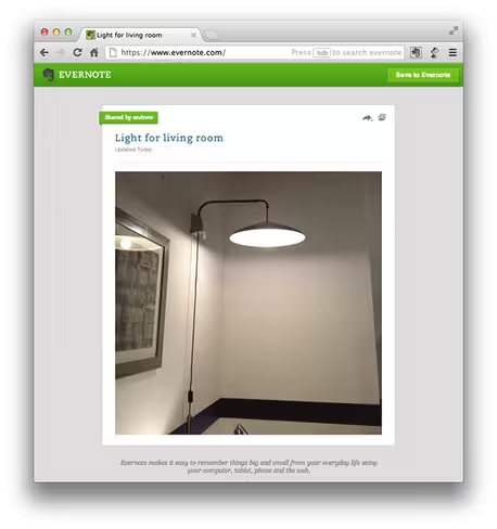
Evernote lets you share individual notes with anyone you please, and now you can do so via a much more beautiful interface, thanks to makeover that puts the note content front and center. Here’s a glimpse of what it looks like:
To see the new look that is pictured above, click on someone’s note and hit the Share icon to re-share it. If the shared note has several images in it, you can click on the Slideshow icon to launch the Slideshow View. Additionally, if you’re logged into Evernote Web, you can copy the shared note into your account.
Single notes aside, Evernote Web now has a cleaner design thanks to some significant visual improvements. Evernote redesigned all of its notebook icons, added a label to the top of the note list so you can clearly see what notebook you’re in, and tweaked the green bar along the top of the app with larger, clearer text.
If you have a small screen, and you’re thinking all this might take up too much space, don’t worry. Evernote has made it easier to hide the left panel by adding a new hide and show arrow at the bottom of the note list.
Evernote seems to be on a redesigning streak. Less than a month ago, the company pushed out updates to Evernote Web as well as its mobile apps. Today the company is focusing on just the Web version, but I’m sure another update for the apps is also on its way. We’ll keep you posted with Evernote news as always.
See also: Evernote updates Web, Mac, and Windows apps with new sharing interface, permissions, and re-sharing
Image credit: Alan Witikoski
Get the TNW newsletter
Get the most important tech news in your inbox each week.


