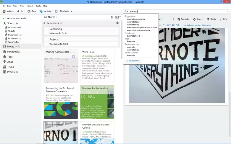
Evernote is rolling out a new version of its note-taking app for Windows users today, sporting a notable redesign, a quick access shortcuts panel, reminders and related notes. Launched in beta last month, Evernote 5 for Windows now has a flat design and general UI that closely resembles its Mac counterpart. It looks slick and professional, putting the emphasis back on users’ notes.
Shortcuts have been added in the top left-hand corner of the screen, giving users near-instant access to some of their most frequently used notes and notebooks. The remaining menu items have also been refined here, offering a clear entry point for finding specific content.
Related notes will also appear under any open document for a more seamless workflow. Search queries now include suggestions based on related notes, and reminders have finally been introduced for Windows users.
“Reminders are three features wrapped into one,” the company said. “By clicking on the alarm clock, you’ll pin the selected note into the Reminder list at the top of the Note List, create a to-do item for that note and add alarms to make sure your notes are done on time.”
It’s a pretty hefty upgrade and one that Evernote says has been a year in the making. The Evernote for Windows app will auto-update within the next week, although users can check it out right now with a fresh install.
Featured image credit: Ian Walton/Getty Images
Get the TNW newsletter
Get the most important tech news in your inbox each week.


