A ridiculous amount of work goes into successful app release. From planning and sketching to design and development, simply getting the talent together in one room can be a difficult task. If you’ve built a great app and are about to tell the whole world, you owe it to yourself to take some time and get inspired by these great app releases by other creators.
The following videos were selected because of overall creativity, quality and strategy. Some of them are niche apps, but no matter what, these 8 promo videos do a wonderful job grabbing attention. And since no launch is complete without a great teaser video, let’s leave it to the pros to show us how it’s done:
Tell a story
Duet is a charming messaging app by Crush + Lovely that we covered back in December. The beautifully filmed video tells the story of distance and how intimate the app can be, while drawing an emotional connection with couples in long-distance relationships.
Cute sells
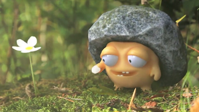
This teaser video for Pebble Universe is just plain cute. It features great CG art and compositing, so if your app is heavy on the animation side, don’t be afraid to venture outside your actual game to sell your adorable character. Obviously, this doesn’t apply to apps without the cute element built-in. (via NOTCOT)
YetYet is an appcessory that turns your iPad into a Furby-like creature for kids. Overall, it’s a weird, charming and cuddly toy that’s likely a much better alternative for kids than a bare iPad. The video the team created expresses all of those traits at once.
Go hands on
Orphion‘s promo video is a simple hands-on clip that shows exactly how the app works. The clean voice over and line-in audio straight from the iPad make this great, plus the creator does a good job telling us what it’s all about. It isn’t perfect though: it may be a little long and is perhaps too technical for the non-musically inclined, but it still hooked me in as a successful demo and an all around cool app.
Experiment
Whale Trail took an interesting approach, releasing a behind-the-scenes documentary and an actual music video before the game teaser. The inside look provides an intimate window into the teams development process, and makes the audience feel like they’re a part of the process.
Screen capture
Limbo is a haunting experimental game for a number of devices, and the promo video is simply a short compilation of exciting gameplay. If you believe your app speaks for itself, then this is the way to go — especially because it’s super affordable, too!
Focus on the user
Everything Butt Art‘s teaser takes us out of the app and focuses on the user. In this case, the best way to pitch the app to parents was to show how much fun kids will have playing with it. (we covered Everything Butt Art’s launch earlier today)
Perfect your pitch
Sparrow is an absolutely amazing mail app for the Mac, and its video is short, sweet and to the point. It got my attention fast, showed off for a bit and now I’m hooked.
No matter what you do, make sure you show you’re passionate about your creation. Excitement is contagious, and if you can convey that energy in your promo without looking crazy, you may have a winner.
Obviously, your app has to be decent for it to truly take off, but it’s important to remember that your promotional video is the first (and often the only) thing potential customers will see before they decide whether or not to download your final result. Keep that in mind and have some fun with it!
Get the TNW newsletter
Get the most important tech news in your inbox each week.


