Alexander Huls is a freelance writer whose work has appeared in The New York Times, The Atlantic, Esquire and other publications. This post was originally published on the Shutterstock blog and has been reprinted with permission.
Many infographics are visualizations of things like survey results, social media statistics and cold, hard data of all shapes and sizes. And that’s all important, of course — but one company is making infographics of a different kind.
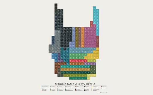
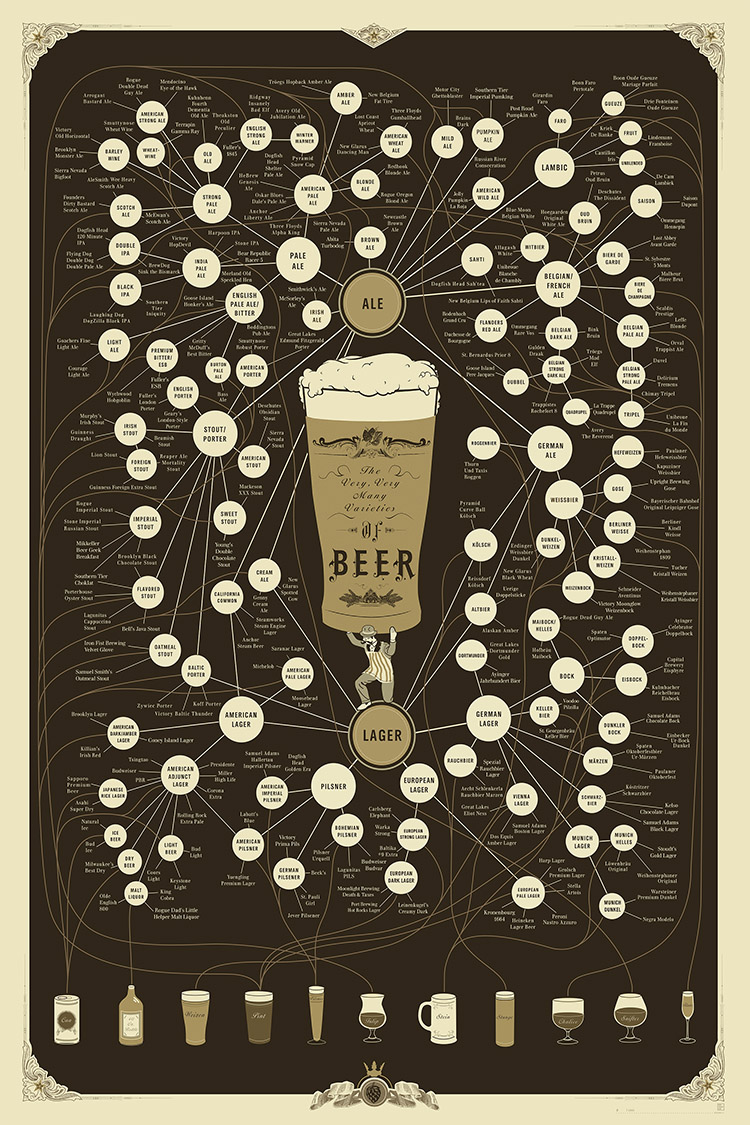
Since 2010, Pop Chart Lab has distinguished itself by producing gorgeously designed infographic posters and prints based on another type of data: the everyday things people love. Video games, comic books, TV shows, coffee and beer all fall in the Pop Chart Lab domain.
For a little more insight into how these projects come to life, we spoke with Pop Chart Lab co-founder and creative director Ben Gibson about what goes into picking the passion they’ll tackle next, how they proceed to research and design, and what tips they have for creating beautiful infographics of your own.
Shutterstock: It says on your Website that the company’s goal is to “render all human experiences in chart form.” Why is that important to you?
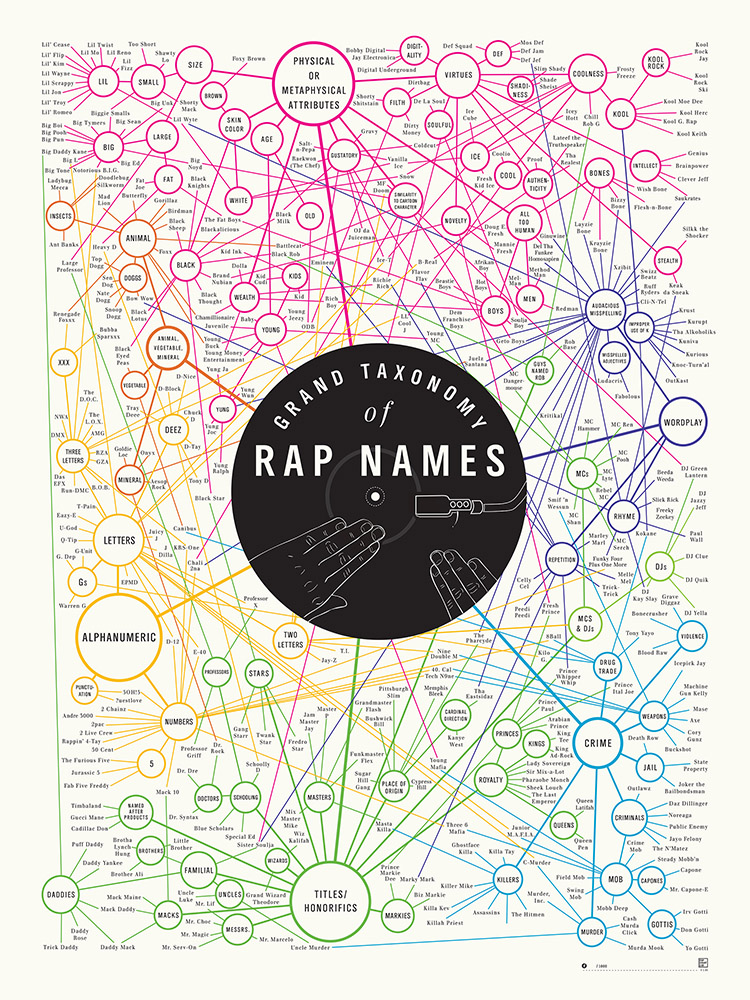
Ben Gibson: Pop Chart Lab started because we saw a void to fill. We wondered why no one was charting anything fun, be it types of beer, rap names, or the journey of the Fresh Prince. Once we started down that road, it was hard to stop. There are always going to be things to be charted, data to be collected and arranged in a pleasing, informative way. Really, the world is data, and life is about extrapolating that data and arranging it in a way we can understand. If we can make art while doing so, all the better.
Infographics often tend to convey statistical data about things like surveys or Internet usage. Why is PCL’s approach to create infographics reflecting everyday interests and hobbies?
We ask ourselves three things: Is this something people are interested in? Is this something people would want to put on their wall? Does it have a lot of data? The crossover isn’t necessarily as high as you might think. Statistics and surveys are fleeting, but interests and hobbies are generally lifelong pursuits — and we want to make products that people will want to keep around for a long time. After all, putting a poster on your wall is generally a years-long commitment.
How do you determine which subjects to take on for your projects?
Many of the factors are simply business-related: For example, we need to have a big “anchor” release with mass appeal (e.g., beer, rap) every so often to support our more niche releases, such as Sentence Diagrams or Shoes of Sex & the City. Often, we’ll try to time releases around real-life events — a baseball chart around the World Series, or our History of Apple Chart near the announcement for the next iPhone. Beyond that, it’s a matter of deciding whether a given subject has already been charted (by us or others) too much or not enough, and whether we have a worthwhile angle on it.
Do you start with the research or do you start with the design?
For prints, sometimes we’ll have a rough idea in mind for how a finished product will ultimately look. But generally, the research must always precede design, because we don’t want to commit all that time and effort to a design without knowing if there’s enough data to support it, or whether that data will work within the framework of that design. Our philosophy is more about arranging intricate reams of data in a pleasing way, not creating an intricate design and seeing if we can then fill it with data.
How do you go about deciding the best way to visually relay information?
Because our charts are always going to be intricate, legibility, ease of comprehension, and making sure there’s enough room to fit all that information in are always priorities. We always look for the most elegant way to portray complex stories and data in a format that’s visually rich and detailed — but if it’s not accessible or readable, what’s the point?
How do you compile your research and data?
99 percent of our research is done in-house. We have a crack team of data-obsessives that, frankly, would spend much of their free time looking up an insane amount of geeky data, so it’s just a matter of making sure they remember to write it down. In this day and age, you can thoroughly research nearly anything on the Internet given enough time and an eye for verifying sources.
We also sometimes do our research via, believe it or not, books— such as a 3,000-page encyclopedia of wine grapes or a thick catalog of classic American cars. All told, research can take anywhere from a few days (our American Flags chart), to nearly two years (our Wine Families chart).
Many of your infographics are aimed at subjects with big followings — comics, video games, beers — that can be quick to point out inaccuracies. Does that make you more cautious?
Our company wouldn’t exist if it weren’t for people who are hardcore about their hobbies, so we’re of course aware of them and grateful for their passionate interest. Part of the reason we’re aware of them is because we are them — you can’t really work at this company without being kind of a hardcore, particular obsessive yourself.
At the same time, we are, for better or for worse, human — for now! — so we’re aware that the occasional oversight is always a possibility. But that’s why our products are always on pre-release for a few days before actual printing begins. Fans can weigh in with feedback, point out omissions or suggest additions, and if we decide it’s a worthwhile change, we’ll make it.
Have you ever had instances where someone objected to your data?
The Internet being the Internet (or more specifically, comments sections being comments sections) we do get, shall we say, “passionate” feedback exactly as often as you might think. But as we said, this is all part of the feedback process, and part of the cost of doing business online. And we do vet every suggestion we get just to make sure.
I’m going to tape a banner above my desk that reads: “Just because someone’s a jerk doesn’t mean they’re incorrect!” Which is not to say that we don’t have tons of enthusiastic, friendly fans. Ninety-nine percent of our customer responses actually are positive.
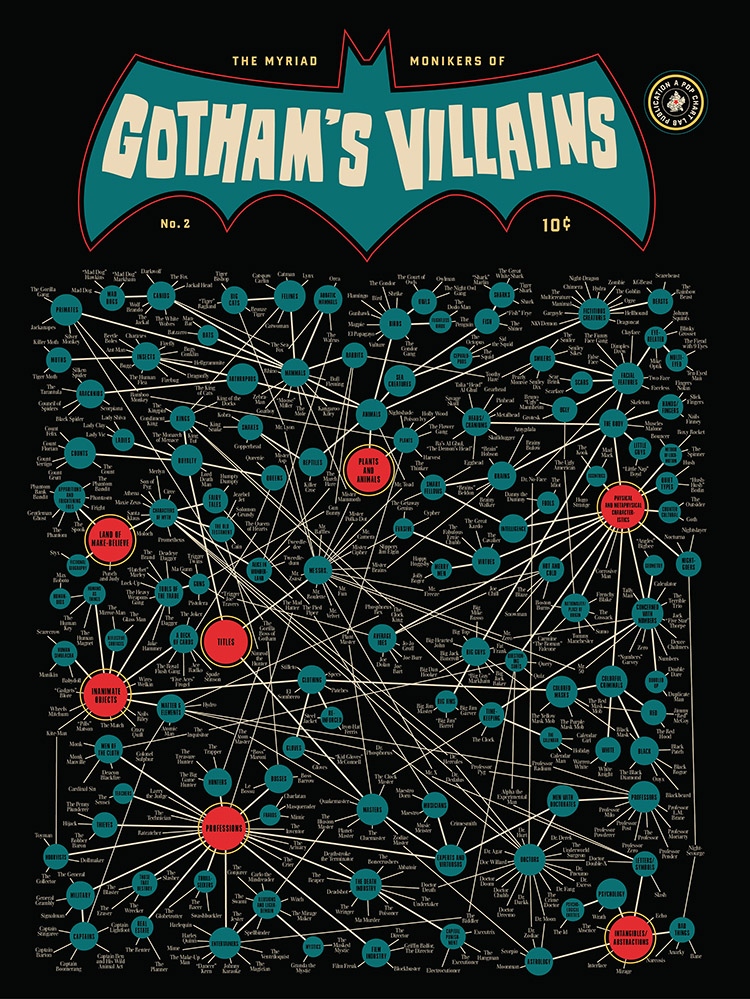
A lot of your posters — for example “Gotham’s Villains” — are just packed with information. How does that much data still remain legible and aesthetically pleasing?
Mostly just practical considerations. We try not to make the type too tiny, and there are limits to how much data the boundaries of a design can contain, not to mention how much detail the human eye can take in without freaking out. So, part of the design process is editing down the research — curating and culling the data (and text) to boil it down to the essentials, while still allowing us to tell a content-rich story.
How much do you think about making sure the design matches the tone of the subject?
Generally, we actually don’t think too much about this — because if it doesn’t spring to mind fairly quickly, it probably doesn’t match the sensibility of the subject all that readily. Sometimes these overarching design themes only come together fairly late in the process, as a happy accident. Our chart of fictional cats, for instance, only concretely morphed into a giant cat’s head pretty close to deadline, after a designer happened to notice it was sort of already looking like one anyway.

What programs do you prefer to use to put your infographics together?
We often plan out and play with general layouts of charts in a very bare-bones charting program called OmniGraffle, just to get a sense of how the data will be arranged and sort of form the initial skeleton of the chart. When it’s time for the real design work, however, we pretty much only use Illustrator.
Given the intricacy of our charts, we need to keep every single detail of our designs clean and editable at will, and Illustrator is by far the most powerful program in terms of providing the combination of design tools and data-architecting capabilities we need.
What would be your top three tips for compiling research for an infographic?
1. Set parameters/limits on your research as early as possible. Rarely are you going to be able to include everything, so decide on your angle early on to save time.
2. Check and double-check your sources. Wikipedia actually is a great tool for general research, but no one should need to be told that it shouldn’t be trusted sight unseen. Find corroborating data whenever possible.
3. Know when to call it quits. Sometimes, the idea you had just isn’t working for whatever reason, as much as you don’t want to admit it. Maybe there’s not as much data as you thought; maybe you can’t find enough sources; maybe it’s something that’s not going to make a great infographic.
But that’s okay, because there are always other things to chart. Move on to something else — however, don’t go nuts on the delete button or anything. File that data away for a day when inspiration or an idea for a new angle might hit you.

What tips would you offer for rendering all that data into a pleasing visual form?
Decide on a cohesive story and figure out exactly what you want to say. It’s very tempting for the concept of data visualizations to drift into areas that don’t pertain to the piece’s concept. Give the piece a visual style and architecture that furthers and enhances the concept, serving form and function as equally as possible — don’t fall in love with one at the great expense of the other.
And push it through as many rounds of editing and redesigning as you can stand. It’s tough to do this with data visualization, as the complexity obviously makes it extremely time-consuming to retool. But, ultimately, the piece will end up better for it.
Get the TNW newsletter
Get the most important tech news in your inbox each week.