Design Flashback is a new series that takes a break from web and mobile projects to dig up some amazing retro/vintage inspiration. Looking beyond the web brings entirely new ideas to the table, and besides, graphic design repeats itself; just like fashion.
Outside inspiration is particularly important if you’re self-taught, since it’s more than likely that you zeroed in on the Internet (as you rightly should), while completely ignoring the greats in every other industry.
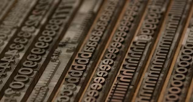
Typography exploded during the 1950’s, leading to some of today’s most notable and common typefaces. And as with most exemplary type designs, many fonts from this decade aged particularly well and continue to have an massive impact on design today. Take a sec to be inspired — here’s a list of 10 Iconic typefaces born in the 1950’s:
Helvetica
 So much has been said about Helvetica that there’s not much left to say. It’s a classic, incredibly well designed typeface that was designed in 1957 in conjunction with Eduard Hoffmann for the Haas Type Foundry.
Egyptienne

The 💜 of EU tech
The latest rumblings from the EU tech scene, a story from our wise ol' founder Boris, and some questionable AI art. It's free, every week, in your inbox. Sign up now!
 Egyptienne was designed in 1956 by Adrian Frutiger for the Deberny & Peignot Foundry and was the first new text face created for the process of photocomposition.
Meridien
 Undertaken in 1957 for Deberny & Peignot, Adrian Frutiger’s Meridien develops the Latin form into a classical text face of brilliant texture.
Univers
 Univers is a realist sans-serif typeface designed by Adrian Frutiger in 1954.
Palatino
 Palatino is a large font family that began as an old style serif typeface designed by Hermann Zapf in 1948 (okay, 2 years early) by the Linotype foundry.
Optima
 Optima is a humanist, sans-serif typeface designed by Hermann Zapf between 1952 and 1955 for the D. Stempel AG foundry, Frankfurt, Germany.
Futura (Light, Light Oblique, Extra Bold, Extra Bold Italic)
 Futura is a geometric sans-serif typeface designed in 1927 by Paul Renner. As you can see, it wasn’t designed in the 50’s, but grew substantially at this time with the addition of Light, Light Oblique, Extra Bold, Extra Bold italic.
Courier
 Courier is a monospaced slab serif typeface designed to resemble the output from a strike-on typewriter.
Microgramma
 Microgramma is a sans serif font designed by Aldo Novarese and Alessandro Butti for the Nebiolo Type Foundry in 1952.
Sistina
 Sistina Regular was designed by Hermann Zapf in 1950.
Remember, great design transcends the medium. It doesn’t matter if it’s industrial, packaging, print, automotive, Web or anything else. Get inspired every day by people who don’t create anything the way you would. Get inspired by people who aren’t anything like you — then go back to your screen and make something beautiful.
Get the TNW newsletter
Get the most important tech news in your inbox each week.