Design Flashback is a new series that takes a break from web and mobile projects to dig up some amazing retro/vintage inspiration. Looking beyond the web brings entirely new ideas to the table, and besides, graphic design repeats itself; just like fashion.
Outside inspiration is particularly important if you’re self-taught, since it’s more than likely that you zeroed in on the Internet (as you rightly should), while completely ignoring the greats in every other industry.
Posters (the holy grail of design) are particularly great for inspiration, and the emergence of Parallax scrolling websites is like an infinite digital poster design. Take a sec to be inspired — then get back you coding monkeys! Here’s a list of 13 Delicious Posters from the 1970s:
Montreal 1976 Olympics

The wonderfully minimalist Rainbow Beaver (aka “Amik” or the beaver mascot) was supposedly hated at the time. Sure it’s weird and even irrelevant, but I love it.
Olivetti Advertisements
These advertisements by Olivetti, an Italian typewriter manufacturer, are absolutely beautiful.
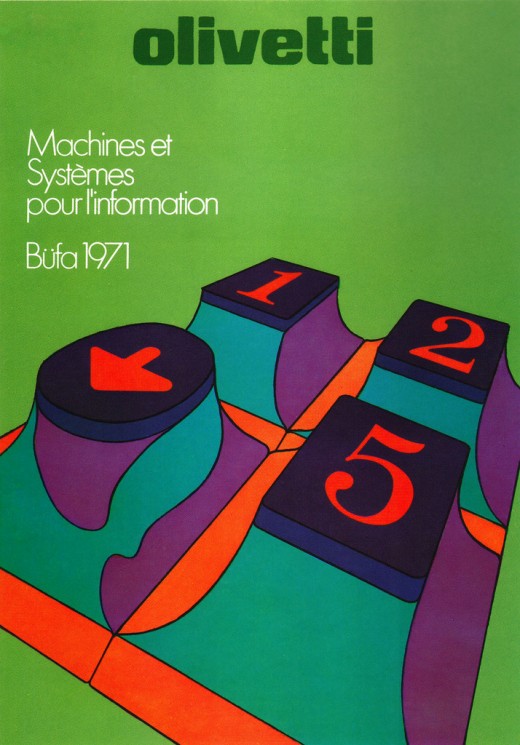
Poster advertising Olivetti’s participation in office equipment exhibit (Switzerland)
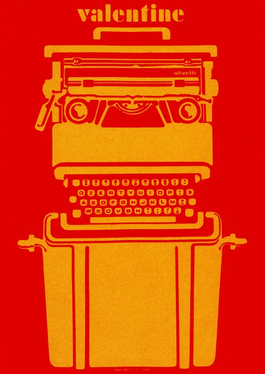
Silkscreen poster for a portable typewriter.
Learn more about these posters here, and view the entire flicker set here.
Introducing Apple II
The ad, introduced in September, 1977, was unusually sleek for a 70s Apple ad.
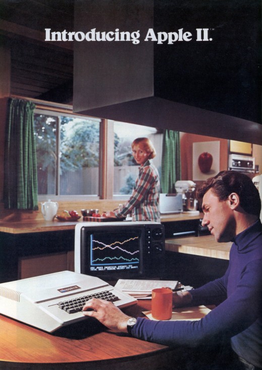
According to Modern Mechanix, this ad was printed when “you could still buy the Apple II as a kit with just the motherboard. Also the floppy drive wasn’t released until the year after this ad.” It’s strangely futuristic and also quite a bit sexist.
BELL GUITAR
The cover for the Bell Guitar Catalogue from 1973. The color is what really stands out to me.
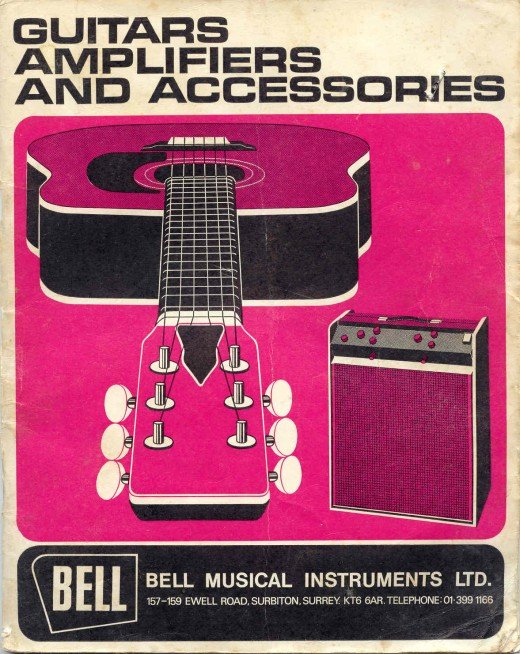
View the entire catalogue here.
Polaroid Land Camera
It’s hard to not be a fan of Polaroid’s Land Camera series. Though they varied greatly model by model, they were always an impressive feat of engineering.
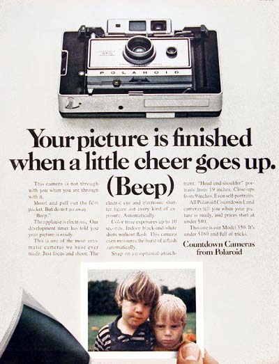
This ad particularly reminds me of Apple’s manifesto from its reemergence in the late 90s.
Dylan
Milton Glaser is an iconic American designer that continues to create amazing work to this very day.
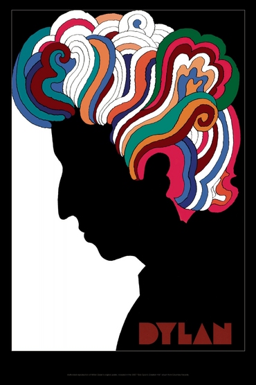
This poster is an authorized reproduction of the well-known poster included in the Bob Dylan’s Greatest Hits album in 1967 (I know, not quite the 70s, but I couldn’t resist!).
Recta Film
This 1969 magazine ad for Recta Film is almost carelessly minimalist — in a good way.
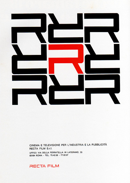
For the bottom of the poster, it’s like the designer said “this is all we have to say, so lets just say it and move on.”
Minute Man
1975 Poster for the U.S. Department of the Interior
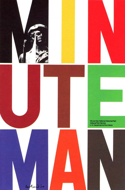
See more of Paul Rand’s poster work here.
Chanel No 5
1970 ad for cologne and perfume
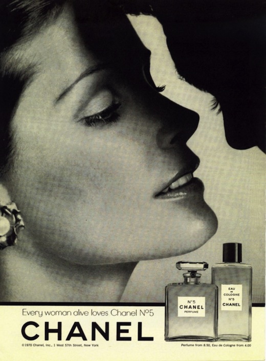
“Every woman alive loves Channel No 5”
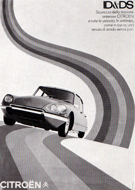
Citröen Italia: Sicurezza della trazione
1969 Poster made in Italy by Delpire Pubblicità
Saul Bass
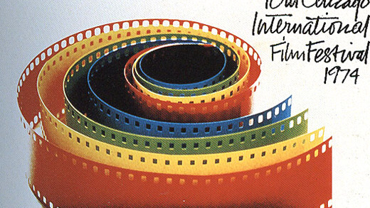
Saul Bass was an iconic designer known for his movie titles, poster and identity designs.
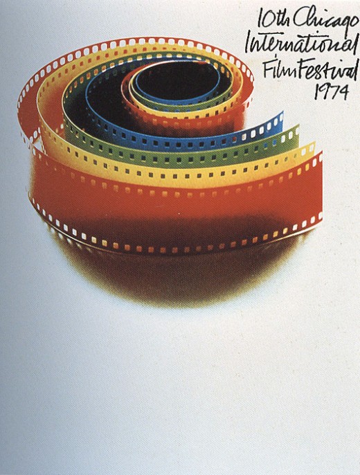
Design for the 10th Chicago International Film Festival in 1974.
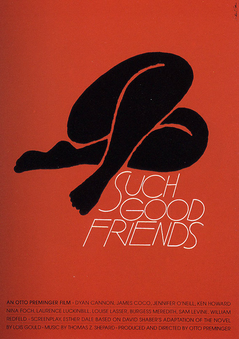
Design for the 1971 film Such Good Friends.
If you’re wondering how you could possibly integrate some of these iconic designs into your current work, check out some of these vintage-inspired designs created within the last few years.
Remember, great design transcends the medium. It doesn’t matter if it’s industrial, packaging, print, automotive, Web or anything else. Get inspired every day by people who don’t create anything the way you would. Get inspired by people who aren’t anything like you — then go back to your screen and make something beautiful.
Get the TNW newsletter
Get the most important tech news in your inbox each week.


