There’s a good chance that you’re sitting on a wealth of data and you don’t even know it. Information from your various tools that you use every day, from Google Docs to Stripe and Mailchimp contain vast stores of information, but turning that information into usable data is a more difficult task than many of us will ever attempt. It’s with this fact in mind that Mountain View’s Datahero went to work to bridge the gap between data and information for the rest of us.
Datahero, as you might recall from our coverage of the company one year ago, is essentially data science as a service. Using supremely complex algorithms on the data that you import, the application spits out amazingly-detailed visualizations, customizable via a click-and-drag interface to include whatever information you need.
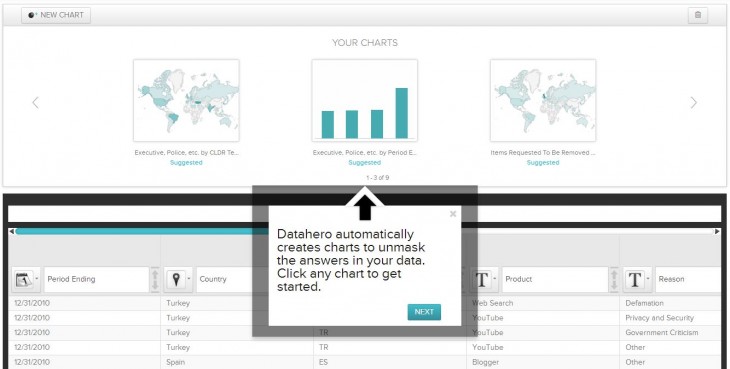
What’s perhaps most impressive about Datahero’s consumer-facing feature is the automated visualizations. For instance, when I imported a CSV file of Google takedown requests, Datahero knew that it would make sense to provide a map view instead of a pie chart or graph, so it defaulted to that:

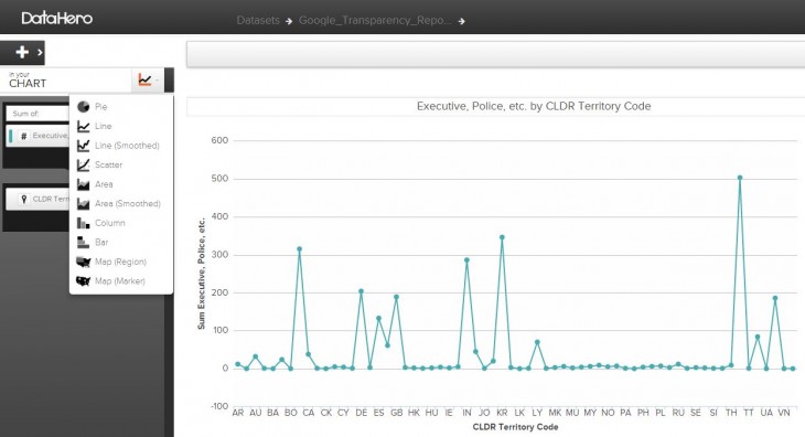
If you do, perhaps, need a different type of view, flipping to it requires nothing more than a click on a button:

While the graphs and other visualizations are stunning, the true power of Datahero comes into play when you start adding information. A simple interface will show you all of the available fields of data from which you can choose, and you can overlay one to another in order to see correlations that you might not otherwise have found. For instance, in a demo with the Datahero team using Stripe payments, we found a correlation between transactions from American Express and a higher instance of chargebacks. By digging deeper and overlaying the number of transactions of each card type, we found that the higher number of chargebacks was simply related to a greater use of Amex cards on the whole.
The team tells me that, essentially, they created Datahero to help people unmask the answers in their data. The emphasis was on creating something for the end user, who otherwise wouldn’t have had the chance to uncover the answers that their data can provide. So now, by simply uploading a file and clicking around to get the pertinent information, the user can walk into their next meeting looking like a genius.
There are other interesting features of Datahero as well, including the algorithm’s ability to suggest the questions that need to be asked. For instance, I uploaded a CSV of data from a company that gives a high-level overview of years in business, profitability, average product cost and much more. Datahero immediately suggested that I look at a combination of these three points (out of the 15+ that were included) in order to get a high-level view of company health. For a moment, I felt like I was considerably smarter than I actually am.
Right now, the focus is on data of smaller sizes. The team tells me that 90% of the users in the beta phase have been uploading data of 10mb or less. However, Datahero can handle whatever you throw at it, so even large sets should be able to be investigated. The focus on the end-user, rather than on enterprise, is a simple choice of avoiding pain points for the company when it comes to enterprise procurement. Instead of worrying about the hassles that surround it, Datahero picked up a pricing structure that makes it simple for an individual to get access to the tools.
The free plan allows for services from Dropbox, Box and Google Drive. If you want Mailchimp, Salesforce or Stripe, it will cost you $29 per month. So get smart. Or at least get smart enough to pay $29 for a service that will make you look like a genius. Give Datahero a try and find out what you’ve been missing in your reports.
Get the TNW newsletter
Get the most important tech news in your inbox each week.


