![Create a lifestream from your social networks in minutes with Glossi [Invites]](https://img-cdn.tnwcdn.com/image?fit=1280%2C720&url=https%3A%2F%2Fcdn0.tnwcdn.com%2Fwp-content%2Fblogs.dir%2F1%2Ffiles%2F2011%2F09%2Fstream.jpg&signature=31bd6b8045db3830711331f02cf7edc3)
We share our photos, thoughts, locations and more on a ton of websites every day. From Twitter, to Instagram, to Foursquare, and more, each of us have a service or two which we use religiously on a daily basis. Glossi is the latest site which gives you one place to bring all of that information together.
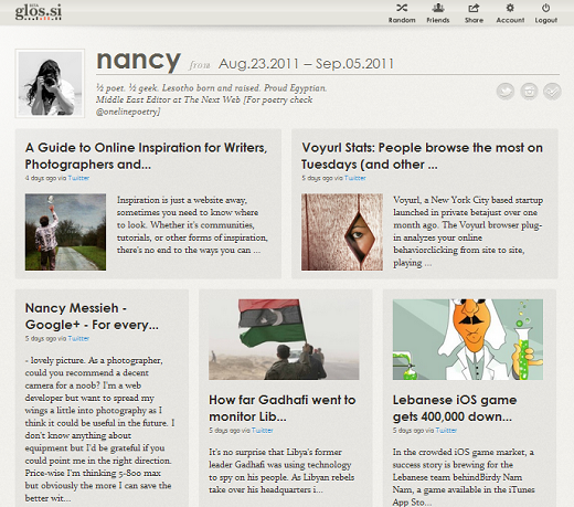
Glossi possesses some similarities to Twylah, a service we recently reviewed, but rather than just present the latest and most popular topics you’ve shared on Twitter, Glossi pulls in all of your content from Facebook, Twitter, Instagram, Tumblr and Foursquare.
Once you’ve signed up for a free account, you can simply authorize the accounts of your choice, and Glossi will instantly create a sleek and attractive lifestream of sorts for you.
Glossi’s main strengths are how easy the service is to use, and the final product looks pretty good. If you’re one of those people who’s stopped blogging, preferring to spend that time on social networks, Glossi is the perfect way to give you an attractive online magazine of your own to share with your followers and friends.
Glossi gives users an easy way to display the kind of information that they share online at a glance. So why use Glossi? The service requires no effort whatsoever on your part. After plugging in your accounts, you can leave the site to do its thing. Simply share the link on your online profiles and let potential followers see exactly what kind of content you’re into. While they could easily do this using each social network, Glossi puts it all in one place, and does it with style.

In addition to creating your own page, you can easily see which of your friends from your social networks have created pages on Glossi, as well as randomly shuffle through other users’ profiles, to see what kind of content they’re sharing. This StumbleUpon-like feature is a great way to discover new content and new people to follow on your favourite social networks.
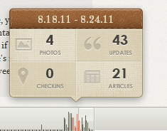
You can also get a sense of your updating pattern through weekly statistics. At the bottom of the page, hovering over a barely visible graph will give you information on how many photos, checkins, updates, and articles, you’ve shared for that week.

There are a few features we wouldn’t mind seeing added to Glossi, the most important of which would be the ability to selectively exclude posts, and we wouldn’t say no to themes.
We caught up with Glossi’s product co-founder, Sandy Lin, to ask her a couple of questions about the new service.
Speaking about the inspiration behind creating the service, Sandy told The Next Web:
We created Glossi because we were frustrated that the digital content we create on our favorite apps are spread across many networks. This became a problem when I was at the Coachella Music Festival earlier this year – we went around checking into places on Foursquare, taking pictures with Instagram, and sending out text updates on Twitter. The problem was that the content was all over the place. If there was a way to pull all this content together, we’d have a pretty good view of our weekend in Coachella.
So we realized then, as heavy social media users, the content we create increasingly represents who we are and reflects important moments in our lives. Yet, there’s no easy way to see it all in one place. The problem is only exacerbated with all the cool new apps coming out every day that allow us create even more content. Although there are services that aggregate activity streams across networks, they usually just display your streams in reverse chronological order; they are not built with an eye towards easy consumption and visual appeal. We want Glossi to be a simple way to create a beautiful page of your online activities that you can be proud to share with others or look back on in private.
While at the moment Glossi only offers access to 5 networks, there are plans to add many more services as well as RSS support. Before they get to that, the Glossi team will be getting rid of a few of the kinks:
Right now the top priority is to improve the magazine-like display algorithm, which includes the technology to find the best title, text, and image for articles that you share, and de-duplicating activities that are cross-posted in multiple networks. Once we iron that out, we’ll start adding support for more networks and media types., including RSS, Posterous, Flickr, Gowalla, Vimeo, Last.fm.
We want to be really thoughtful in the features that we release – the last thing we want to be is yet another social network that you have to worry about keeping up. We want to be just the opposite. We want to be the app that helps you make sense of all the content you create in the various networks. Our vision for Glossi is that you can pick whatever tool you like at the moment – for example: Foursquare, Google Places, or Gowalla for checking in, and rest assured Glossi will display that data beautifully.
Sandy is joined on the Glossi team by co-founder Dan Goldin, who is currently Yodle’s Analytics Product Manager, and Marc Schäffner-Gurney, Glossi’s UX co-founder, and the the head of UX at Crowdtap, a New York based startup which launched at this year’s SXSW.
If you want to get in on the private beta, Glossi has kindly provided 500 beta invites for The Next Web readers. Simply follow the link and sign up for an account. And be sure to let us know what you think of the service in the comments.
Get the TNW newsletter
Get the most important tech news in your inbox each week.


