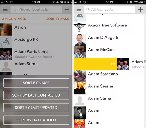
Cobook has given its contacts book app a pretty radical design overhaul for the iPhone today, introducing a brand new look with a cleaner typeface, transparent menus and intuitive swipe-based gestures.
Individual contacts can now be selected by sliding the user’s name and profile picture over to the right-hand side of the screen. A button located at the very top can then be used to trigger specific in-app actions such as group tags, text messages and emails – useful when selecting and updating multiple contacts at once.
Swiping further to the right brings up a number of quick actions for a single contact, while swiping to the left starts a new phone call. Cobook has clearly taken some design cues from email app Mailbox and in this instance, that’s not a bad decision – maintaining a digital address book can often feel laborious and these new controls certainly streamline the process.
The aforementioned design overhaul includes a new, thinner sans-serif typeface and a far subtler use of Cobook’s iconic orange color scheme. Combined with the transparent side menu on the left-hand side of the screen, it’s fair to say that the look and feel of the app has been tweaked to feed into the new design of iOS 7.
The change works for Cobook and reinforces the company’s ambition to become the default contacts and dialer app on the iPhone.
Elsewhere, all of the app’s prior functionality remains in tact. Users can add new contacts manually from the home screen, or pull them-in automatically based on their Facebook, Twitter or LinkedIn accounts. Livecards – a unified business card of sorts tied to each Cobook user – are also still supported too, enabling users to track changes in one another’s contact details automatically.
Individual contact entries are still attractive and easy to navigate, with a number of tabs at the bottom for quick access to their Facebook, LinkedIn or Twitter feed. It’s also possible to sort contact now from the home screen using a number of basic filters such as date added, last contacted and last updated.
With version 3.0 Cobook is also attempting to monetize its iOS app for the first time. A store is now available in the side menu, featuring an ‘essentials’ pack for all-new Foursquare and Instagram profile support. The second pack will import profile information from Xing – a little more useful given that the primary purpose of the app is to collate contact details.
Even if users don’t spend a penny, Cobook is still one of the most functional and well-designed apps available for the iPhone. It’s even more useful when paired with the accompanying Mac app, offering frighteningly quick access to contact information on the desktop.
➤ Cobook | iOS
Disclosure: This article contains an affiliate link. While we only ever write about products we think deserve to be on the pages of our site, The Next Web may earn a small commission if you click through and buy the product in question. For more information, please see our Terms of Service
Image Credit: Justin Sullivan/Getty Images
Get the TNW newsletter
Get the most important tech news in your inbox each week.


