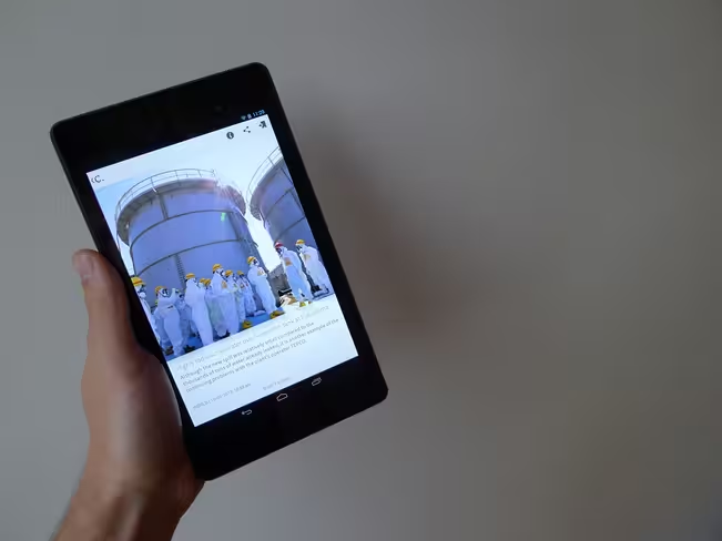
Circa is already one of our favorite news reader apps for the iPhone, breaking stories down to only the essential facts, quotes or photos. Version 2.0 is being released today on the App Store with a new, iOS 7-influenced design, push notification system and article format for handling breaking news. What’s more, Circa is also launching its first Android app.
Circa on Android
Circa is different from other news reader apps because it uses an in-house team of editors to create each atomized story. Every segment of the article is sourced from multiple news outlets, but it’s the staff at Circa who piece them all together and manage each story within the app.
The Android app is near identical to its iOS counterpart, which is a welcome sight in this case. After all, why fix a service that isn’t broken?
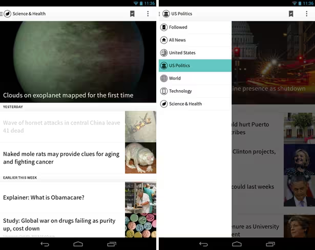
The home screen is a selection of Circa’s best stories covering a ream of different topics such as technology, US politics, science and health. A large banner image at the top represents the top story of the day, while smaller stories sit underneath with a headline and small thumbnail image.
Tapping the icon in the top-left hand corner of the app pulls in the side-bar which lists all the available news sections. It would be nice to see a few more categories, but the selection isn’t bad for a first outing.
(It’s worth noting that you can also move between different sections by swiping left or right at any time on the home screen.)
Reading: A few quirks
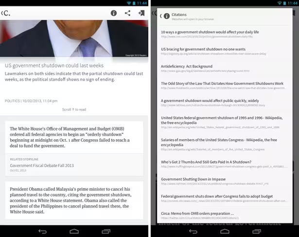
The reading experience on Android differs to the existing (and now updated) iOS app though. Whereas on the iPhone, swiping vertically in any capacity would move an entire block or section of the story, the Android app lets you scroll back and forth at your own pace.
Personally, I prefer the execution in the iOS app. The tiny, vertical line of circles on the right-hand side are an effective way to judge the length of the story and your position within Circa’s segmented article structure. In the Android app, its absence causes some problems with the citations tool located at the top of the app. If you have multiple story segments on screen – a common occurrence when reading Circa on an Android tablet or oversized smartphone – it can be difficult to discern which quote or fact the sources are referring to.
(Note: In the app’s settings, there’s a Smooth Scroll checkbox to enable ‘standard scrolling’. In our tests this didn’t affect the reading experience, however.)
Aside from this little quirk, the Android app is a delightful way to read the news. The bite-sized articles are concise and comprehensive, delivering all of the facts in a format that is easy to read and absorb.
Circa for iOS 7
The changes to the iOS app are a little more incremental.
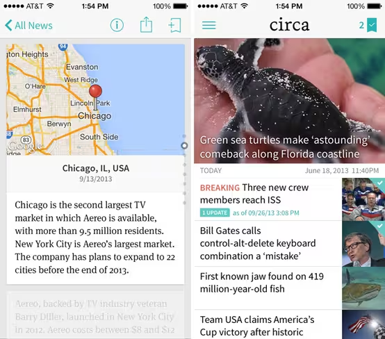
It’s always had a pretty flat design, relying on a predominantly black and white color scheme to reinforce the photos attached to each story. That’s still the case in the latest visual overhaul, although the teal highlights are far more prevalent this time around.
It’s subtle and inoffensive, replicating the professional feel of a long-standing broadsheet newspaper. Some of the icons have been tweaked to fit in with the iOS 7 aesthetic, but it’s not a dramatic departure by any means.
A new approach for breaking news
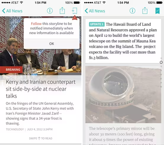
As before, you can hit the plus icon in the top right-hand corner of the screen to save an article to your ‘Following’ list. In both the iOS and Android apps, these are then added to a separate category accessible in the side-menu or the bookmark icon on the home screen, where you can track the story as it develops.
Articles will fade out and show a green tick to denote that you’re up to date. When a new story segment is available, the transparency will be removed and the ‘Updated’ line will be changed accordingly. In the settings, you can also choose to receive a push notification whenever an update goes live.
Breaking news, which has been given a massive overhaul for version 2.0, operates in a similar fashion. Editors will decide when a developing story is worth your attention and send a push notification to your device. If you choose to track the story, Circa will then release additional push notifications whenever the piece is updated with a new segment.
Unlike other Circa articles though, breaking stories will always position the latest update at the top of the screen. Other segments are then positioned in order of importance – rather than chronological, or reverse chronological – to ensure that you always get the most useful information first.
“All told, a reader is able to be notified of a big breaking news event, follow that with one tap, and then get a moment-by-moment breakdown of everything happening in real-time, then reading only what they haven’t seen yet,” a company spokesperson said. “We’re breaking the news, but then building the story up over time.”
Circa is focused on building a platform where they can update and evolve their stories, rather than sending users to entirely new articles within the app. It’s a huge feature and the ability for readers to opt-in or opt-out of individual stories as they break should keep the entire system in check.
Wrap up
Circa is more than a unified inbox for all of your favorite news outlets. The company’s editors are creating entirely new content from existing articles on the Web, before offering them to readers in a unique format built specifically for consumption on a smartphone or tablet.
(It’s worth noting that you can also jump to the original article(s) by hitting the citation button in each story, so it’s really not a case of ‘one or the other’ here.)
Aside from the scrolling issues mentioned earlier, the Circa for Android app is a brilliant way to keep up with the news. The additional tools for handling breaking stories is also a welcome improvement, both in the iOS and Android incarnations. Regardless of what platform you’re on, both of these apps are worth keeping on your home screen.
Disclosure: This article contains an affiliate link. While we only ever write about products we think deserve to be on the pages of our site, The Next Web may earn a small commission if you click through and buy the product in question.
Get the TNW newsletter
Get the most important tech news in your inbox each week.
