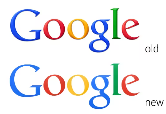
A number of technology firms including Yahoo and Motorola Mobility have redesigned their logos recently in a bid to refresh their public image. Now, it looks like Google could be the next in line to give its iconic multi-colored branding a small makeover.
Ars Technica found this new, flat version of the Google logo after digging around the Chrome Beta for Android APK. It’s not a huge departure, but the decision to take out all of the harsh gradients and switch over to lighter shades of each primary color has a noticeable effect.
The logo redesign would make sense, given the industry trend towards a cleaner, two-dimensional aesthetic (the upcoming iOS 7 redesign is a notable example), and the flat, lower case ‘g’ used for the Google+ and Google Search app icons.
There’s no way of knowing whether Google will finalize this logo and roll it out across all of its products. In this writer’s opinion, it would be a small, but welcome improvement over the current iteration.
➤ Chrome beta for Android (via Ars Technica)
Featured image credit: KIMIHIRO HOSHINO/AFP/Getty Images
Get the TNW newsletter
Get the most important tech news in your inbox each week.
