Flickr is looking to improve the photo experience on its social network. Beginning today, users can opt-in to preview its new layout, which is set to roll out later this year. What’s different? When you look at an individual photo page, the image will now be bigger, better organized, and faster to load.
First reported by Engadget, the new layout is a welcome one as it looks much cleaner than before. Following the refreshed update that Yahoo CEO Marissa Mayer unveiled in May, the upcoming redesign will make viewing all the pertinent information all on one screen — potentially while also appealing to users on mobile devices.
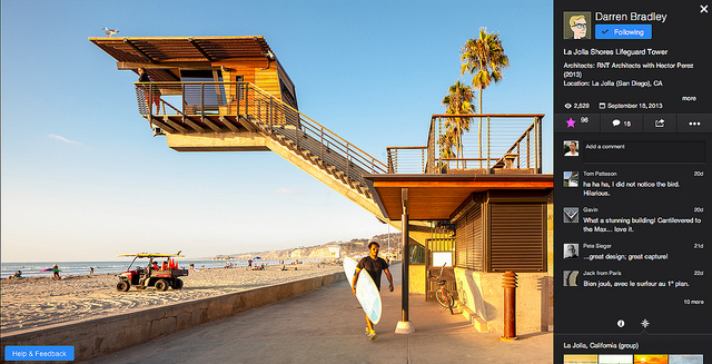
In the preview, photos have now been made 25 percent bigger than on the previous photo page, offering more pixels and a cleaner view “without any elements on the top or bottom of the screen.”
To help eliminate scrolling, Flickr has also moved all the photo title, comments, tags, additional photos, and any other relevant information to the side of the image. In addition, a new recommendation feature has been added to help you find similar photos that you may like — it wouldn’t surprise us if you favorited a particular photo that the recommendations would dynamically change accordingly.
Lastly, Flickr has put some nitro in its servers to help photos load faster. In its blog post, the company says that the new photo experience has been built “from the ground up.” How much faster hasn’t been determined, but with larger images comes bigger file sizes, so it’s no surprise that Flickr wants to compensate for that.
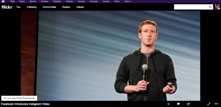
Here is what Flickr looks like now:

This is what your photo page could look like during the Preview phase:
So how do you get access to the preview? Simply go to your Flickr account and when you view an individual photo page, you’ll see a notification on the lower-left hand side of your screen asking you to “Try our new Photo Experience”. When you click on that link, the page will be transformed into the new one — that’s it.
Once you’ve enabled it, all photos you view on Flickr will have the new layout.
Flickr hasn’t mentioned anything about this new preview coming to its mobile apps so in the meantime, you’ll have to experience this just on your desktop or the mobile Web.
Get the TNW newsletter
Get the most important tech news in your inbox each week.


