Today Yahoo unveiled a major update to its photo-sharing service, Flickr, including the addition of full-resolution images, an updated Android application, and 1 terabyte of free storage. The newly redesigned site is now available for everyone to use. We took a look at the changes.
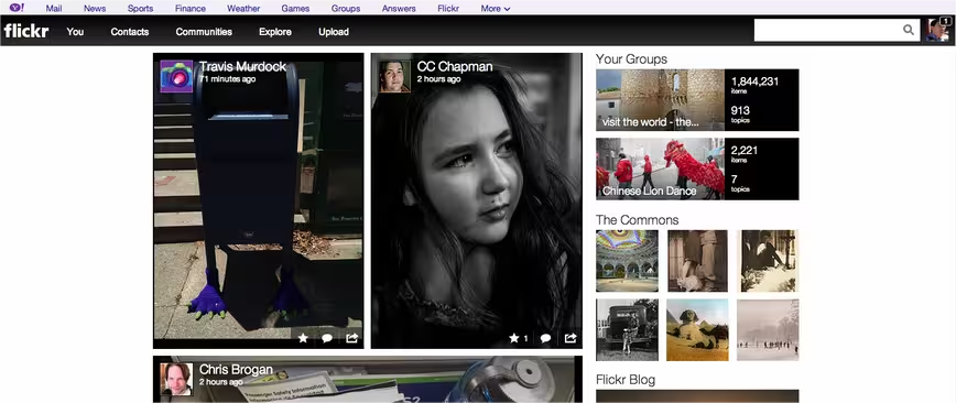
When you log into Flickr, one of the first things revamped is the news feed. Before the main page listed activities for a user’s photos and recent uploads from their Flickr contacts. Now, it’s become much more visual with larger images and a redesigned user interface.
While touting the fact that photos will be displayed in full resolution, the overall design looks a bit incomplete in some places. Instead of its traditional color scheme of blue, pink, and white, Yahoo has opted instead to have black be the dominate color, which may help accentuate photos while acting as the backdrop, but in other areas of the site, it looks a bit dark and could be still improved.
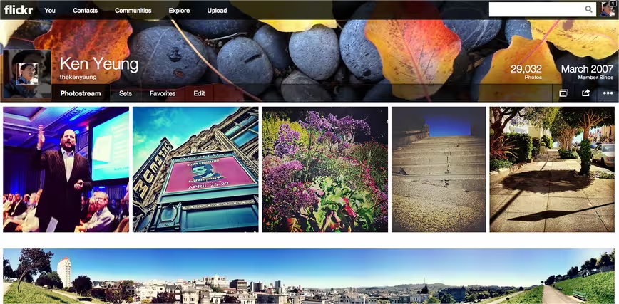
When viewing a user’s photostream, this is perhaps one of the nicely done parts of the redesign. Profiles now includes a cover photo, which is something that currently exists on services like Facebook and Google+ profiles. Based on our measurements, it appears that the optimal size for the cover photos is around 1418 pixels wide by 189 pixels high.
Flickr has expanded its updated photostream design to take up the entire screen real estate so that instead of the traditional two column approach, it now is in a more artistic collage of photos. Users can click on any photo to perform a standard set of actions, including favoriting, commenting, sharing, and more. It’s noteworthy that the photostream utilizes infinite scrolling so that pagination isn’t needed, although the service has it displayed.
When looking at individual photos, users will find that the photo spans the entire width of the screen — no longer is it constrained to a fraction of the page. All photos are surrounded by a black background. Below each image are the sections where you can post comments, view details about the specific photo, navigate through the user’s photostream, and view tags.
Photo sets have also been enhanced so that the thumbnails have been enlarged and that they span the entire width of the screen. Clicking on any of the sets will display them in the same manner as the default photostream, in a aesthetically-appealing collage.
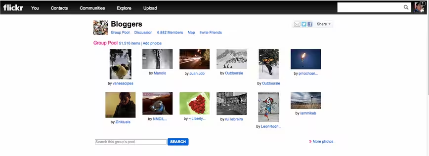
Not every part of Flickr has been updated. When browsing through the Communities section, the interface looked the same as before, with a list of groups that you’re a part of. When exploring a specific group, the page also remains as it was before — it looks like the new update only affects user profiles.
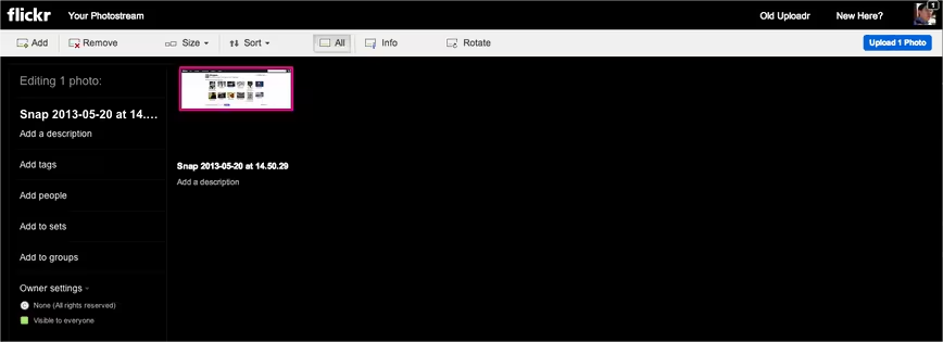
The upload feature has been upgraded with a drag and drop service. Users can find photos from their computer or cloud-based file storage service and drop it in. Either individually or in a batch, users can add add in the same content, including a description, tags, people, and more — nothing different in terms of functionality, just with aesthetics. If you’re not a fan of the new upload method, Flickr gives you the option of switching to the old uploader, although it’s not clear how long that will remain.
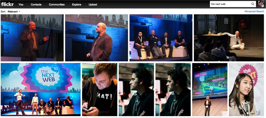
Running a search on the new Flickr is definitely an improved visual experience. The company has set out to make sure that these images pop out at you while you’re looking for photos.
Of course, Flickr wants you to store more photos on its service so it is giving everyone more storage space: 1 terabyte worth, in fact. Users don’t need to do anything right now, and those with a subscription plan won’t have to do anything to upgrade their service. Flickr says that all subscriptions remain the same with unlimited space, an ad-free experience, and statistics.
According to the company’s FAQ section, those with a free account will not only have 1TB of space, but each photo uploaded will be limited to a size of 200MB. Users can create collections and post their photos or videos in up to 60 group pools.
Flickr is also discontinuing its Pro account, but those current subscribers will be able to renew the plan. Those new Flickr users interested in the plan will not be able to upgrade, instead being a part of the 1TB plan. Also being terminated is the “Gift of Pro” program.
Three plans will now be available. Besides the Free plan, an Ad Free and Doublr plan will be available for $49.99 and $499.99 per year, respectively.
Overall, Flickr’s redesign is a very impressive effort and the company has made efforts to appeal more to the photography community. Whether that will convert into people flocking back to the service remains to be seen, but Flickr certainly isn’t the stagnant service people once thought it was.
Photo credit: LOIC VENANCE/AFP/Getty Images
Get the TNW newsletter
Get the most important tech news in your inbox each week.
