Minimalist apps are all the rage right now. The idea of cutting out all but the simplest of interface elements and focusing on letting the user complete a single task really well has inspired the likes of iA Writer, Clear and Byword. While some of The Next Web team adore this approach, I’m sometimes left wondering whether these apps are really all they’re cracked up to be.
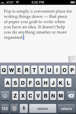
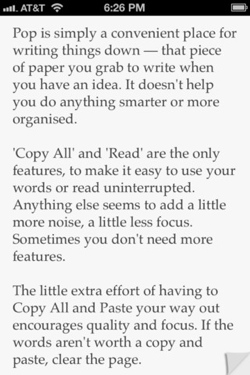
This was particularly highlighted when I was recently pitched Pop, a notepad app for iOS that takes simplicity to its extreme by having no features at all. You get a white screen (with a tiny page curl in the corner for effect) and you type away. That’s it. When you’re done, you can copy and paste the text to wherever you want to use it.
I’ll admit – while I appreciate the hidden controls and subtle use of sound of the likes of OmmWriter Dana, Pop seemed to be taking things a step too far – to the point where it was simply laughing at those who bought it – “Ha, you paid 99 cents for a blank screen.”
However, Pop was released to a positive buzz, with favorable reviews, and it hit the top 25 rankings in the App Store’s Productivity section within two days – so there’s clearly a demand for it. To try to understand how the app came about and who it’s designed for, I spoke to its UK-based designer, Colin McFarland.
TNW: So, minimalist apps are the Emperor’s New Clothes, right? I look at an app that’s just a white screen and the ability to type text and I just think “Surely that’s just a ‘My first text entry’ app from a ‘learn to code for iOS’ course?” Why wouldn’t I just use the iOS Notes app?
CM: Pop was designed for the single purpose of writing something down and worrying about what do with it later, hopefully Pop is invisible and you don’t notice it at all, you came here to write something.
Maybe you’ll use both — just like you have a few notebooks, post-its, or pieces of paper. Maybe Pop is all you need, or maybe it won’t be useful for you. It’s for you to decide its purpose. If you just want to write something down, do you need more than ‘a white screen and the ability to type text’?
TNW: But where does it end? Once you’ve had an app that does nothing but let you type, is it possible to get any more minimal?
CM: Pop wasn’t designed to be the most minimal app, it was designed to only have the features that are necessary for quickly writing something down. Features exist where they are useful, like Copy All so you can get out quicker — with a word count as an after thought. Pop tries to make features invisible, so they don’t get in the way.
TNW: Okay, you’re starting to sway me a little. Is there a temptation to add more features? How do you do that without losing that minimal feel?
CM: The design was driven by a core philosophy: Feature number one should always be as few features as needed to perform the primary purpose. There are other things that could help serve the purpose, like synching between devices since Pop is a universal app. Again though, I’m not interested in features getting in the way, any new features would need to remain invisible.
TNW: Aside from Pop, what other minimalist apps would you recommend for people interested in the genre, and why?
CM: I appreciate the simplicity of these apps, all-purpose built to do one thing well.
Instapaper by Marco Arment (save pages to read them later), Clear by Realmac Software: (to-do list with a completely gestural interface, not a button in sight), Dot series by UsTwo (Minimal games created in 48 hours, start with the original DOT), The Accidental News Explorer by Brendan Dawes (A simple news app that lets you find something, then find something else).
Q: So, what’s next for you?
CM: Maybe more from Pop, definitely more apps following the same philosophy.
Get the TNW newsletter
Get the most important tech news in your inbox each week.


