For almost 200 years, the Braille system has helped the visually-impaired read. Created by Louis Braille in the 1820’s after he lost his sight, the system uses embossed dot combinations to represent letters, numbers and punctuation (64 combinations made with 6 dot cells, spelling out every letter of a word, and more combinations representing contracted signs).
Today, technology is helping the visually impaired go beyond using just books, with special displays, computer assistance, and even apps, such as Braille Touch.
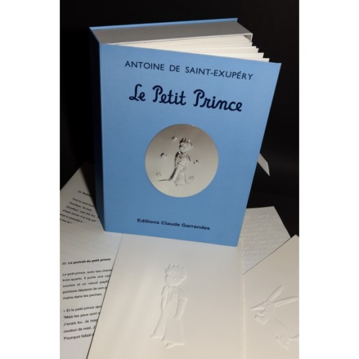
(Discover “this collector’s book with drawings in relief and texts in English, French and Braille”.)
Despite Braille having a similar path to any other form of typography, it has changed little since its inception. Now however, this is starting to change. Although it was created to fill a need for blind people, tactile typography may apply to others, as long as they have hands ;).
The above video shows how Wimpy, an American burger chain, used sesame seeds to tell blind people that they produced a Braille menu.
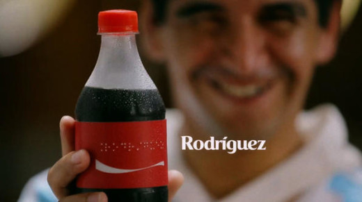
Coca-Cola edited bottles with Braille labels for the Argentina National Soccer Team for the Blind. Every soccer player received a bottle with his name on it written in Braille. More about this initiative here.
Braille is a field to explore in many ways. Below are a few experiments designers’ have dabbled with around Braille and other tactile typefaces, all of which try to erase the limits between sighted and non-sighted writing (and reading and printing).
A type to learn Braille
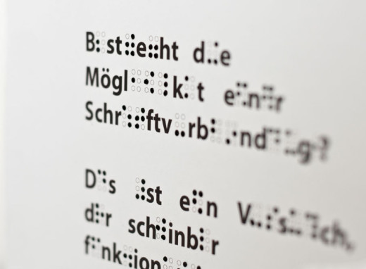
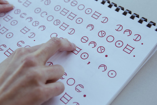
Simone Fahrenhorst, Integrated Design student at Köln International School of Design, wanted to find a solution to an increasing problem: the loss of sight as we age. To help these people be prepared for potential blindness, she created an alphabetic system mixing Braille and Latin signs, and “a new typography that can be seen as a point of intersection between Braille and normal print”, where Latin and Braille letters are designed on the same grid.
Educational, reassuring and readable by both sighted and visually-impaired people, the Learning Braille Type is a very relevant graphic project, both in form and substance.
Words are composed with letters in Latin and Braille. Sighted people can then read and understand the signs in Braille by deduction.
Kobigraphs
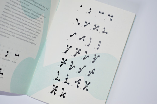
Susan Jolly is the curator of dotlessbraille.org, a website dedicated to “demystifying Braille”. In the 70’s, her father came up with the idea of a Braille analog system called the Kobigraphs. He developed Kobigraphs, “as a simple way of writing Braille in inkprint–much simpler [by hand] than dots”. Based on a Braille cell, Kobigraphs are drawn by joining the dots of a Braille combination. It’s a simple way of increasing Braille literacy by giving everyone the possibility to share the same (paper) “language”.
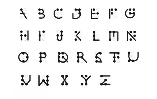
In 2014, Greg Bland, a young graphic designer, “became curious about the idea of this typographic ‘bridge’ between embossed Braille for the blind and visual letterforms for sighted persons to read Braille more easily”. In order to encourage sighted people to learn Braille, he designed a personal and contemporary Kobigraphs’ alphabet. The result is gorgeous, accessible and touches upon the standard that makes up Brailles.
From A to Z, Greg Bland’s Kobigraphs are drawn by joining the dots of Braille combinations with a single line for each sign, in a dynamic way. To draw a Kobigraph by hand, you don’t need to remove the pen from the paper.
Why only dots?
Dots have not been chosen to write Braille just for fun. Convenience, efficacy and accessibility were selection criteria too ;)! However, Deon Staffelbach, an American designer, asked himself if other shapes than standard dots could add “an additional level of information” to Braille.
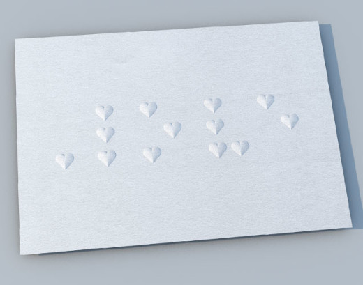
He designed thre “Braille fonts”: Constellation (dots= stars), Love (dots= hearts) and Pyramid (dots= pyramids), each of them having 3 heights of embossment for light, regular and bold. Although these fonts may be difficult to read for long texts (In Search of Lost Time by Marcel Proust with little hearts, really makes you want to go to bed for a really long time), it may be an interesting alternative, depending on the (short) message conveyed, and whether it can understandable for both sighted and non-sighted people.
A lovely card on which is written the word “love”, in Braille, every dot is replaced by a heart.
A Tool tool to read everything but Braille
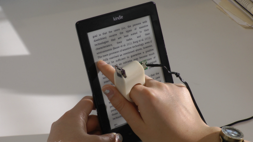
The Fluid Interfaces is a research group of students and alumni at MIT’s Media Laboratory. Their goal is, “to design and develop interfaces that are a more natural extension of our minds, bodies and behavior”. The researchers recently created a tool that can detect and read out loud any printed text.
The FingerReader is a prototype ring that allows, “wearers (to) scan a text line with their finger and receive an audio feedback of the words and a haptic feedback of the layout”. This awesome tool will perhaps lead to the death of Braille, but before that it will allow every visually-impaired person to read any written support.
Introductory video to the FingerReader, “a wearable device to explore printed text on the go”.
Textscape
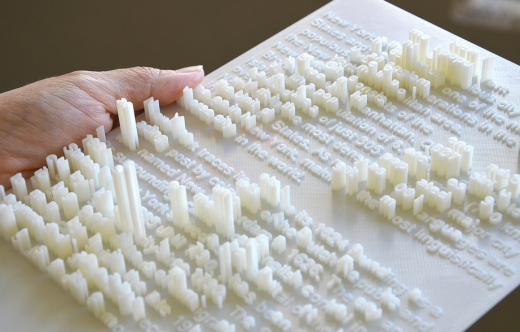
Textscape is a 3D printing technology project by the Chinese artist and designer Hongtao Zhou. The 3D typographic documents offer a double and even a triple reading: letters can be read by both sight and touch, and can also form, thanks to volume and the different heights of signs, an image or a new text to decipher. “These documents make the reading process interactive for general audience or blind people to read as knowledge as well as art”.
A 3D document representing an embossed text about New York City. Some letters, taller than the other, become the buildings of the city. Seen or touched from above, the document is a text to read, viewed or touched from the side, it offers a typographical architecture of New York. ©Hongtao Zhou
Elia Frames Tactile Font: An alternative to Braille
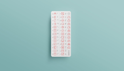
According to its CEO, “Elia is a company founded on the belief that change is not only possible, but inevitable”. The Elia team of engineers and designers recently developed a font that may change the world, and especially the future of Braille’s world. Elia Frames is a tactile font whose design and construction are very different to Braille. Only shapes in relief and reading by touch remained. The Elia Frames’ alphabet is divided into several groups of framed letters.
Letters of each group have a common shape, for example letters from the first group (from A to D) are designed with open circular frames while the second group of letters (from E to N) have squared shapes. Numbers have house shape frames. These shapes and divisions aim to facilitate the learning of the writing language by both visually-impaired and sighted people.
Elia Frames is very intuitive and faster to learn than Braille, which should encourage more people to embrace it. The font can be downloaded for free from ELIA’s website. And to print your embossed tactile font, Elia team also worked on Elia Touch Printer (more here about this impressive tool)!
Despite the large decline of use, Braille remains today the only effective method of writing and reading adapted to blind and visually-impaired people. It can not disappear until it has found a better built substitute, which is not for tomorrow. No, tomorrow, designers and researchers will continue to experiment around this unique form.
They will keep questioning readability, like with this “Rubiks Cube for blind persons“, designed by Konstantin Datz (a totally white Rubiks Cube where colors are written in Braille). Tomorrow, they will keep going where no one has gone yet, trying to give visually-impaired people access to more and more (tactile) experiences and (cultural) discoveries.
This is what Philipp Meyer did with the creation of the first “tactile comic for blind people”. And after tomorrow, June 19th, a new kind of book will be released at the Paris headquarters of Unesco: a guide for blind yoga students using a “tactile printing system (…) developed at IIT-Delhi”.
Thinking about design, graphic or type, with all senses, may be the key to richer and more innovative forms of creativity!
Read Next: The ultimate Web typography guide
Image credit: Fontyou
This post first appeared on Fontyou.
Get the TNW newsletter
Get the most important tech news in your inbox each week.
