Many websites and applications these days are designed to trick you into doing things that their creators want. Here are some examples from timewellspent.io:
- YouTube autoplays more videos to keep us from leaving.
- Instagram shows new likes one at a time, to keep us checking for more.
- Facebook wants to show whatever keeps us scrolling.
- Snapchat turns conversations into streaks we don’t want to lose.
- Our media turns events into breaking news to keep us watching.
But one of the most manipulative websites I’ve ever come across is Booking.com, the large hotel search and booking service.
If you ever used Booking.com, you probably noticed (and hopefully resisted!) some ways it nudges you to book whatever property you are looking at:
Let’s see what’s going on here.
Prices
First, it tries to persuade you that the price is low. “Jackpot! This is the cheapest price you’ve seen in London for your dates!” Of course it is — this is literally the first price I am seeing for these days — so that statement is tautological. The first price I see will automatically be the lowest I will have seen, no matter how ridiculously high it’s going to be! The statement “This is the highest price you’ve seen in London for your dates!” would be just as valid.
Likewise, the struck-through prices are there to anchor you and make the actual price seem like a great deal. The struck-through US$175 is before applying my 10 percent “genius” discount — ok, that’s fair. But where does the US$189 come from? Let’s hover over the price to get an explanation:
I imagine most people will feel intimidated by the complex description, skip to the last sentence, and get the impression that “you get the same room for a lower price compared to other check-in dates”. (If this wasn’t the case, Booking.com’s marketing department would change the wording to make it so.)
But what is it actually saying? If there is only one room of this type, then 90 percent of time there will be an appearance of a lucky deal. What you should be reading is “If I choose this, I am not a total loser.”
And if there are three comparable room types with differential pricing, there is even less of a reason to feel good about this — you’ve successfully avoided the worst three percent of the offerings.
Urgency
Another way Booking.com manipulates you is by conveying the sense of urgency.
“In high demand – only 3 rooms left on our site!”
“33 other people looking now, according to our Booking.com travel scientists” (what?)
“Last chance! Only 1 room left on our site!”
And just to prove they are not kidding, they will show you something that you’ve missed already:
But my favorite one is this red badge:
Although it cannot be seen on the screenshot, the badge doesn’t appear right away when you open the page. Instead, it pops up one or two seconds later, making it seem like a realtime notification — an impression reinforced by the alarm clock icon. To be clear, it is not realtime, and there is no reason to delay its display other than to trick you:
How much time has elapsed since the last booking doesn’t simply play on our irrational emotions. This is a valuable piece of information that can be used to estimate at what rate these rooms are being booked. By a Gott-like argument (see Algorithms to Live By for an excellent explanation), if the last booking was made four hours ago, you can estimate that a room is booked about every 8 hours. Plenty of time to relax and compare your options. If, on the other hand, the last booking happened just two seconds ago, you’d better not waste another second before entering your credit card number.
Kudos to Booking for at least providing the actual information in a tooltip window (I wonder what regulations make them do that), but not all users will hover to read it, and even then, something that you experience (a badge popping up) will probably take precedence over what you later read.
The “Someone just booked this” badge does not just make you worry that the room you are considering will soon be snatched; it also reassures you. If other people are actively booking this property, it must be good. Of course, the person who made a reservation four hours ago has not yet visited the hotel and so probably has little more knowledge than you. Their decision to book is probably to some extent influenced by the same red badge. This situation, where everyone relies on everyone else to have accurate information, is also well described in Algorithms to Live By.
Reviews
Instead of listening to people who have just booked the property but have not yet visited it, we should turn to those who have been there, right? That’s what reviews are for!
But Booking.com managed to game the reviews, too. There are quite a few crappy hotels out there, especially on the cheaper end of the spectrum. These are the hotels you and I would want to avoid, but if we did, Booking would not make money off them.
An extreme example is the hotel I’m currently staying at, New Union. From its Booking.com page you wouldn’t think there’s anything wrong with it, would you?
If you spend enough time perusing that page, you’ll eventually stumble upon the “fine print”:
“Noise may be heard whilst the bar is open” is an understatement; the music is so loud that the floor in my room shakes very perceptibly, and the bar is open until late at night/early in the morning. And why is this warning hidden in the fine print instead of being a big red fucking badge?
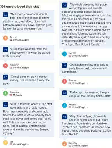
To be fair, this is more of the hotel’s fault than Booking’s. Also, I should have read the fine print. Or the reviews. But wait, I’ve read the reviews:
 What I didn’t realize skimming an overloaded webpage was that the reviews displayed on the main page had been cherry-picked. The full list of reviews is available from a separate page, e.g.
Ratings
Notice something interesting here: the first, moderately negative review, gives the place a rating of 7 out of 10, and the second review, probably as negative as it gets, gives it almost a 6. As a result, the overall rating of the property is high (7.6), and even the distribution of ratings does not look alarming:
Unlike IMDB or Amazon, where you simply give a movie or product a number of stars, when you rate your stay on Booking.com, you evaluate it on several factors: location, cleanliness, facilities etc.
But Booking.com doesn’t present individual ratings; it presents the average (like 7.1 or 5.8) and the average of averages (the overall rating of a property). It is unlikely that all factors will be bad simultaneously, but a problem in one of them may easily ruin your trip. A great location will not compensate for sleepless nights, but Booking.com thinks otherwise.
What to do with all of this
Frankly, I don’t think I am going to stop using Booking.com. I am not aware of any other service with a comparable number of properties and reviews.
Instead, we need to be aware of all the ways Booking is trying to screw us over and try to counter them:
- Ignore urgency-provoking red text and anchoring struck-through prices.
- Do not rely on the magnitude of the ratings. I think it is still fine to use them as a sorting criterion.
- Do not read the cherry-picked reviews on the main page. Go to the review page (“Our guests’ experiences”) and sort the reviews from newest to oldest, to get an up-to-date and hopefully unbiased selection.
As I learned from several commenters on Hacker News, these manipulative tricks are called “dark patterns”, and they are catalogued over at darkpatterns.org.
Get the TNW newsletter
Get the most important tech news in your inbox each week.


