The BlackBerry Z30 is the Canadian handset maker’s most recent range-topping smartphone, but with ever-increasing competition in the consumer and its core enterprise markets does the 5-inch BlackBerry 10 device have enough to keep potential buyers interested?
Ahead of the device’s launch, we went hands-on with the Z30 to see if it can run with the rest of the pack. What follows is just our initial impressions – a full review will follow in due course.
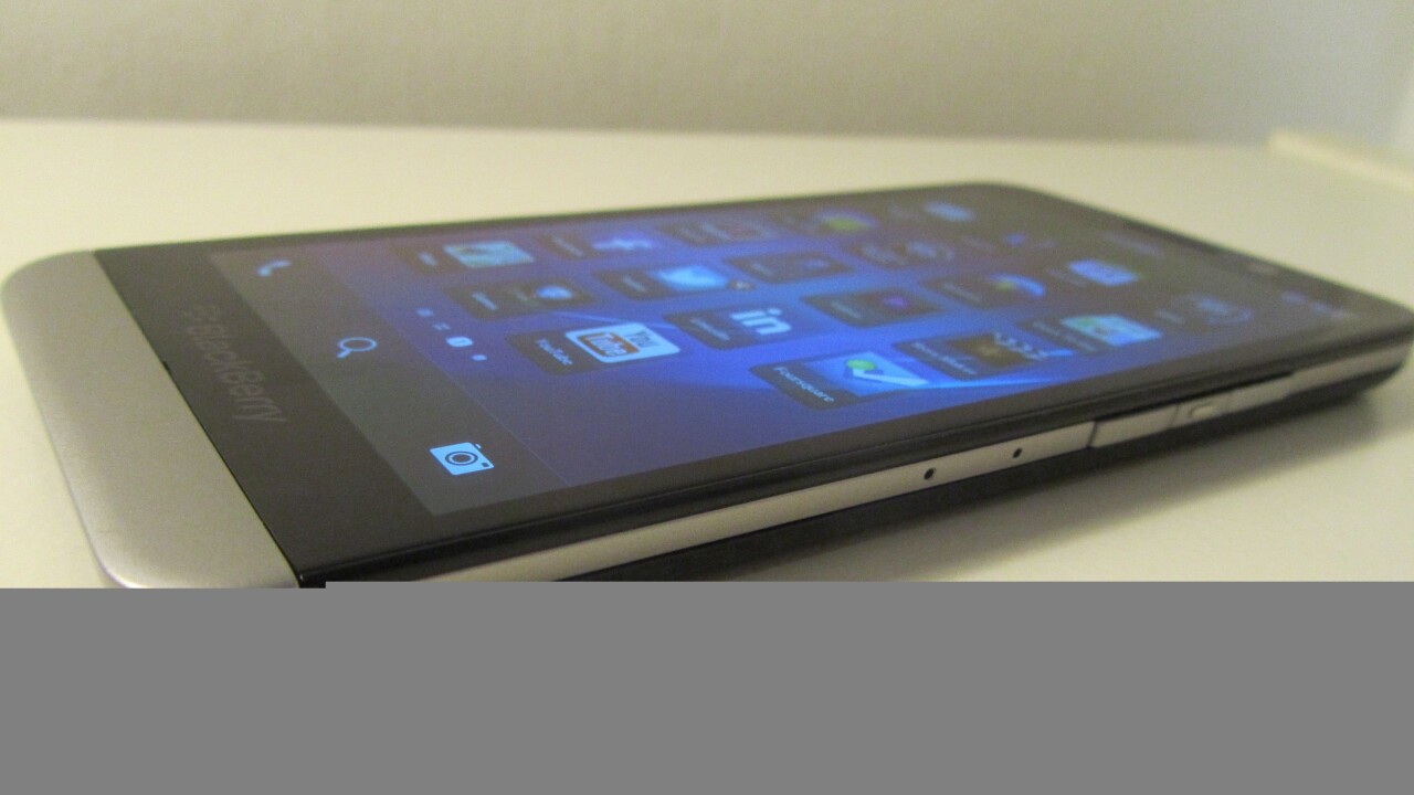
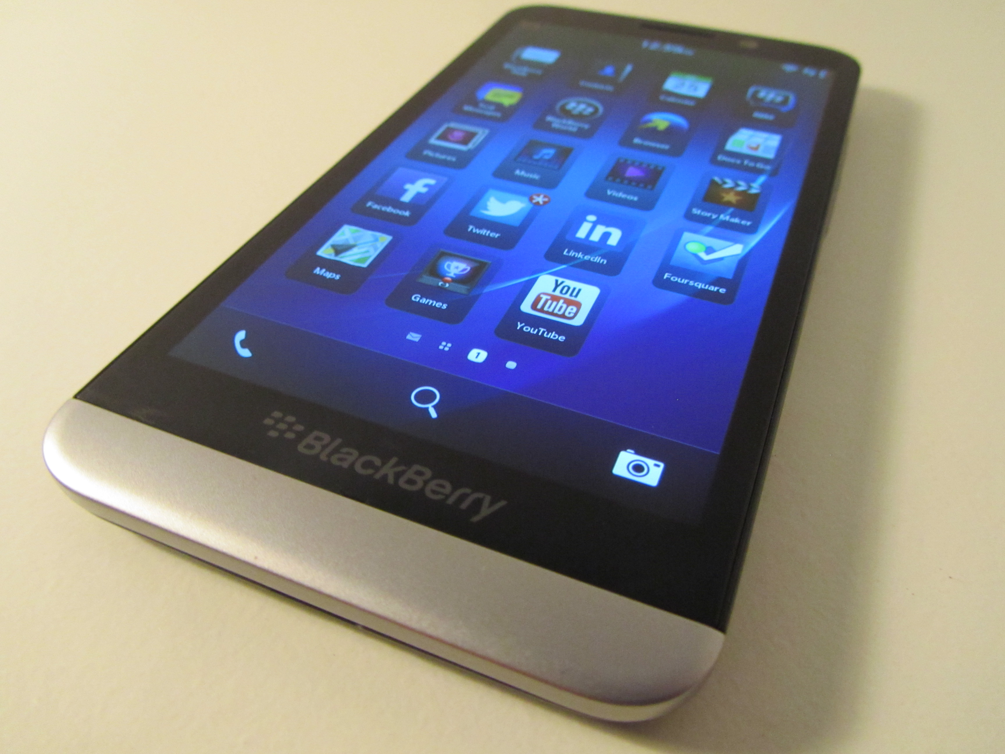
First things first, the 5-inch 720p display looks much more appealing than that found on the other full touchscreen Z10 handset, and that’s before you switch it on. There’s a reason for this: instead of using an LCD display (like the Z10) it has a Super Amoled offering that gives a much more sleek appearance, both to the device itself and to the quality of the images on-screen.
Needless to say, under-the-bonnet you’ll find the most recent version of BlackBerry’s operating system (10.2) which makes small tweaks to the platform to make things a little more convenient.
For example, core navigation is done in the same way as previous models using BlackBerry’s ‘peek and flow’ approach – allowing you to peek at all your messages in a unified inbox called the BlackBerry Hub – but there’s now a Priority Hub option that prioritises important messages, using things like existing conversation chains and surname identification (there’s a good chance you might want your family email prioritised above other less important messages) to categorize them as a priority.
There’s also now the option to just view all messages and emails that have attachments in a single list (or grid) view.
In our initial brief testing, that feeling of the Z30 keeping the same core experience as other BlackBerry 10 devices runs throughout, with other little tweaks here and there designed to streamline the overall use rather than revolutionize it.
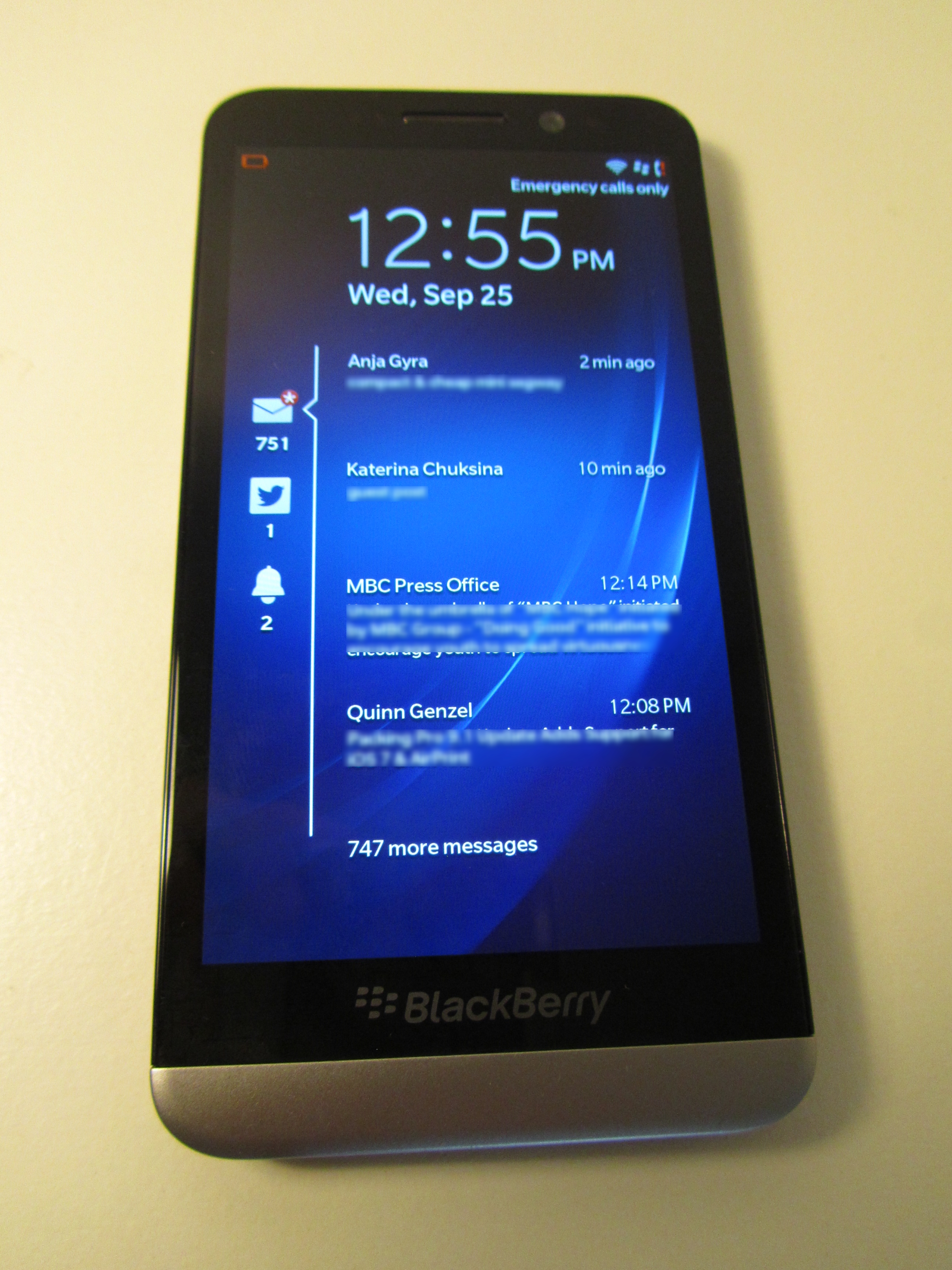
For example, notifications are still shown on a locked home screen and denoted by an icon and a number to show how many there are and whether they’re an email, SMS, Faceboook notification, tweet etc. but rather than having to unlock the screen to see the content you can just tap the icon and it will expand to show you a snippet of each message. Revolutionary? No, but definitely handy and a bit of a time-saver.
BBM – which as we all know is headed to iOS and Android imminently – has also been tweaked with a couple of new features too. Obviously there’s still the option of video calling and screen sharing, but you now have the option of replying to a BBM message directly from the pull-down notification at the top of the screen no matter what you were doing when you received it without the need to switch into the BBM app or BlackBerry Hub.
Again, it’s just something that saves a little time and means you don’t have to switch between apps.
We’ll need to spend a bit more time with the phone before being able to comment on things like the claimed 25 hour battery life, but the 2880 mAh battery certainly gives the phone a solid feeling – officially it weight 170 grams.

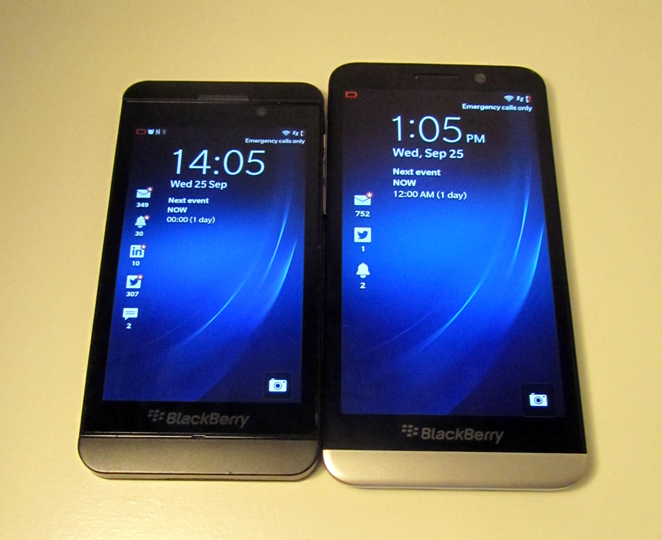
The handset’s chassis is noticeably more comfortable to hold than the Z10 though, despite seeming a little weightier, and even though it has a 5-inch display, it doesn’t feel oversized (as some others can), which is helped by being a bit thinner and sleeker than the Z10. I definitely approve of the lower metal casing and banding over the plastic of other models, and it helps to give a more premium feel to the device.
First impressions count
The Z30, on first impressions, strikes me a solid follow-up to the Z10 and strays into the 5-inch screen territory for BlackBerry for the first time. It’s a move that brings it closer to parity with rivals on store shelves and makes the it seem less ‘different’ than others on the market. While for many manufacturers this would be a bad thing, BlackBerry has been struggling to win back consumers en-masse for some time now, so perhaps seeming a bit more in-line with competition could work in its favor if the user experience can win out in the long run.
We’ll report back with a full review in the near future.
Get the TNW newsletter
Get the most important tech news in your inbox each week.


