Bing, Microsoft’s search engine with the attractive backdrops, has announced that it has had a bit of a clean up.
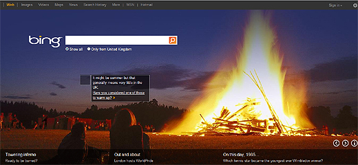
The UK site now has a cleaner home page, on which the larger images the search engine is known for, get a bit more breathing space.

If you can’t remember what it was like before, the header has been minimised and information that was on the left of the page has been removed.

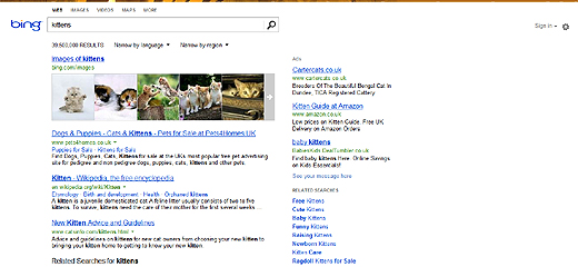
The Bing UK Blog says that these subtle changes raise “the level of consistency and predictability while making it easier for you to scan the page and quickly find the information you want.”
There has been a tweak in spacing too, apparently to improve readability. There is still a curious amount of white space on the right as we look at the results, but time will tell what will appear there in future.
Beneath the surface, there have also been changes to get searches moving faster and present relevant content to users.
It sounds as though there will be more tweaks in the pipeline. Bing’s final word on the changes today states, “Bing’s goal is to help you spend less time searching and more time doing. Changing how Bing looks is the next big step in doing just that.”
Last month the US version had an overhaul. It’s worth noting that the US site has a snappy three column design (read more about that here) with Standard, Snapshot and Social elements for users to choose from. Fingers crossed, some of that functionality will spread to global users.
Let’s see if these steps in speed and cosmetics can bring Microsoft closer to taking a larger bite out of the mighty Google.
Image Credit: Official_Powerset
Get the TNW newsletter
Get the most important tech news in your inbox each week.


