Behance, a popular platform for sharing and finding creative work, has just launched a handsome redesign that makes discovering talent and inspiration so much easier. The site has long housed work from some of the most compelling designers alive, and this redesign fine tunes everything without ditching its core.
The site started nearly six years ago, and now millions of visitors, enthusiasts and creative professionals from across industries use Behance every day to connect and showcase their creations. Most recently, the site launched a slick iPhone app and before that Behance released a student only gallery that shows off the next generation of creative talent.
As for the new version, the team says it catapults the original core functionality of Behance to a whole new level — we can’t help but agree.
More specifically, key features like gallery browsing, activity feeds, member profiles, curated galleries and following members have all be retooled. The goal? “To provide a level of discovery, efficiency, and transparency that the creative world has never seen.”
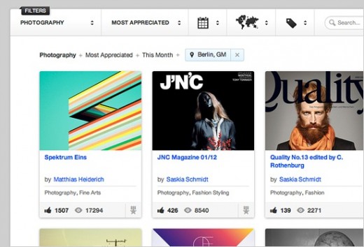
 The new explore tab lets you hone in on specific categories, such as photography trends in Berlin, or the work coming out of design schools like RISD and Parsons. You can also find work based solely on the tools used, so if your curious about a certain camera, you can explore all works that used a Leica or Nikon.
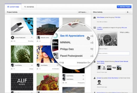
 The activity feed has been refined into a visual stream of information about the creative work of the people and teams you follow. You can see appreciation and comment trends in a glimpse, view the latest projects your peers have uploaded to Behance, and track your own portfolio statistics.
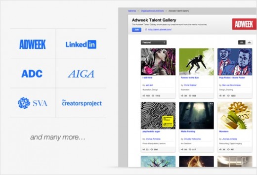
 The new look also emphasizes curated galleries from the likes Adweek, AIGA, and The Creator’s Project, as well as top schools like SVA. In addition, collections curated by Behance members themselves are also much more prominent and accessible.
Overall, the redesign is an major step for Behance as a discovery platform and as a place for likeminded creatives to share work. If you’re in search of emerging inspiration or a place to show off your stuff, look no further than the link below.
➤ Behance
Are you a Behance user? Feel free to share your profile link below!
Get the TNW newsletter
Get the most important tech news in your inbox each week.


