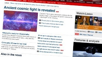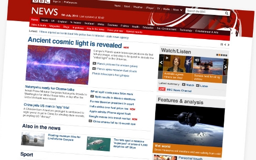
 The BBC is set to launch a redesigned version of its News website and it has just posted some screenshots of the new look.
The site’s editor, Steve Hermann writes of the new look, “We have focused on design and navigation, looking to see how we can make all the existing content we produce each day easier for you to find, use and share.”
The new look promises:
• a fresh, updated design, with more space for the main stories of the day
• better use of video and images
• clearer and more prominent labelling and signposting of key stories, whether you are on the front page or a story page
• a better indication of which are the most recent headlines
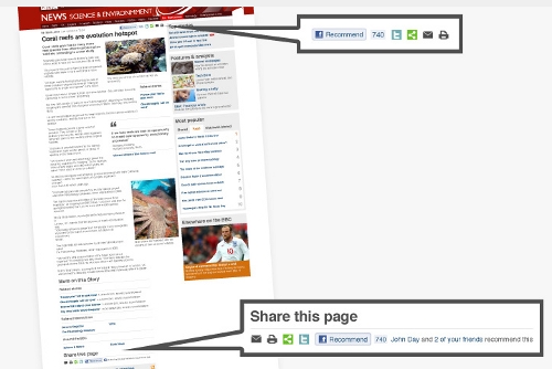
• easier ways to share stories with others, for those who wish to
What do you think? We think it’s certainly cleaner and more “2010” and the increased emphasis on video reflects the improved connection speeds many users now have. The sharing function allows easy posting of stories to Facebook and Twitter. No surprise there in 2010, but for the BBC – famously shy of endorsing individual companies and products – it’s perhaps a surprising move.
The new design will roll out over the next week or so and coincides with the launch of a specific version of the site aimed at the North American market.
See more images in this BBC slideshow.
Get the TNW newsletter
Get the most important tech news in your inbox each week.


