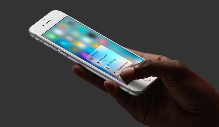
During Apple’s September event it announced a new technology called 3D Touch as part of the iPhone 6s. Apple calls it the “next generation of multitouch” and it isn’t mincing words when it comes to how important it is to the future.
Aside from the confusing naming, 3D Touch is similar to Force Touch found in both the Apple Watch and the MacBook, but with the new name it’s coming to the iPhone for the first time.
3D Touch is an incredibly interesting technology; it offers an unprecedented new way to interact with the iPhone. On top of just gestures, it allows iPhone to sense depth of a press, which opens up new opportunities for interface design beyond simple taps and swipes.
The demonstrations of 3D Touch during Apple’s keynote showed only a tiny glimpse — press harder on an icon and you’ll get something similar to the right click menu on a computer or press harder on a link in an email and get a preview of the page — but it’s going to be much bigger.
With 3D Touch, Apple is making a move that could eventually kill the convoluted, infamously confusing hamburger menu. Much has been written about how the hamburger menu needs to die, but nobody had offered a compelling alternative that would allow us to kill it off until now.
Seriously, I need a tutorial for this? pic.twitter.com/yyMLxcyEfn
— Luke Wroblewski (@LukeW) February 6, 2014
On Apple Watch, Force Touch is an ingenius way to eradicate the hamburger menu entirely from its interface and shows the beginnings of the plan for iPhone in action.
Force Touch solely helped the company avoid hamburger menus appearing anywhere in its wrist-worn interfaces from day one. With 3D Touch on iPhone, Apple is making its first moves toward killing it off on your phone, too.
Today the hamburger menu is frequently used to hide the options you only need to use occasionally, or is just lazily used when developers and designers don’t know where else to hide away options and buttons.
With 3D Touch, they can be hidden away entirely behind a consistent, memorable gesture. Just push a little harder to see more — that’s it.
If Apple can train iPhone owners to use 3D Touch to reveal more options — just like on Apple Watch — it’ll be able to slowly eradicate the hamburger menu from interface design.
That’s the difficult part, but it’s not insurmountable.
The lack of interface signals on the screen to tell people about hidden options behind a 3D Touch could mean users forget or never discover options hidden behind it. On Apple Watch this is already true; for weeks after buying it I didn’t know a harder press would clear all notifications, until I discovered it by accident.
This can be solved, however, by gently guiding new iPhone owners to use 3D Touch regularly through the use of tutorials, popups and subtle on-boarding hints.
One way Apple is doing this already is leveraging 3D Touch for Live Photos — to see the moving version of your shot, you push harder on a photo. That’s one of a few subtle ways Apple’s training you for what to expect when you experiment with 3D Touch, before it comes widely adopted.
Over time, as 3D Touch becomes expected, consistent and essential, it’ll offer new choices in interface design that haven’t existed in the past. It allows designers to simplify the user interface and only display content as the user needs it.
3D Touch is not a power user feature and isn’t just for nerds. It’s the new normal way to interact with devices and I expect other phone makers to take inspiration very quickly as interface design quickly embraces the new opportunity the technology offers.
It won’t happen overnight, but the existence of 3D Touch will gradually chip away at hamburger menus’ prevalence and we’ll forget we ever used them.
Hamburger menus will — finally — become endangered.
Get the TNW newsletter
Get the most important tech news in your inbox each week.


