At some point soon, Apple will ditch the MacBook Pro’s Touch Bar. But I have a simple request: rather than dispensing of it entirely, Apple should instead replace it with something I’ve brilliantly named ‘Touch Keys.’
Before we get there though, let’s have a little natter about the Touch Bar itself.
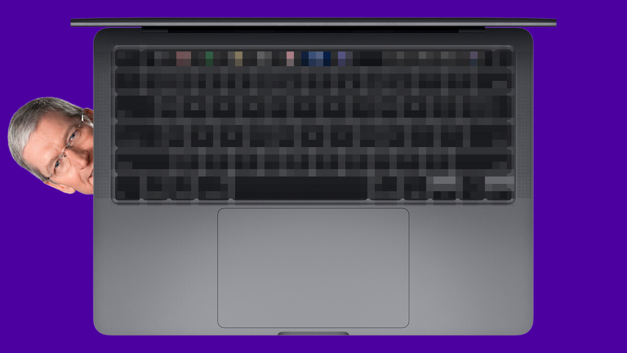
In case your memory needs jogging, the Touch Bar is an OLED screen that stretches across the top of some MacBook Pro models. If you’re interested, it looks like this:
It replaces the traditional function keys you find on keyboards with a customizable array. These can also change between different programs, the idea being to give you unparalleled control over how you use the software.
Much like a Shakespearean protagonist, the Touch Bar has a fatal flaw: it’s shit.
I’ve gone into detail about this before, but the best way to summarize the technology’s deficiencies is it’s not as good as buttons. Apple has invented something that delivers a worse experience than what was there before.
And that’s why the company needs needs to create the Touch Keys.
What the hell are Touch Keys?
Bear with me, we’ll get to that shortly.
On an intellectual level, the Touch Bar is a great idea. Having a row of function keys you can customize to your specific preferences is undoubtedly a Good Thing™. The issue has been the implementation.
What Apple needs to do is replace the Touch Bar with a row of buttons that each have a little display. Touch Key, if you will.
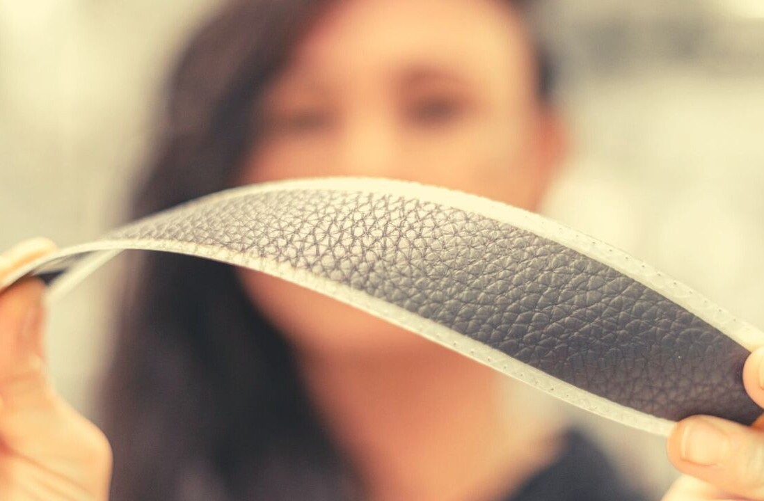
This shift would solve so many of Touch Bar’s reliability and tactility issues — and may actually be useful. I’d go even further. Get rid of the OLED displays and give the Touch Keys an e-ink display.
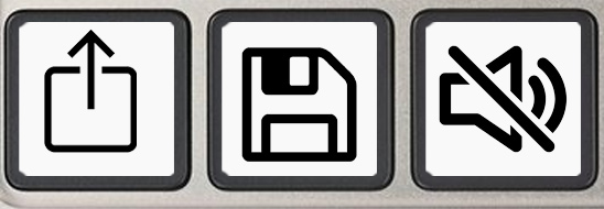
No, it won’t look quite as pretty, but it’ll use less power, feel better to the touch, and fit into the aesthetics of the keyboard far better.
A move to the Touch Keys would also do wonders for Apple’s image.
On current evidence, we’ll end up thinking and talking about the Touch Bar in the same way as the butterfly keyboard: an abject failure. Something Apple claimed was incredible up to the moment it removed it.
This doesn’t need to be the case with the Touch Bar. If Apple took the spirit of the technology and tweaked it into something like the Touch Keys, then it becomes an evolutionary step, rather than a stumbling failure.
I know this is never going to happen, but we’ve all got to have a dream, right? And one of mine is a sparkling new MacBook Pro complete with a set of glittering, e-ink Touch Keys. You can thank me later, Mr. Tim Apple.
Get the TNW newsletter
Get the most important tech news in your inbox each week.
