Apple and design are almost synonymous in the tech world, as the company’s often-bold aesthetic choices have the potential to shape a generation of products.
But for all its design clout, sometimes Apple pursues form at the expense of function. Other times, it just makes some flat-out bizarre choices that make no sense.
Don’t believe us? Judge for yourself. What follows is a list of just some of Apple’s worst design and user-experience decisions over the years.
The Macintosh TV
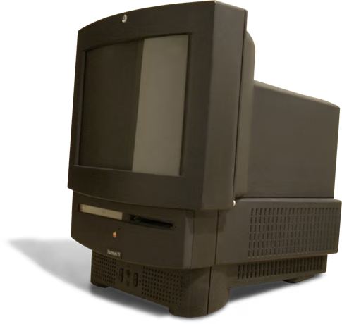
In 1993, way before there was the Apple TV, Apple tried to make a Macintosh TV. It is basically part Mac, part TV, and by all accounts, it wasn’t particularly good at being either. The fact that it cost $2,099 in the early 90s didn’t help (about $4,000 in today’s money).

The 💜 of EU tech
The latest rumblings from the EU tech scene, a story from our wise ol' founder Boris, and some questionable AI art. It's free, every week, in your inbox. Sign up now!
Indeed, it sold so poorly that Apple discontinued the product in a little over 3 months.
The Apple Newton
Apple’s first attempt at a personal digital assistant, the Newton, was arguably ahead of its time. But at launch, it simply wasn’t all that good. In particular, the handwriting recognition — its headline feature — was awful in the first few models. That isn’t too surprising given handwriting recognition in 2021 still isn’t perfect.
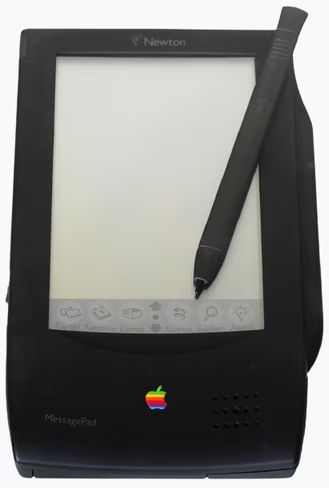
Then the Palm Pilot was released, eating up the Newton’s market share — and it debuted with a more reliable ‘Graffiti’ handwriting system.
Notably, Steve Jobs seemed to hate the Newton, and promptly discontinued it upon his return to Apple in 1997. Jobs’ disdain for the Newton might’ve arguably even inspired the iPhone.
The original iMac’s ‘hockey puck’ mouse
The original iMac is iconic, but its included mouse was terrible.
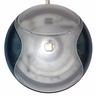
It was perfectly circular for some reason, which made it unnecessarily difficult to find the proper orientation without looking at the mouse. It was also egregiously uncomfortable for a device that’s supposed to be your primary way of interacting with a computer. That’s a shame, coming from the company that popularized the mouse in the first place.
The non-existent controls of the iPod Shuffle (Gen 3)
The iPod shuffle was already a quirky device, meant to let you play music in a small form factor without a distracting screen. But then the third generation of the device threw the baby out with the bathwater by eliminating buttons altogether.
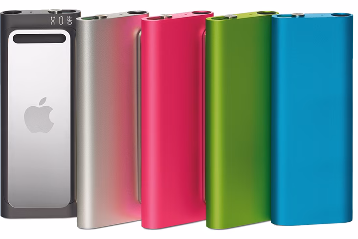
Instead, you could only control it using headphones that had a compatible inline remote, greatly limiting listening options and generally being far less convenient than simply having buttons on the device. Luckily Apple saw its mistake and quickly brought back the buttons for the fourth (and last) generation of the iPod Shuffle.
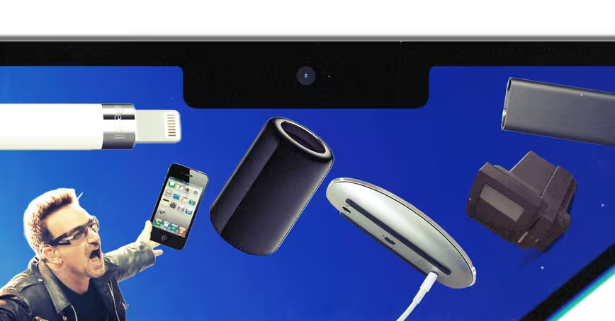
The iPhone 4’s Antennagate
The iPhone 4 is arguably one of the most iconic and beautiful gadgets ever made. I’ve heard many an Apple fan say it is the best-designed iPhone of them all. Well, except for one big issue: simply holding the device could cause it to lose signal.
The iPhone 4’s frame iconic metal frame also served as its antennas. By touching the phone’s lower left edge — a natural place when holding the phone with your left hand — one could bridge the antennas, resulting in significant signal loss.
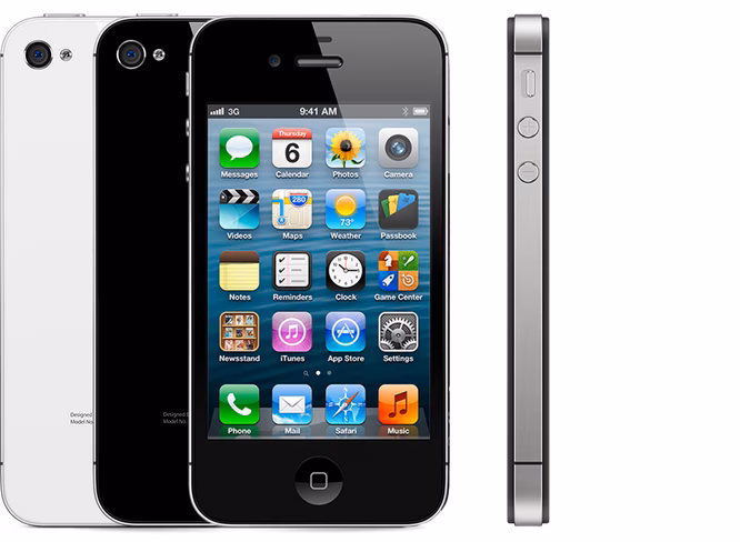
This led to Steve Jobs notoriously responding to people’s complaints by saying “just avoid holding it this way.” That quickly found itself in meme territory, albeit often paraphrased as “you’re holding it wrong.”
Apple eventually acknowledged the problem and started to offer bumper cases for consumers that would reduce the problem. Then the iPhone 4S came out, and Apple figured out a way to fix the problem while maintaining a similar design.
The Magic Mouse 2 and its absurd charger location
Few products are as notoriously ‘Apple design’ as the Magic Mouse 2. On the one hand, the futuristic mouse offered a smooth touch-sensitive surface to allow you to use multi-finger gestures. Yet when it came time to charge the mouse, the charging port was inexplicably tucked into the bottom face of the device.
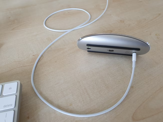
This means that the mouse can’t be used while charging, an odd limitation that I’ve not seen on any other wireless mouse since. Sure, you’d only have to charge it occasionally, but it’s still utterly nonsensical. The few times you had to get something done but your battery was dead were bound to be immensely annoying.
It’s especially puzzling as just about every other wireless mouse on the market sticks the charging port on the top of the mouse, such that it can optionally be used in wired mode, but it seems Apple did not want to interrupt the smooth top surface.
The trash can Mac Pro
The 2013 Mac Pro was peak Apple design, at least the kind that Windows users liked to make fun of from across the aisle. On the one hand, it was a head-turner. On the other hand, it kind of looked like a glossy trash can.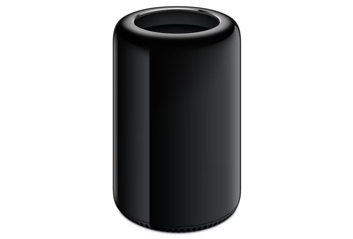
Apple managed to pack a lot of performance into a small form factor thanks to clever thermal management, but it completely missed the point for many professionals due to its almost complete lack of upgradeability and repairability.
The one good thing to come out of the trash can Mac Pro is that in some ways it seems to have catalyzed Apple’s recent turn towards appeasing professional users again. In 2019, Apple announced the current Mac Pro design, returning to a tower form factor with easy-to-access components.
That time Apple made you listen to U2
Remember that time Apple automatically added a U2 album into everyone’s iTunes library for free? Forcing people who don’t give a darn about Bono to download the album if they had automatic downloads enabled? It might not be a hardware design fail, but it sure is a weird user experience decision.
It was a move that, at the time, seemed at odds with Apple’s stance on streaming music — many artists decried the totally free download as devaluing music — and today seems at odds with Apple’s stance on privacy and user consent.
Bendgate
The iPhone 6 and 6 Plus were notoriously prone to bending, such that users reported the phone bending when they sat down with the phone in their rear pockets. The frame was weakest around the volume buttons in particular.
Although Apple claimed only a few users experienced bending, internal Apple tests (revealed in court documents), showed the iPhone 6 Plus was 7.2 times more likely to bend than the iPhone 5s. Apple later rectified the issue by using a stronger type of aluminum in the iPhone 6S, although the issue returned on the 2018 iPad Pro.
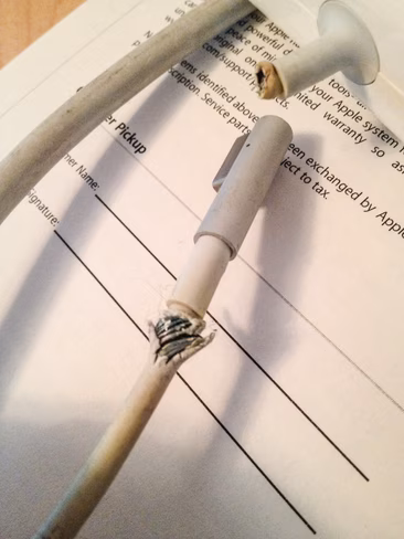
Charging the original Apple Pencil
In another instance of ‘why does it charge like that?’ Apple’s original Pencil charged by plugging directly into the iPad’s lightning port. It made your iPad look like a giant fly swatter and seemed destined to lead to damaged connectors.
https://twitter.com/thomasfuchs/status/1015724989495029765
Whether or not it was that big of a deal is kind of besides the point — it was an unnecessary design choice. Thankfully, Apple moved to wireless charging for the Apple Pencil 2.
Apple cables in general
Apple cables have been notoriously prone to cracking and fraying throughout the years. This was especially painful given their oft-proprietary nature, and some users even suspected a conspiracy that Apple simply wanted you to keep on buying accessories.
Thankfully, the company has started to improve its cable quality of late, using braided designs that appear more durable.
The butterfly keyboard
Apple started the unfortunate trend of making laptop keys unnecessarily shallow with its butterfly keyboard, but the design was fatally flawed. Butterfly keyboards were particularly susceptible to getting a bit of debris trapped under the keys, rendering them unreliable and often straight-up unusable. All in the name of shaving off a millimeter or two.
Some people liked the extra shallow, but to many of us, it also simply led to keys that felt like absolute trash, so I’m glad the company has seen it fit to return to good old scissor switches.
Apple HomePod’s limited connectivity
The Apple HomePod was pretty darn solid when it came to acoustics, but it was simply too limited in functionality for its price. It only worked with Apple devices and required you to mostly use Apple services or a handful of AirPlay-compatible ones. It didn’t launch with multi-room support or the ability to create a stereo pair. And Siri was not as good or flexible as the Google Assistant or Amazon Alexa. And there was no way to connect it to a physical audio output either.
When it came to a smart speaker, decent sound quality simply wasn’t enough to justify the HomePod’s premium $349 price. Apple discontinued it in a little over three years. One can’t help but wonder how much more successful the HomePod might’ve been had Apple just opened its walled garden a little bit.
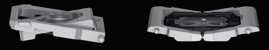
The $1,000 monitor stand
There’s nothing really wrong with the Pro Display XDR’s stand, except for the fact that it’s a $999 add-on… for a monitor that already costs $5,999.
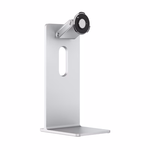
Adding insult to injury, even if you want to use your own stand, you have to pony up $200 for an adapter, because the display isn’t compatible out-of-the-box with the VESA standard every other monitor uses.
The 2021 MacBook Pro’s Notch
The iPhone X’s notch wasn’t quite egregious enough to make this list, considering that phone ushered in the era of thin bezels and its notch is justified by Face ID. But on the 2021 Mac Pro, the notch is simply puzzling.

The laptop has a high-quality webcam and super thin bezels, but the notch is inexplicably wide considering there’s no Face ID onboard; it appears to be a branding choice as much as an actual design requirement.
Worse, it led to numerous UI issues at launch, and Apple’s official explanation for not using Face ID was nonsense. We imagine Face ID will make its way to the MacBook Pro eventually, but for now, the notch is just something Apple fans will have to live with for the massive performance upgrades.
Such is often the story with Apple. As much as the company pushes design forward, sometimes that means living with the quirks too.
Get the TNW newsletter
Get the most important tech news in your inbox each week.