Today saw the arrival of one of the most anticipated Android apps in recent memory, with the launch of Instagram. The app is hugely popular on the iPhone and got some 430K signups on its pre-release signup page for Google’s OS.
Now that it’s out, we decided to put it through its paces to see how the Android flavor compares against the one that iPhone users have grown to know and love. We found that much of the aesthetic had been ported over from iOS, with just a few concessions to Android user interface conventions. There are a few interesting details, however.
The odd sizes of the screenshots are due to the differing sizes in the screens of the Samsung Galaxy Nexus, which I used to test Instagram for Android, and the iPhone. I’ve left them this way because it does illustrate how the app uses screen real-estate differently.
The home screen is nearly identical on both platforms, but there have been some tweaks to the tab bar, including a redesigned camera button and the standard Android ‘active bar’ on the current tab. Note that the tab bar is located on the bottom in both apps, despite the Android UI convention standard being ‘tabs at the top’.
The News tab is pretty much the same as well, although there are two large tabs on the Android version, rather than the two buttons of the iOS version. I feel that this makes the ‘Following’ section more visible to users. I know that it took me some time on Instagram before I even noticed that there were two sections here.
Next up is the Profile screen. This is one area where the Android version of Instagram shines, in that it gets you directly to your profile, burying all of the details of your account under the standard settings button in the upper right corner of the interface. This is a contrast to the iPhone, where you’re dumped into a standard list of options, rather than brought to your profile directly. There’s an extra tap needed here. I suppose that your mileage may vary, depending on whether you tap on that button just to tweak settings or if you like to check your follower count and other stats more often.
You’ll also notice a nicely prominent search button which allows you to tool around inside Instagram right from the first screen, duplicating the feel of the iOS ‘Settings’ list in at least one respect.

Once you do get to the profile screen on the iPhone, you’ll notice that the tabs actually do Android a disservice here. The choice between grid and list is a simple display option and yet it is given a ton of prominence. This wastes space that could have been dedicated to displaying more images. Because there is more vertical space on the larger screen, you actually end up seeing about the same amount as on the iPhone, but you could be seeing another row or so right off the bat.
And there is no guarantee that all Android devices will scale the way that the Galaxy Nexus does, so you could be seeing a lot less on some phones. I do like that the photos, followers and following badges are all in alignment with your profile picture.
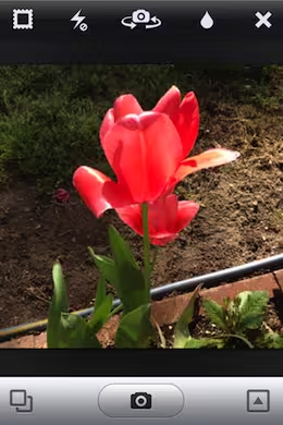
And then we come to the image capture process itself. Instagram for Android is designed to be backwards compatible all the way to Android 2.2 devices with OpenGL ES 2 support. I believe that it is due to this requirement that it has no live preview of filters. This is an option which was added only recently to the iPhone version, utilizing instructions made available in iOS 5, but which works on phones back to the iPhone 3GS.
You’ll also notice that you have no option to choose whether you want a frame on an image before you shoot it. The cancel button has been left aligned and there is now an Instagram logo for constant branding. There is also no ’tilt-shift’ function here, but, unlike the filters, there is actually no inclusion of tilt-shift at any point in the process, it’s just absent. This also may have to do with the technical limitations of older Android devices or versions.
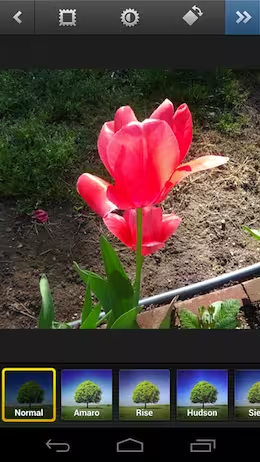
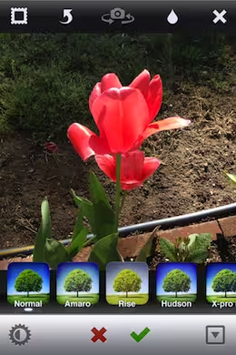
Once you’ve shot your image you’re presented with a slightly pared down filter screen. The tilt-shift is gone, the clarity has been moved to the top and the camera flip button is missing because this is a separate screen on Android, where the iPhone shows you the image right in the capture module. This allows for a bit quicker workflow. The ‘next’ or ‘ok’ button is a bit obscure on Android, in the upper right corner, featuring no visual identification that it’s a confirmation button. It looks more like ‘fast forward’ than anything.
You’ll also notice that Instagram for Android uses a software back button of one sort or another throughout the app. Sometimes it’s an ‘x’ for close, sometimes it’s a chevron. This mimics iOS, where there is no fixed ‘back’ button that cannot be accessed outside software, as is the case with many Android devices. As it stands, I didn’t use the back button displayed at the bottom of the screen in Ice Cream Sandwich at all.
The filters did not cover the image on the Android device I used, but once again, that is likely a function of the size and proportions of the screen I was using. Once you’ve chosen a filter, the iPhone version brings you directly to the posting screen, while the Android version pauses to render an image.
This means that the entire process, from shoot to ‘post’, is actually slightly faster on the iPhone than on an Android device. Not much, but definitely a noticeable amount.
The resulting photographs above are from the Galaxy Nexus on the left and the iPhone on the right with the Amaro filter applied. Since there is a big difference in the optics involved I don’t think you can draw any conclusions besides the fact that the iPhone 4S takes way, way better pictures than the Galaxy Nexus.
The interface itself is largely very nice looking. It’s well designed and clear, with a distinctly ‘hybrid’ feel which mixes conventions of Android and iOS together. My one major gripe with the interface is that the ‘ok’ button to take you from image capture to post is too obscure and hard to reach on a large Android device. The checkmark at the bottom on iOS is much easier to reach. Scrolling is also much smoother on the iPhone, but that’s the facts of life on Android.
Fragmentation rears its head once again with Instagram on Android, forcing the company to leave out features it could have otherwise shipped in order to support the wide array of OS versions and hardware out there. I know people like to pretend this isn’t a problem, but it is.
Aside from that, Instagram for Android is a great example of an iOS development house making a good translation of its app that manages to be similar on both platforms, while retaining a singular theme between them. If you’re an Android user that has been waiting, this is a faithful and mostly whole Instagram experience, enjoy.
See also: Instagram alternatives: 8 great choices
Get the TNW newsletter
Get the most important tech news in your inbox each week.


