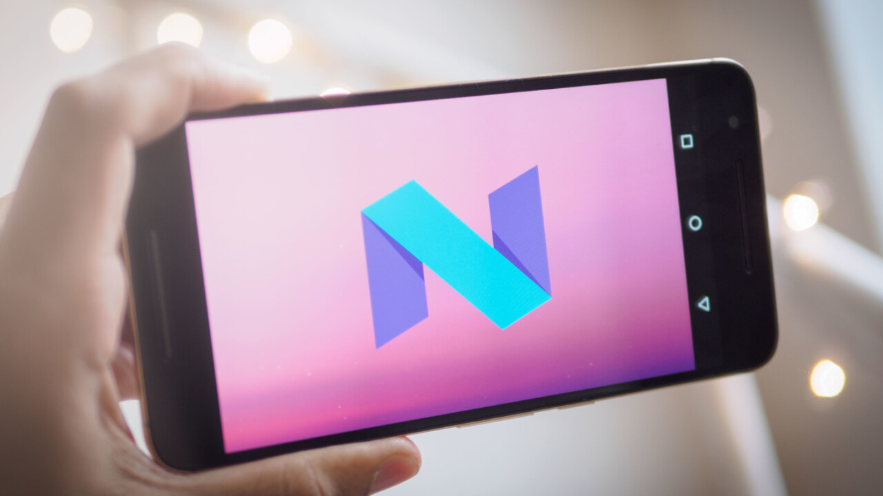
Google took pretty much everyone by surprise when it announced the Android N Developer Preview yesterday, over two months before the expected announcement at Google I/O.
After joining the new Android Beta Program, I installed the OS a Huawei Nexus 6P through a simple system update. While the company only really highlighted a couple of user-facing features – split screen mode and improved notifications – it turns out there are already a ton of new settings and features to play around with in Android N.
A lot of these have already made using Android N a much more pleasant experience than Marshmallow, so here are some of the best features we hope make the cut into the final version of the OS.
Split-Screen
Though Split Screen view first showed up as a hidden setting in a preview for Marshmallow, this time around it looks like it’s here to stay. It’s so good we wrote a whole article about it.
There are two methods for activating it: you can hold down the Recents button, or – within the Recents view – drag an app to the top or bottom of your screen.
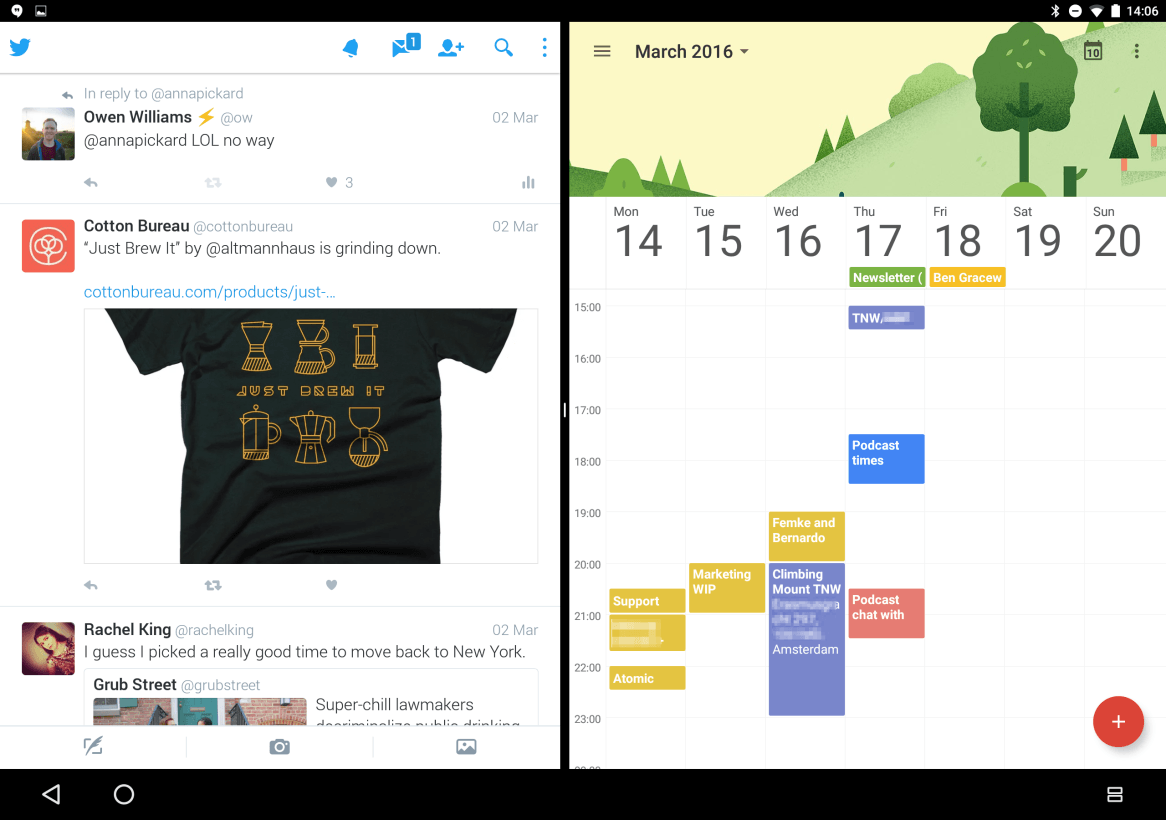
Google says it’s requiring developers to use a new code to specify an apps behavior while being resized (whether it should just move elements around or completely redraw), but so far every app we’ve tried has worked just fine; in fact, it’s been smoother on my Gp than the equivalent experience on Samsung and LG’s devices.
That said, it does warn you that an app ‘may not work with split-screen’ if it hasn’t implemented the new code – and you’ll be seeing that a lot – but it nonetheless works well enough to make Android tablets actually worth doing work on.
More informative and powerful notifications
Notifications are a a lot more powerful in Android N. Aside from an aesthetic change – they now sport a more minimal white look – you can now perform actions like reply to a message right from a notification.
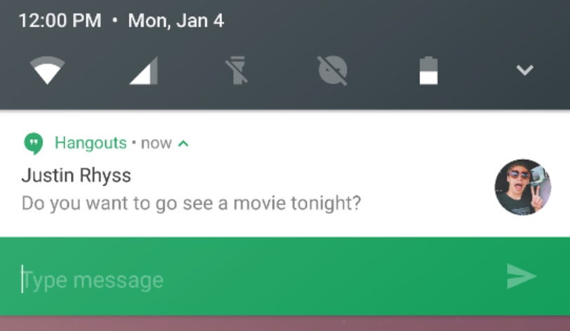
Multiple notifications from a single app are now bundled together, and you can expand notifications either using the old two finger method, or by pressing on a new arrow button. The latter should come in handy more Android novices who may not be aware of the two finger slide.
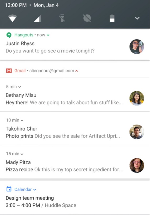
It’s particularly useful for apps like Gmail, where you can not only see that you have several unread emails, but also preview each one individually. I’m not sure what the limit is, but I was able to read 8 separate emails right from the notifications menu.
Meanwhile, a half-swipe to the right will also let you access notification controls, such blocking an app from showing notifications or changing its priority, which is a bit more accessible and intuitive than the old long-press that would take onto a separate screen.
A ton of user-tweakable UI settings
If you’re like me, you may be annoyed by all the little icons that fill up your status bar, leaving you little space for notifications. You can now customize almost all of these to your liking, including the icons for Bluetooth, volume, Wi-Fi, cellular data, airplane mode, alarms and more.
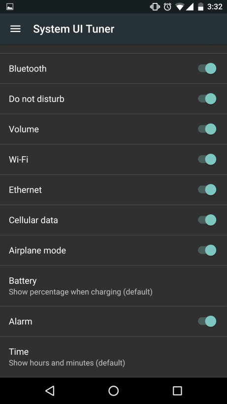
You can also add percentages to the battery Heck, you can even add seconds to the time display, or disable the time altogether if you’d rather not know how late you are to your next meeting.
That said, the System UI Tuner is a hidden feature; you need to hold the gear icon in the notifications shade for a few seconds before it will show up as a setting soption. And to be clear, this feature was available in Marshmallow, it was just a lot less robust.
For instance, the same System UI tuner now lets you calibrate your display’s color, which can come in handy if you find the display too warm or cold. It’s also useful if you want to match your phone’s display to your laptop.
Night Mode
Perhaps the best tweak in the System UI tuner: at long last, stock Android has a dark theme.
Another feature that was first presented in a Marshmallow preview, this time it looks like Night Mode might be here to stay.
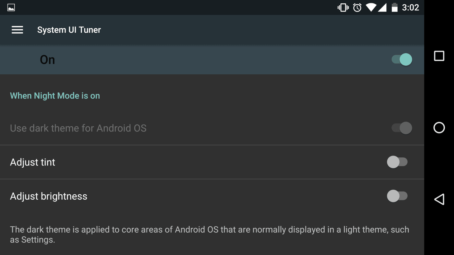
It actually consists of three toggles. The first one switched the UI to a darker aesthetic. It’s not as pervasive as one would like – it pretty much only affects the Settings menu at the moment – but it’s still early days. Plus, it looks really nice on OLED panels like on the 6P, where blacks are really pitch black.
The other two toggles bring f.lux-like functionality, including an orange tint to filter out blue wavelengths of light and brightness adjustments depending on the time of day. Another nice tidbit: Once you activate Night Mode, you can also toggle it from quick settings for easier access.
DPI Scaling
Here’s a UI tweak that’s not in the system UI tuner: DPI Scaling.
While Android previously allowed you to change the size of text throughout your device, DPI scaling is much more useful, as it affects the entire interface. If you have poor eyesight, you can make items larger to make them easily visible.
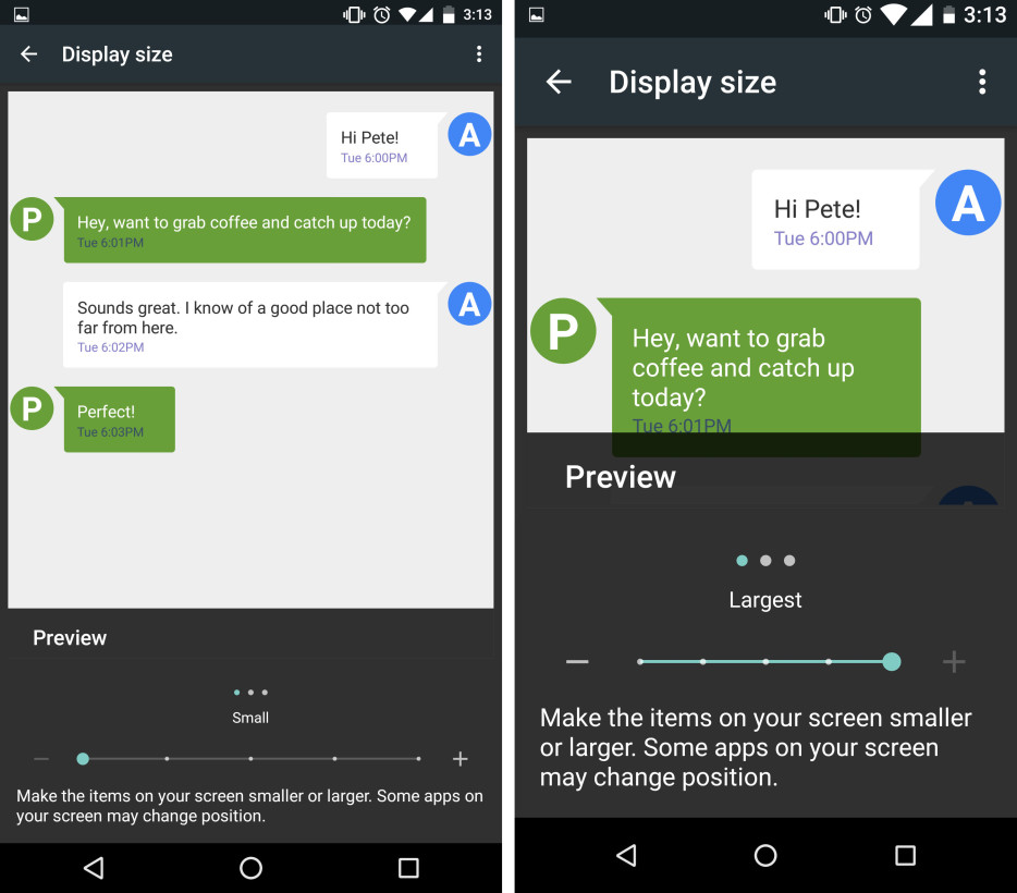
On the other hand, if you have good eyesight and want to fit as much information on your screen as possible, you might prefer going for the smallest scaling option; it’s particularly handy if you use split-screen a lot, and lets you fit more icons into your launcher.
Emergency Information
Android N wants to keep you safer, too. When someone tries to use your phone while it’s locked, there will be an ‘Emergency’ button at the bottom, which provides a dialer for calling 911 or another contact.
That was available in previous versions of the OS, but new to Android N is an ‘Emergency Info’ button that provides important details about you to a potential helper.
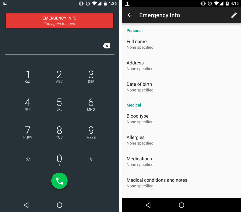
It may seem like a small thing, but it could really be a potential life-saver. You can add details like your address, allergies, blood type, medications, previous medical conditions, emergency contacts and other information that could help out a response team or Good Samaritan.
Quick app switch, AKA Alt+Tab for Android
Perhaps my favorite new feature is the smallest: double tap the Recents button to switch to your last app immediately, even if you’re in the launcher. Double tap again to switch back.
It works exactly like Alt+Tab on a PC, and it’s enough to make me want to leave the Android N preview on my phone. You will use it. A lot.
More informative Settings
Google is trying to save you a few click with an updated settings menu.
First off, something slightly odd: setting suggestions. Open up setting sand you might be greeted by a suggested setting change at the top of the menu; in my case, Google asked me to change my wallpaper. I’ve no idea how Google goes about suggesting settings, except perhaps noting ones you haven’t touched yet.
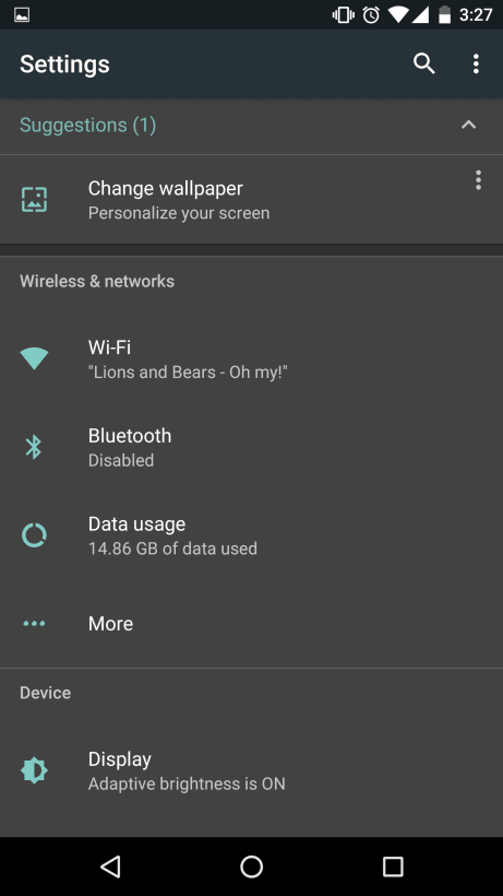
Second are settings previews under each menu item. For example, I can see information such as how much storage space and RAM I have left without ever having to click on a menu item. It’s a small but great time-saver for those times you’re going into the menu only to check whether a particular setting is on or to find out system details.
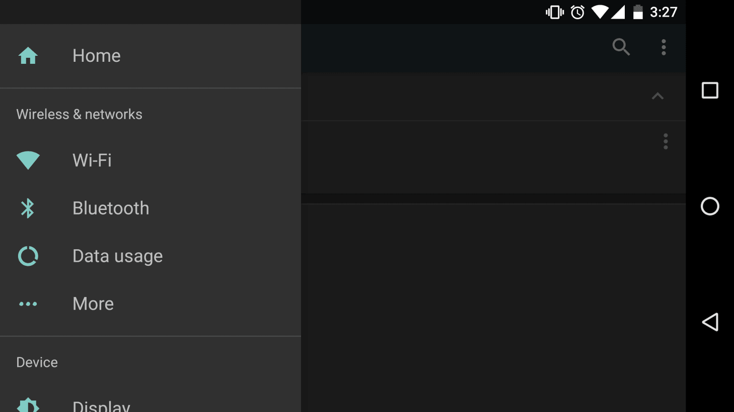
Third, you can now view the full settings list by swiping in from the left of your screen, or by pressing a hamburger menu on the top-left of the screen. It’s not necessarily faster than hitting the back button, but we’re not complaining about the extra methods.
No more ‘Optimizing Apps’ after an update and much faster app installs
Google has finally done away with the incredibly annoying ‘Optimizing Apps’ phase after updating your phone thanks to some behind the scenes tweaks. It means you’re able to install this preview (and any subsequent updates) way faster than before.
As Android Police points out, the same change also means that apps from the Google Play Store install much more quickly, which will come in handy when you buy a new device and restore your old apps. Per Google’s own assessment, “large apps that required several minutes to optimize and install in Android 6.0 can now install in just a matter of seconds,” which has indeed been my own experience.
Custom Quick Settings tiles

The Quick Settings Menu has a few changes too. The most notable one is that you now have access to five settings from the first time you pull down the notifications shade.
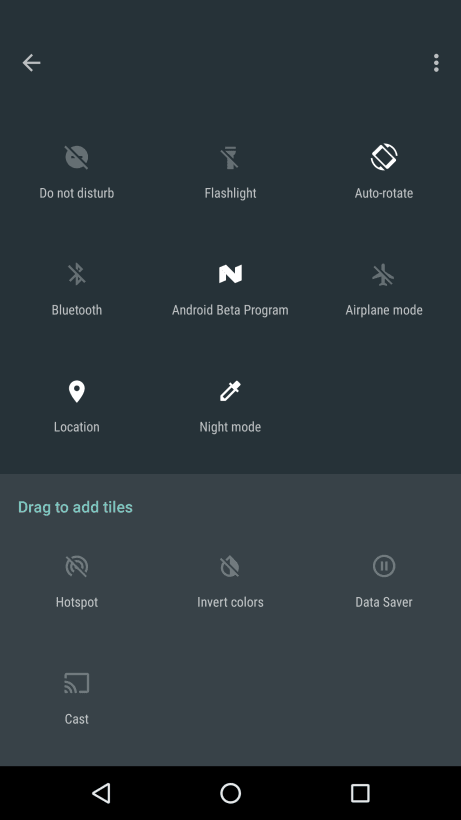
When you pull the shade down all the way, you’ll see that the settings tiles are now paginated, and there’s also an edit button so you can adjust the order of the tiles directly. The first 5 tiles become the preview toggles.
Apps can make their own Quick Settings tiles
Perhaps better than the above, Android Police noticed that Google has created a new API that lets developers create their own Quick Settings tiles.
Android is built for the power user again
If there’s one takeaway from my few days using Android N, it’s that it feels like a return to the days where Android was unquestionably the mobile OS for power users. While that’s always been the traditional notion, recent versions of iOS have added a number of features that have arguably made it the better OS for getting stuff done, and it was clearly superior as a tablet OS.
That may not be the case for long. While third-party Android manufacturers added a variety of multi-tasking features, by baking them into the core OS, Google is reminding us that customizability and freedom of choice are at the heart of Android. In fact, many of the features here are reminiscent of the tools people install custom ROM like Cyanogenmod for, so Google’s clearly been listening to its more advanced audience.
Even in preview form, occasional bugs and all, Android N is already a significant improvement over Marshmallow. While it’s possible not all of these features will make it into the final version of Android N, they all appear to be mostly ready for the primetime.
Get the TNW newsletter
Get the most important tech news in your inbox each week.


