One of the fables that floats around UX teams is that of the US space program and its quest for a pen that could be used in anti-gravity.
They reportedly spent million dollars developing a high-tech writing utensil with ink that remained solid until the flow of writing and a pressurized chamber that made it useful upside-down. The Russian cosmonauts, however, simply brought pencils.
Though this story isn’t wholly true, it shines light on the necessity of understanding the larger picture. The space pen did make it into orbit and was a privately-funded accomplishment in engineering.
In their own applications, both writing utensils were successful, but integrating UX design at the onset of project development mitigates the risk of over-complicating the solution.
This is just one of the lessons we can learn from UX Designers. Here are eight habits of UX designers:
They listen to users
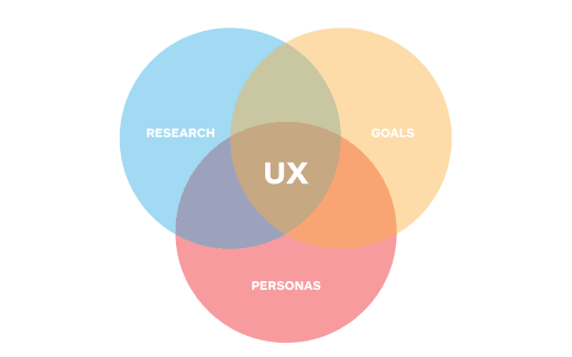
Without users, it would only be experience — which is to say the essence of the UX practice is its user base. This is an obvious point to be made, but what do we mean when we say users inform design? We are really speaking about multiple factors — research external to the designer, shaping results, and discovering clear and definitive goals.
“We all want to create products that make people’s lives easier and more enjoyable, products that delight people around us and ourselves. Creating great experiences starts with understanding your users, their behavior, motivations and goals.” Anna Iurchenko writes in Remote User Research & Usability Methods on UXMag.
The key follow-up is to listen to users. Storyboards and personas are great ways to put captured results into perspective and unearth deeper motivations. Building a complete picture of multiple types of users brings emotional and behavioral factors to the table.
When interviewing potential users, underlying feelings towards how they interact with a product or products are naturally exposed.

They recognize a trend versus pattern
The last few years have seen an emergence of open-source libraries categorizing processes, visuals, and templates. Inspiration for ideology and design can be found in abundance on the web.
However, it can be difficult to discern a trend sneaking into mainstream design when it becomes ubiquitous. Overtime, popular trends have potential to morph into established patterns, but that isn’t always the case.
Brendon Cornwell gives us this lesson in Making and Breaking UX Best Practices on UXBooth, “Pay attention to what’s driving the trend — is it just the next thing, or are there user experience lessons being distilled through the trend? Understanding design trends allows for faster assessment during the creative process, and can help steer products away from becoming the next ‘one of many’.”
They design for tasks, not screens
It’s easy to conceptualize an app or piece of software in terms of volume of screens, but looking deeper is integral to the success of any product.
Nick Kellingley writes in One Size Fits All? on Interaction-Design.org, “Task oriented design asks the question; what will the user do with this application or website on the specific device on which it will be used?”
Allowing tasks to drive design is especially crucial when, for example, UX Designers examine the transition from desktop to mobile. Mobile necessitates touch interaction and content on a reduced scale. It is impossible to simply “shrink” desktop to mobile and expect equal results and productivity.
They learn the rules before they break them
Like any expert in their field, a great UX Designer fully understands not only the guiding principles of UX, but the medium which they are designing for.

To fully comprehend device functionality across various platforms, the best practice is to go straight to the source.
Designing an app for iPhone? The Apple Human Interface Guidelines are definitely the best place to begin, but learning by experiencing and personally testing as many apps as possible is eye-opening.
Relying on a strong foundation of UX guidelines affords designers the ability to deviate when it is sometimes called for. Knowing the rules also means being able to comprehend the ramifications of breaking them. Though it is not wise to abandon all convention when innovating, new processes and ways of doing things are often the natural by-product of creation.
They consider all routes
It is virtually impossible to imagine every potential idea when building a product, but creating a bank of ideas early-on might prevent critical revisions.
Of course, revolutionary ideas may spark anywhere in the design process, so the ability to iterate quickly is key.
Of its Pattern Library system, the UX team at MailChimp has written, “We believe iteration is a vital part of the design process. Being able to change fast requires both an efficient workflow and a well defined collection of reusable parts that can assemble new interfaces quickly, without accruing new technical or design debt.”
They understand real life context
What about stepping outside the screen? What is the desired total experience under which a user might interact with a product? Successful UX Designers think about the larger environment.
Credit: Sweet Juniper
Users of any app or piece of software are not always engaged 100 percent. This is especially true of mobile. UX Designers do not expect a user to navigate the app in a windowless, sound-proof room! When designing, erring on the side of simplicity accommodates for distractions.
Kelsey Ruger, gives us these guidelines for designing in context:
- Make it natural and intuitive
- Reduce cognitive load
- Expect interruption and partial attention
- Design for task efficiency and completion, not screens
They plan for failure
The old adage “If it’s too good to be true, then it probably is” unequivocally applies to the user-centered design process.
In his timeless article on Iterative User Interface Design, Jacob Nielsen begins, “It has long been recognized that user interfaces should be designed iteratively in almost all cases because it is virtually impossible to design a user interface that has no usability problems from the start.”
Great UX Designers plan for systems to not work perfectly. Ironing-out wrinkles is informative and serves to strengthen projects, not hinder them.
They stay up to date
Technology moves faster than any other industry. UX Designers stay sharp by constantly reading, researching and exploring. In this way, UX Designers become integral users in their own field.
Eric Reis, author of The Lean Startup, was quoted in an interview saying, “Design is the new basis of competition.”
With more and more Fortune 500 companies prioritizing design, is it any wonder that most in the top rankings either partner with or have UX Designers in house?
Read next: Beyond design trends: Timeless user interface techniques
Get the TNW newsletter
Get the most important tech news in your inbox each week.

