Sky Q, the broadcaster’s next-gen TV service is now being installed in homes across the UK – and last week it was my turn to get access to the multi-room, multi-streaming service.
Here’s my first quick thoughts after just a few days, rather than an exhaustive look at every aspect of the system.
It’s worth noting, due to the options available when signing up, that the boxes provide additional functionality if you’re also a Sky broadband subscriber, effectively acting as a repeater throughout your house wherever you put a box.
For me, that means just the main box and tablet viewing (rather than multiple boxes attached to TVs throughout a larger house) making it a pretty painless affair. No dish change was required, although the installer did need to swap one module. If you’ve got an old Sky dish, you’ll get a new, smaller one.

The Sky Q Silver box
Silver by name, silver by..well, actually, it’s mostly black. And plastic, which is a good thing. Who ever wanted an all metal Sky box? No one, that’s who.
The box allows you to record on multiple (up to four) channels while watching another, but if you’re coming across from an existing Sky box there’s no way to bring your recordings with you. That might frustrate some people, but wasn’t really a huge problem for me – purging programs that were recorded over a year ago and never watched just doesn’t feel like too much of a loss.
The new UI – referred to as Fluid Viewing, where it allows you to stop and pick up a program again from the same point on any device or box – is a real step forward too, allowing you to get to get straight back into the action.
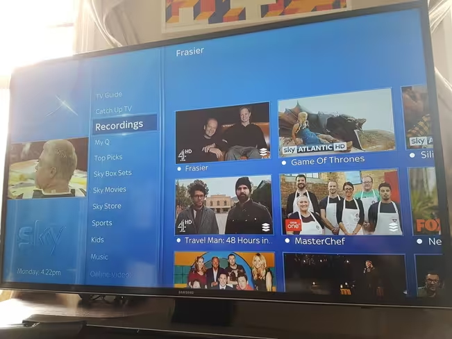
In fact, the entire UI has been redesigned – switching from horizontal to vertical panes of information, with a neat little accenting feature around the selected item that you probably wouldn’t notice were it not pointed out here.
That’s not just to make things look a bit nicer though, it also provides feedback to let you know that your pawing at the touch-sensitive remote is having an effect.
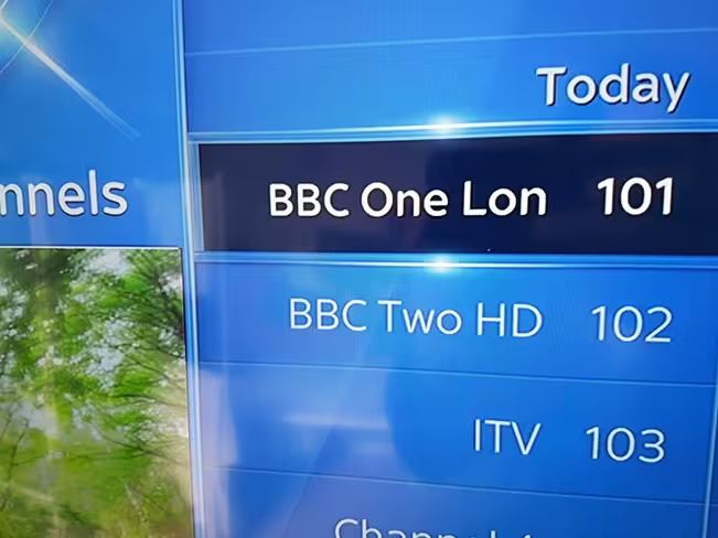
Overall, the new layout lets you easily guide through different content by types, channels, shows, catch up services – and the most frequently accessed places are always just a press or two away.
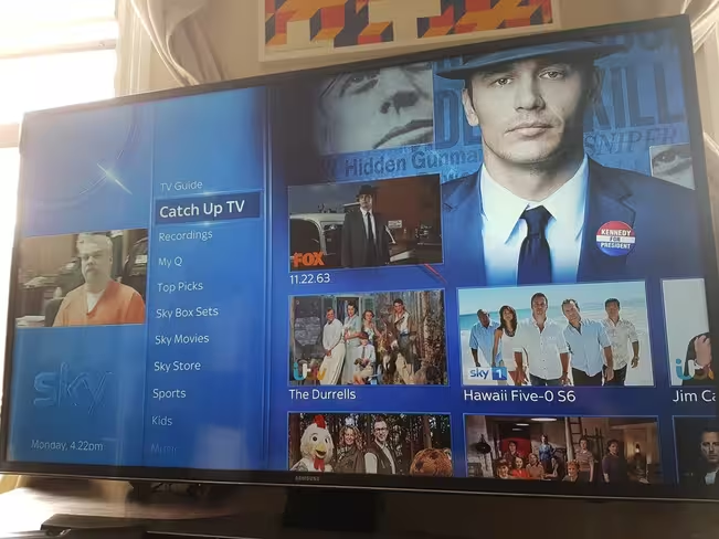
For example, if you want to jump straight to your recordings, hit the ‘Sky’ button on the remote. If you want to jump straight to ‘Top Picks,’ you can hit the ‘Home’ button.
It’s not perfect though – deleting recordings seems to be a little more awkward (there’s no option to press the yellow button on the remote, meaning you need to navigate to the recording to delete it), and I’ve definitely spent far less time looking at the EPG – the emphasis on catchup, on-demand and Sky Movies content in the planner, as well as a much-improved search function removes a lot of the need.

I’ve had a few little software problems along the way too – the semi-transparent panel that pops up with show info wouldn’t go away on one occasion. It also displayed a ‘no connection’ error a couple of times on one particular menu, despite reporting being connected in the settings. Nothing major, and nothing rebooting the box at the mains didn’t fix.
I’ve also had one recording fail due to a “power cut,” though there wasn’t actually one.
To Sky’s credit, once informed of these minor issues, they’ve offered to send out an engineer to carry out a few more tests and check everything is OK.
Being able to seamlessly carry on watching your favorite show as you move from the couch to cooking dinner is really going to be a revelation for anyone feeling tethered to a main TV.
But I do have a rather serious love/hate relationship forming.
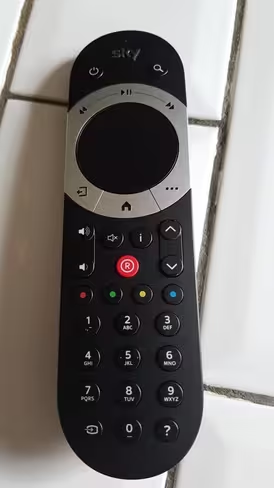
The touch-sensitive controller
The controller is the point of this friction – though I’d want to say up-front that it’s a big step forward from the old Sky remote, even if it can be a little frustrating.
First up, it’s lost a bunch of the buttons that people never used and the primary focus of it is the big touch-sensitive control in the middle. Tapping this brings up current show info when you’re watching a program, and it’s used as the primary navigation and input for most functions.
After a little getting used to, you’ll likely agree. Before that, you’re going to feel a little lost for about five minutes while you feel your way around.
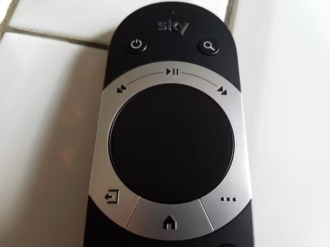
There are also touch-sensitive controls above the main pad for pausing, rewinding and fast-forwarding – and it’s these that I considered my nemesis this past weekend while avoiding the outside world and burning through a box set.
While it’s incredibly convenient to be able to pause, rewind or fast-forward without needing to look at the controls to see what you’re pressing – and it affords you a greater level of control – it’s utterly frustrating to constantly have a recorded or downloaded show jump backwards or forwards because someone accidentally touched the controls while reaching for the volume, or had the temerity to stand up and get a drink, and then sit back down on the sofa and inevitably rewind the show at 30x speed.
It sounds like a minor complaint – and it really is, Sky Q is a truly worthwhile step forward for any family that makes good use of a Sky package already – but it’s also one of those small niggling things that can get really annoying, really quickly. It must have happened 20 times over the space of a few days.
On one of those occasions, the controller was sat on the arm of the chair (face down) when it started to fast-forward through a show. I have no explanation as to why, other than perhaps the touch-sensitive buttons somehow being activated by my sofa. It was at this point that my girlfriend charmingly coined the phrase ‘polterSkyst.’ It’s a fair assessment of the situation.
It’s worth pointing out here that the touch controller isn’t the only option available – there’s another one with directional arrows instead that you can request if preferred.
I would still stick with the new touch-sensitive one though, as despite its minor foibles – like the system as a whole – it’s still an upgrade worth having.
Get the TNW newsletter
Get the most important tech news in your inbox each week.


