If you’ve worked in the design industry for any length of time you’ve probably seen styles come and go.
Maybe you’re using some styles that are so popular they’ve reached their saturation point. Or maybe you haven’t even realized the possibilities that come with the constant influx of new technology.
Whether or not you’ve already noticed the changing times, here are seven signs your design is stuck in the past.
You think serifs are a thing of the past
You’ve seen brands, such as Google and the L.A. Clippers, recently opt for a sans serif logo. Do you know why? The low-resolution of mobile phones and tablets made sans serif type the best choice for easy readability on mobile.
However, 4K is on the rise and resolution on mobile keeps getting better. What does this mean? That’s right, serif typefaces are already making a comeback in digital design thanks to high definition screens.
You are constantly trying to keep up with the latest color trends
Every year there’s a debate on the best color of the year.
Pantone named Rose Quartz and Serenity the joint Color of the Year for 2016, yet Behance found Bright Red to be the most used color for its users. Communication Arts editor Rebecca Huval argues chartreuse has become the go-to color for startups’ office décor.
The point is, it’s not about what color you choose, it’s how you use it. Don’t overdo it with an explosion of colors. Consistent, color saturated design ensures your work will stand out among others and look great on mobile – even with reflection. No matter the color, it’s all about being bold and making a statement.
You do all of your work sitting at a desk
You never know when inspiration will strike, and it’s important to capture that inspiration immediately. Why wait until you’re back at your desk?
Not only is distraction a key variability in creativity, but the iPad Pro and Apple Pencil give designers a more paper-like experience that makes it easy to sketch out and play with your ideas from anywhere. The benefit is that these mobile apps make it easy to put your ideas into production without the need to scan and trace.
It’s said the best camera is the one you have with you, so use your phone to capture content or an app for colors, shapes, and brushes. Those elements are then instantly available on your desktop when you’re ready to sit down.
You think from only one perspective
You scroll through Instagram and your feed is full of selfies and over filtered, blasé landscapes. You don’t want your designs to be #basic, so it’s important to change perspective. Literally.
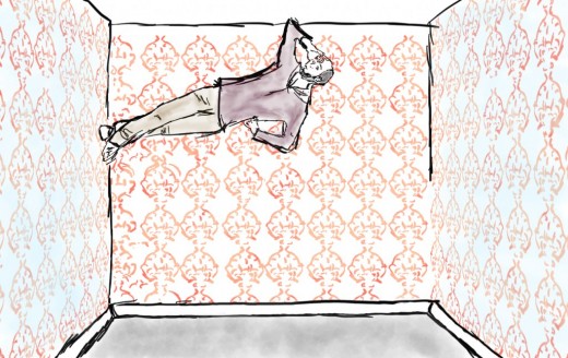
You can even take it one step further by adding your own illustration on top of these images.
You take throwbacks too far
Despite cleaner high-definition screens, gradients – which harken back to the early days of the Web – made a comeback in 2015.
We also saw popularity of a coloring approach to logo design gain momentum, possibly triggered by or the catalyst for the popularity of adult coloring books, and the rise of four pointed sparkle in design, skeumorphism and hand lettering.
When it comes to these “cyclical trends,” use them appropriately. They’re great for temporary projects (eg. a music festival or new app) but not applicable for a company’s branding that will probably be around for a decade.
Your flat design is falling flat
Flat design has become hugely popular for designers. Just like the cyclical trends noted above, the reoccurrence of flat design is a normal cycle in the design industry.
Despite its current popularity, sometimes this style can be repetitive and, many have argued, boring. Break the mold with depth.
There are wonderful tools allowing for multiple layer effects and the flexibility to set a design apart in the flat world of screens.
Your templates are looking like… templates
When it comes to creating online content, especially for small businesses, templates seem to be the path of least resistance. The issue is, no matter how good the template is, it still looks like a template.
For most designers who pride themselves in “hand-craftsmanship” and “uniqueness,” this is pretty much a non-starter.
And let’s not forget when the client asks for something the template can’t do.
Rather than diving deep into the world of development for the sake of the craft there are other solutions which allows designers to create websites with total flexibility. The best part is, no coding is required.
Read next: Why mobile designers must focus on creating ‘micro-moments’
TNW originally published this piece in April of 2016. We sometimes update and/or re-publish articles from our archives that are fun, informative, or highly-relevant… like this one.
Get the TNW newsletter
Get the most important tech news in your inbox each week.

