Ever see somebody biting their nails? Kinda gross, right? It’s a bad habit and everybody’s got them.
While nail-biting may not be super hygienic, at least it doesn’t tend to ruin you, professionally. Inefficiency on the other hand, will put you behind schedule and in the dog house with coworkers and clients alike.
Of course, this is a problem because almost everyone starts out inefficient. Nobody knows the fastest way to do something until they’ve practiced a bit. That’s why inefficiency and laziness are often such close bedfellows.
But that’s not always the case. Sometimes fastidiousness can be just as inefficient as a lackadaisical attitude.
The truth is, there are many behavioral quirks that can lead to inefficiency. This is doubly true for professionals in the web design industry. In this field, there’s a spectrum of behavior that goes both ways. If you lean too hard on either end, you’re going to miss out on some productivity.
So let’s examine some of the major pitfalls that can cause a designer to fall by either wayside.
-
Lazy Design
The number one complaint anyone outside of the design department has about said department? They didn’t work hard enough on the project.

Usually, this comes in the form of forgetting to design for more than one browser. It’s easy to forget that not everyone uses Google Chrome. As painful as it is to admit it, there are still folks out there viewing websites on outdated iterations of IE.
Even more painfully, you must be sure that their viewing experience is consistent with the ones that you’re serving more enlightened Firefox and Chrome users.
There are, of course, other shortcuts you can take which will result in slowdowns to launch.
- Neglecting to take time building a rapport with clients before starting on a project
- Never following up with them on how satisfied they are with the results of a project
- Choosing to always use email instead of making a phone call—you know, all the social aspects of the job.
Then there’s also the impetus never to grow in your technical expertise. If you’re happy with a single professional skillset, and you’d rather not use any new tools or techniques, then that’s evidence of laziness.
There’s something to be said for a high level of mastery in one area, but gaining expertise in multiple disciplines will make it easier for you to deepen your knowledge in whichever area you’re passionate about.
So don’t be afraid to try new things. Whatever you’re used to doing, switch it up and start working on something new every once in awhile. Get outside of your comfort zone and learn a new prototyping tool, check out new tutorials on Tuts+, or try Sketch instead of Photoshop.
But careful not to tread too far onto the other side of the path. If you start obsessing over your designs, you’ll become just as inefficient. And that brings us to our next bad habit.
2. Overdesigning
The “less is more” mantra has put this one on the back-burner in recent years, but it’s still a danger.
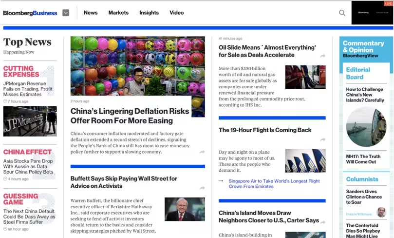
As explained in Interaction Design Best Practices, over designing is the impulse to put too much functionality or too many functions into your designs. The end result is a cluttered and confusing interface. The truly insidious thing about over designing is that it comes from such pure intentions.
You plan to make something perfect, a little too much so. It needs to have every scenario covered so that the user will never be caught in a situation where they are confused about where to go or what to do.

Photo credit: Bloomberg
Unfortunately, providing an abundance of options, paths, and functions to enable users ends up crippling them with indecision. Over designed web pages are usually plagued by all of the following:
- Cluttered interfaces – Over designed UIs are packed with design elements and can seem unattractive. To avoid clutter, subtract elements from your design until it stops functioning, then slowly add them back. If you find yourself trying to justify why an element should be added back, then leave it out.
- Abundant friction – User progress through a website should be unobstructed and seamless. Overdesigned pages can bring the flow to a screeching halt.
- Loss of function – Too many textures or colors dissolve visual hierarchy : legibility, focus, function, etc.
The solution to this is simple. Understand the problems, and design very selectively for the outliers. UX designer, Rodrigo Muniz, recently wrote an article about a pet peeve of his that addresses exactly this issue.

In Rodrigo’s eyes, the scroll button + arrow is redundant over design that solves a problem nobody is having trouble with. We all know how to scroll down the screen. This is an unnecessary design element that takes up space and insults the user’s intelligence.
Obviously, this isn’t the best way to make an impression on your users, and as we’ll cover in our next habit, giving users their due is very important indeed.
3. Forgetting About the User
It’s easy to get caught up in the artistic aspects of design, and forget that they need to serve a function for people with varying degrees of experience and expertise. Acknowledging user fallibility is essential to designing effectively.
Designs which neglect the users will:
- Miss essential functionality
- Insult user intelligence
- Lack a clear navigation flow
- Have vague and robotic feedback
Allow me to draw an example from a developer friend of mine:
Her department was waiting for the front-end designer to deliver a working model of a new UI. The design was held up because of a dropdown field, which wasn’t functioning correctly. The designer had all the values in place but couldn’t figure out what was causing the bug.
They finally consulted with the QA who was testing the issue. When they sat down and watched the QA go to work, they noticed that when he started entering in the value, he was typing with a keyboard instead of mousing through the preset values. That triggered the bug because the dropdown was never designed to account for additional input methods.
Gif credit: Stackoverflow.com
In this case, the designer forgot the number one rule of UX design: users come first, even when it comes to edge cases.
Just because she was used to working with the interface a certain way, it made her omit providing another option for the user, which in this case actually affected the back-end implementation. The slight oversight held up the delivery for days.
Beyond neglecting the user, it’s also possible to become inefficient because you’ve shown them either too much or too little esteem.
The designer in our example assumed that a user would use a mouse to point and click on the appropriate value for the field. This is the faster and easier method of entering in the information.
In most cases it would have been smarter and easier to do so. She assumed a base level of competency in her users. Assuming a base level of competency in the users is tempting, but can often be inefficient.
You must know when to idiot proof your designs.
But then again, you don’t want to lose all respect for your users or else you see every problem as a critical blocker. This can result in the over design which we covered above. It’s all part of walking the fine line and not going too far afield on either end of our spectrum.
Here’s a few tips from the Guide to Usability Testing:
- Prototype early and often. If you use a collaborative design tool like UXPin, you can speed up the process using built-in element libraries and interactions. Once you finish your first low-fidelity prototype, test it with at least 5 users, iterate to high-fidelity, then test again with a different group of users.
- For the fastest and most scalable usability testing, try a service like UserTesting who can recruit, test, and analyze your design for $50 per test. They also send you recordings so you can share with all stakeholders.
- If you’re in a real time crunch, try some hallway usability tests. Like the name suggests, test your designs with two-three coworkers (five if possible) who aren’t involved in the project. Explain a few core tasks, then watch how they interact and take note of successes, failures, and unexpected behavior. Make sure you encourage them to think aloud as they complete tests.
4. Working in Isolation
Humans are social creatures and designers and, designers are no exception. Everyone can benefits from collaboration.
Because design is sometimes mistakenly considered a pure art (and it’s not, because commerce is involved), some designers become attached to an individual approach. It’s their idea, so it should be executed according to their specifications. This is a mistake on many levels.

Image credit: Marknutting.com
Design is a collaborative effort. As explained in Web UI Design Best Practices, you have to consider all of the following parties involved:
- The client or product team: it’s them you’re working for after all
- The user: established by market research
- The design team: to showcase their good work
- The development team: so that it’s possible to put your ideas into practice
- And the QA: to identify bugs before you start testing with users
If any of the moving parts is neglected, the entire process breaks down.
Working in isolation is inefficient because it’s more difficult to check your own work than it is to proofread someone else’s. A fresh set of eyes that’s not attached to any of your preconceived notions of what works or what looks good, can better point out obvious mistakes in form and/or function. Likewise, the design and development teams must communicate closely if you want a smooth transition from concept to delivery.

An inefficient designer may think they’ve got it all planned out, but the reality is they don’t often have their feet grounded in the practical realities of what’s possible.
Neither can it hurt to have a separate set of eyes examine if the way you’re designing something is the best way to accomplish the goal. No matter how good you are at interface design, there might be a different technique that would result in a faster site, a more attractive design, etc. And all of that’s only addressing the communication issues between team members.
If any of your collaborators are overlooked, you risk building a product to completion that’s missing an important piece of the foundation.
5. Rigid Design Process
Another bad habit that breeds inefficiency is rigidity, or being inflexible.
- It might be that you’re really in love with a certain way of doing things.
- Perhaps it’s just more comfortable to put the same old hero image with bold messaging above the fold as your last thirty designs.
- You don’t need to do anything different because there’s no need to reinvent the wheel, and this pattern suits your purposes just fine.
The problem is using easy solutions for the sake of familiarity may cost you more time in the long run. The technique might be more familiar but the execution may still be lacking.
If there’s nothing special or new about the design, then the product team could reject it and you’re back to the drawing board. Alternatively, exploring new techniques and ideas may seem scary, but they could produce the best results at a faster clip than comfortable processes.

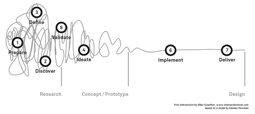
Photo credit: Enterprise Design Associates. Creative Commons.
The determining factor is always the context of the project.
As interaction design expert Robert Hoekman Jr. suggests, sometimes the best design process is no process at all.
6. Overworking
Speaking of balance, all work and no play will indeed make you a dull boy. Additionally, it can turn the quality of your work stale as well. Working too hard can and will slow you down. The creative process is essential to design, stressful overworking can hinder your ability to think creatively.

When maximizing your productivity, it’s important to recognize how thought processes work. There are two types of thought: focused and diffuse.
- Focused thought requires your undivided attention on a task at hand. Reading, recall, repetitive practice and the like are all a part of focused thought, and they’re important for building familiarity with a topic or technique.
- Diffuse thinking is a free-forming, subconscious thought process that ties disparate ideas together and synthesizes them into an overall concept. Diffuse thought occurs while you’re walking, showering, exercising, or otherwise occupied. It’s why you have many brilliant ideas right before bedtime, or in the middle of a workout. You’re basically waiting for your prefrontal cortex to shut up and get out of its own way.
Many of the “ah-hah” moments in history have occurred as a result of diffuse thinking. For example, the Newtonian theory of gravity occurred serendipitously while the renowned mathematician was relaxing beneath the shade of an apple tree.
In sum, relaxation is imperative to working out new solutions. One extremely effective way to leverage both types of thinking is to use the Pomodoro method in which you set a time limit for a specific task (usually 30 minutes), then follow it up with a 3-5 minute break.
However you handle it, you should always follow sessions of intense concentration with moments of relaxation.
Conclusion
These are just a few of the bad habits an inefficient designer can end up adopting.
But with healthy communication, deliberate practice, and a deep well of patience most if not all of these behaviors can be either alleviated or eliminated.
If you’d like to explore more skills and techniques of great Web designers, check out our free 109-page e-book Web Design Best Practices. The book explores techniques spanning UX design, visual design, and interaction design. Examples are analyzed from 33 companies including Apple, Spotify, Skullcandy, and others.
Read Next: How video games improve your interaction design
Image credit: Shutterstock
Get the TNW newsletter
Get the most important tech news in your inbox each week.


